
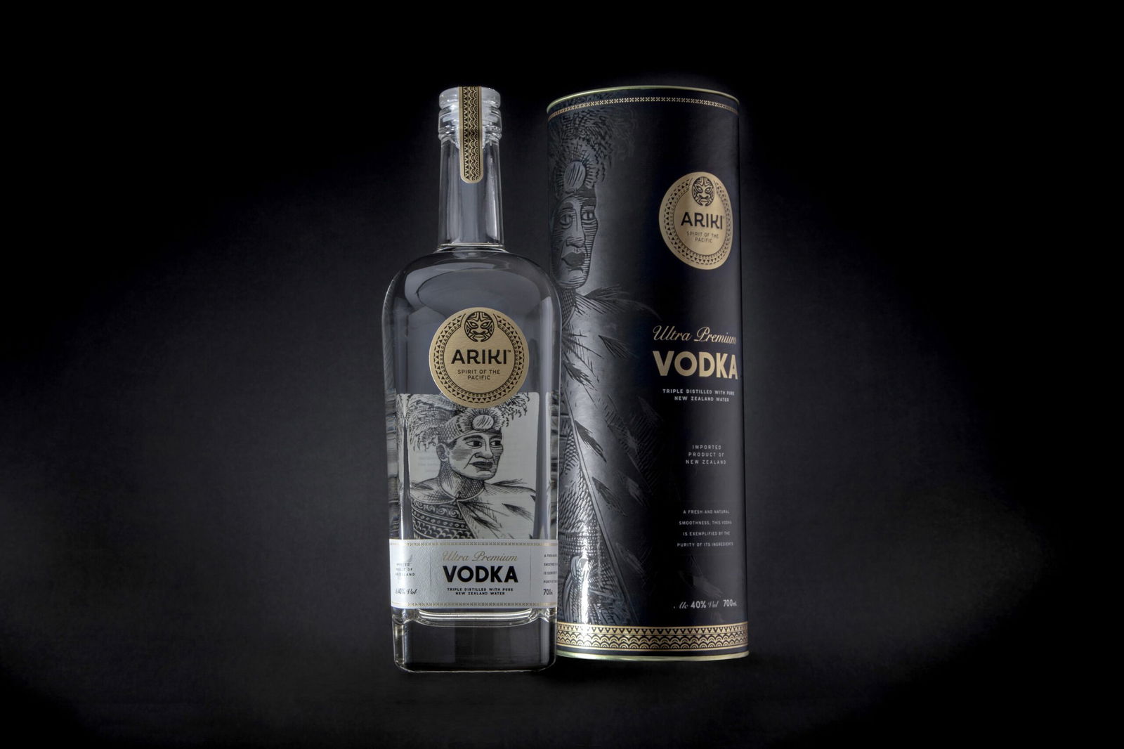
Ultra-Premium Beverage Branding & Packaging Design
CLIENT: Ariki Spirits Co.
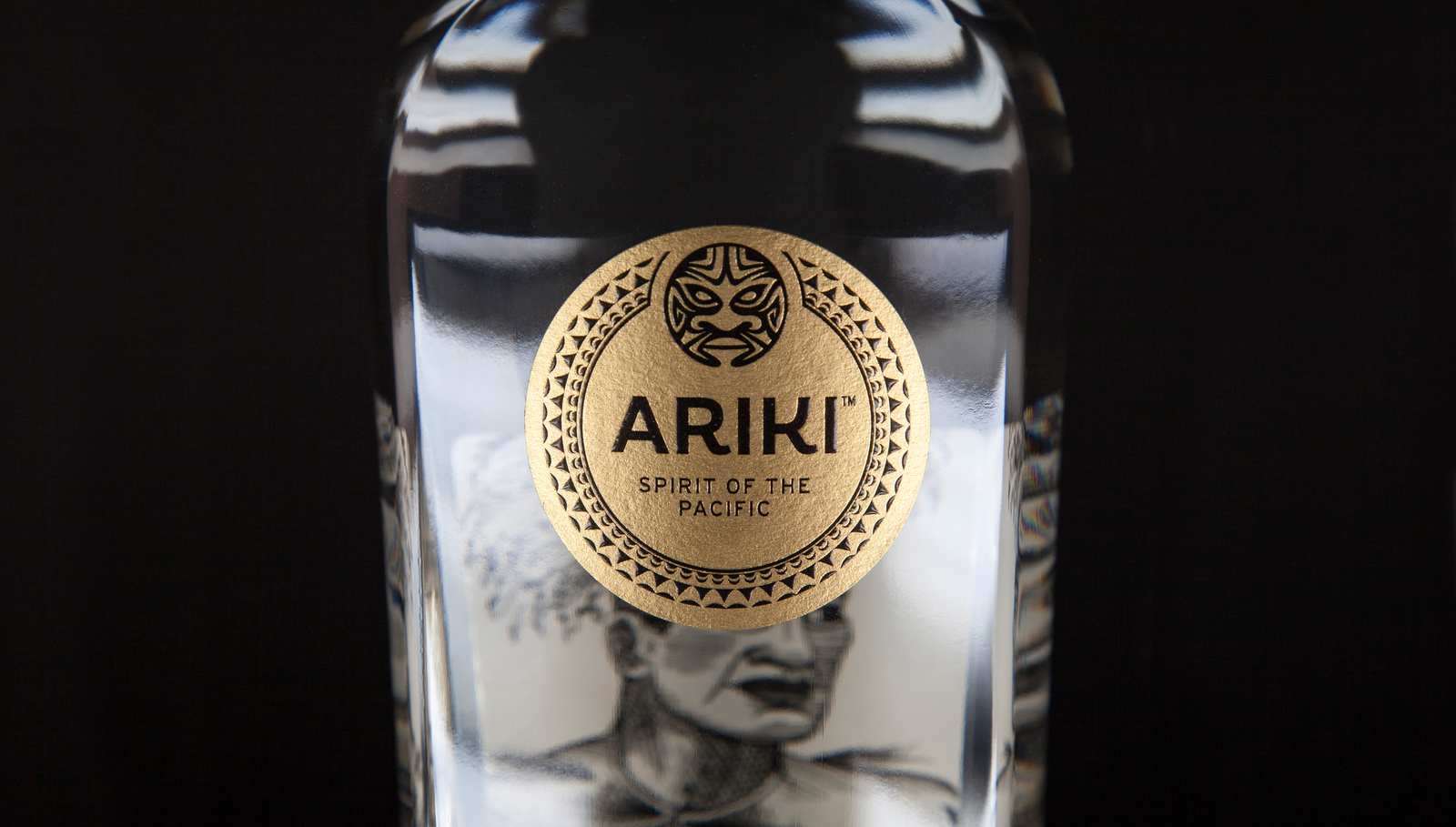
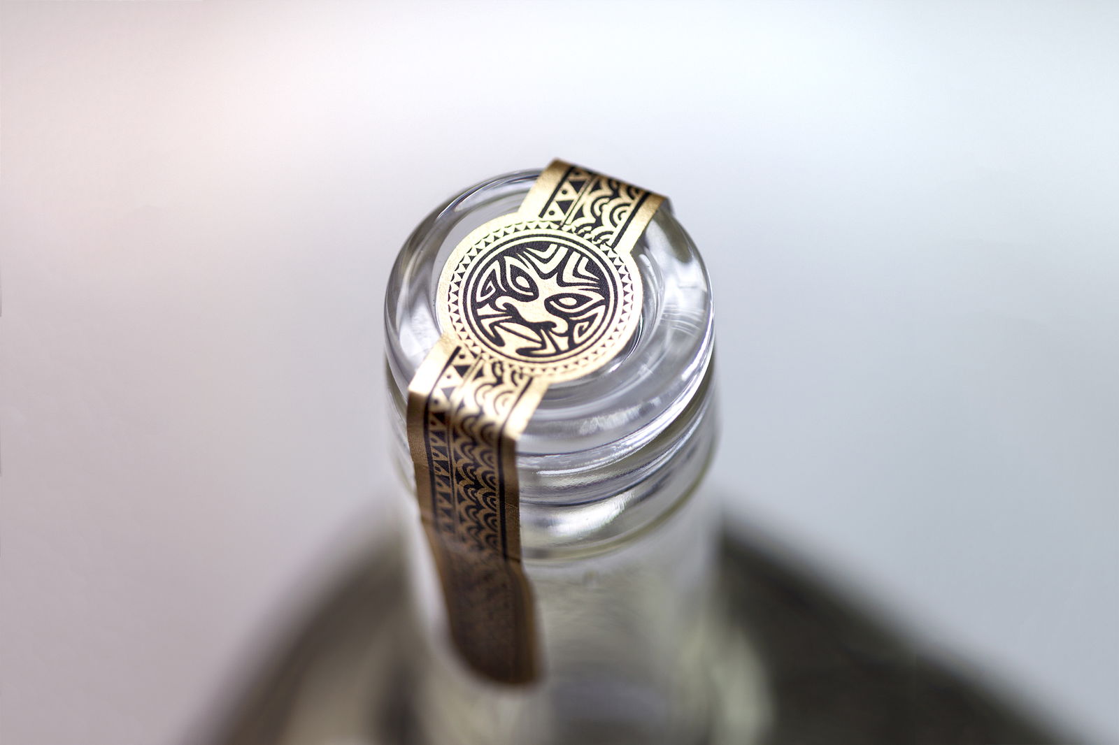
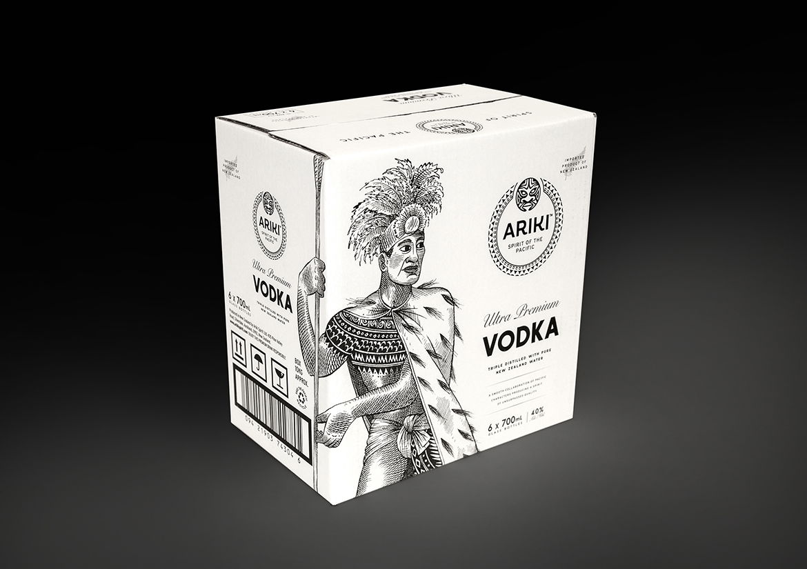
Crafting an ultra-premium spirit deserves packaging that tells a story as rich as the drink itself. Our challenge? To wrap Ariki Vodka and Gin in a design as exceptional as the spirit inside—one that captures the brand’s Pacific heritage, premium positioning, and challenger mindset in a crowded global market.
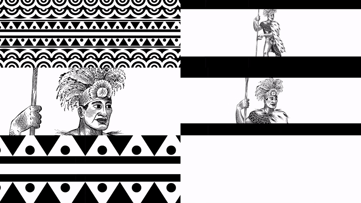
With Ariki meaning “royalty, chieftain, leader,” we knew the brand needed an identity that exuded heritage and prestige. We collaborated with renowned artist Anna Crichton to create a striking illustration of Ariki—an iconic symbol of exploration and legend—making it the centrepiece of our packaging design, brand touchpoints, and point of sale materials.
Branding Design
Packaging Design
Visual Identity
Illustration - (Anna Crichton)
Photography



Related Projects
Contact Redfire
+64 9 3585692
begin@redfiredesign.co.nz
Design Services
Copyright © 2000- 2025 Redfire
All rights reserved.


