
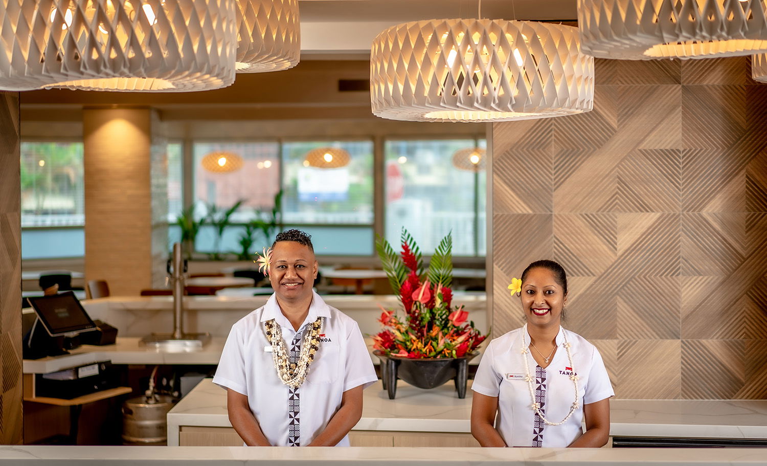
Hotel Rebranding & Marketing in the Pacific Islands
CLIENT: Tanoa Hotel Group
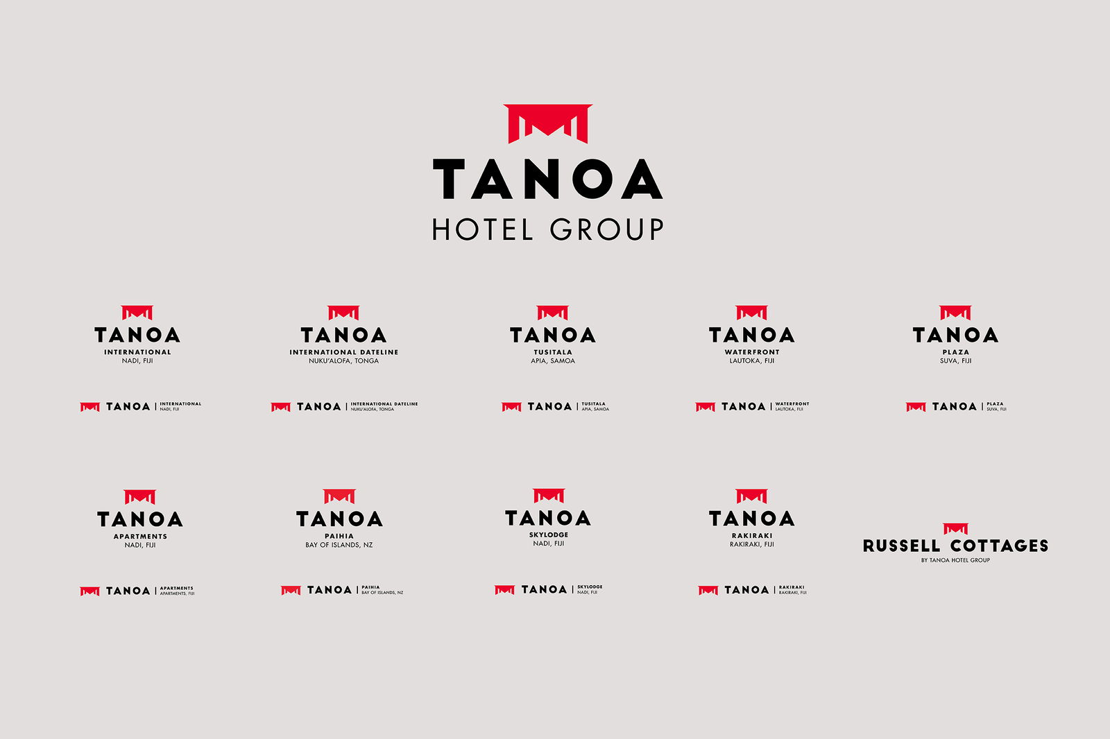
Tanoa Hotel Group is a proud, family-owned business with over 40 years of history and 10 hotels across some of the South Pacific’s most stunning locations: Fiji, Samoa, Tonga, and New Zealand.
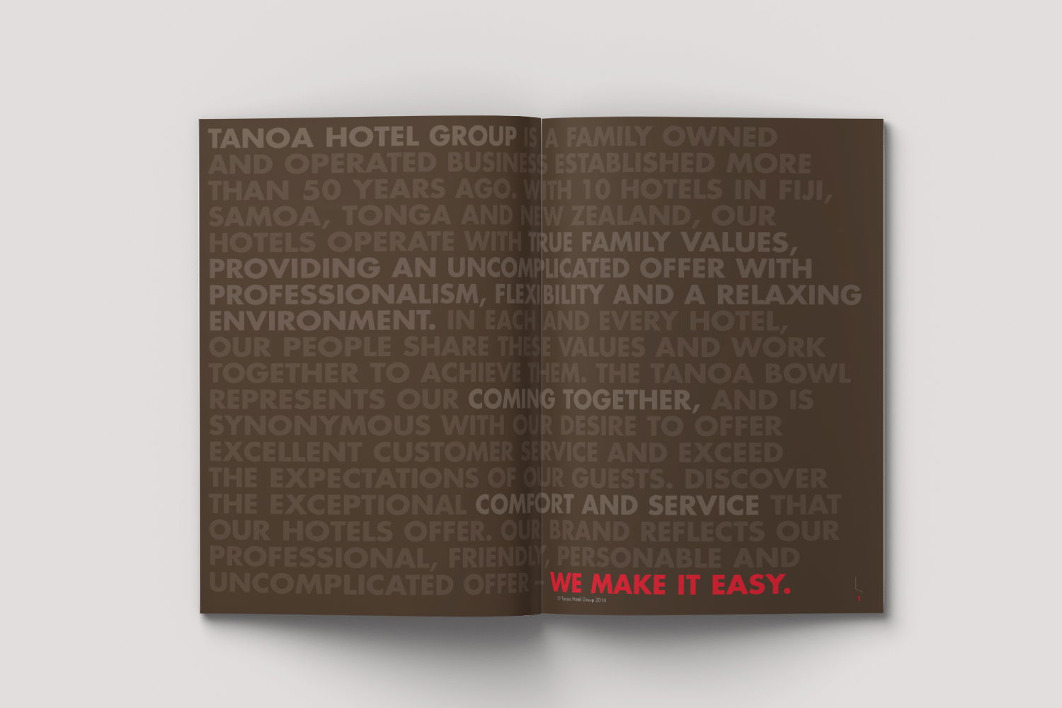
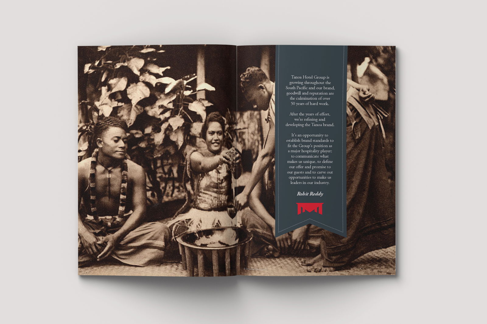
We were engaged to refresh the Tanoa brand — creating a more contemporary tone and visual style while honouring the group's rich cultural heritage. A new brand proposition, "We Make It Easy," was introduced, weaving through all branding and marketing communications.
READ MORE
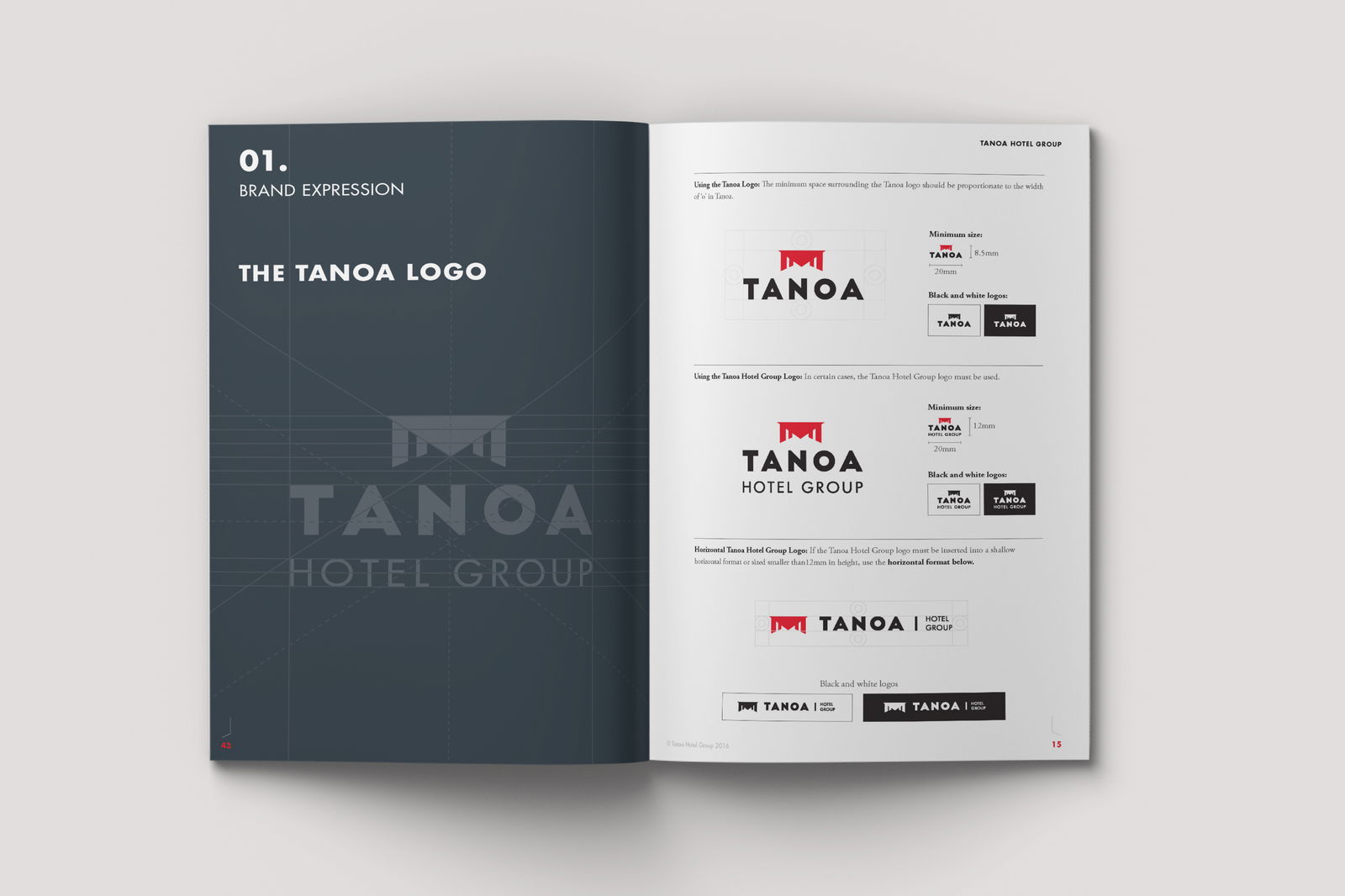
We started by modernising the Tanoa brandmark. A bold, clean font was paired with the iconic Tanoa Bowl — a powerful symbol of the company’s cultural roots. This careful balance allowed us to evolve the brand while staying true to its identity.
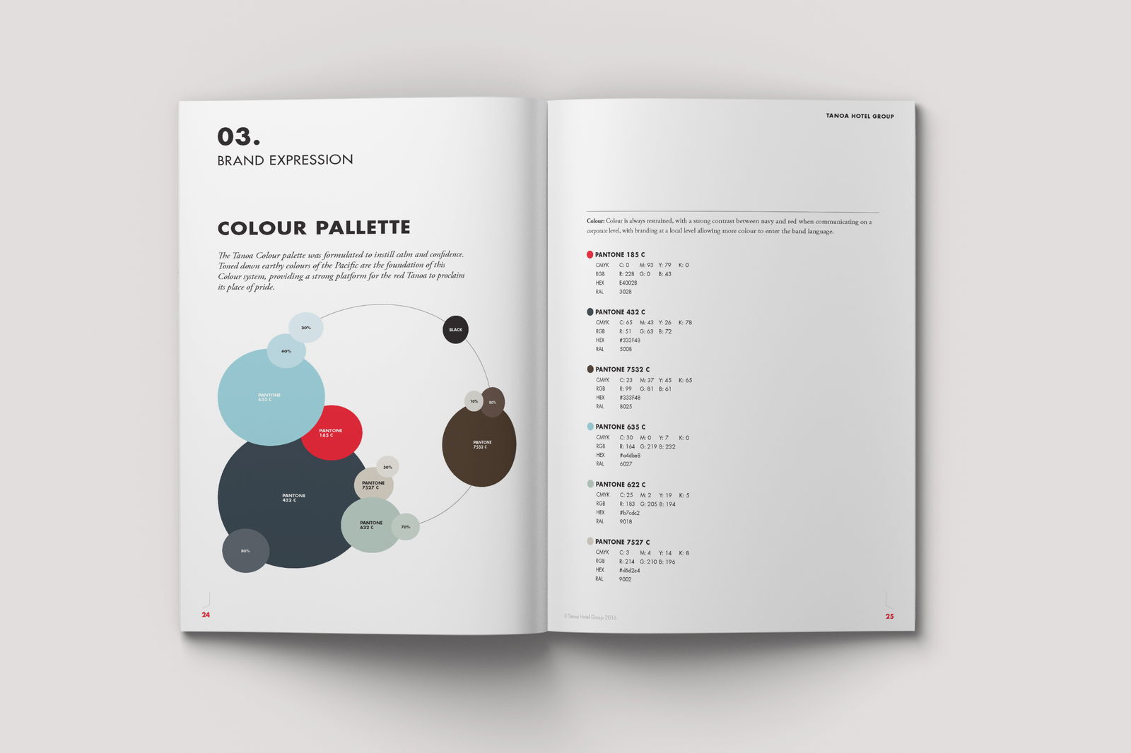
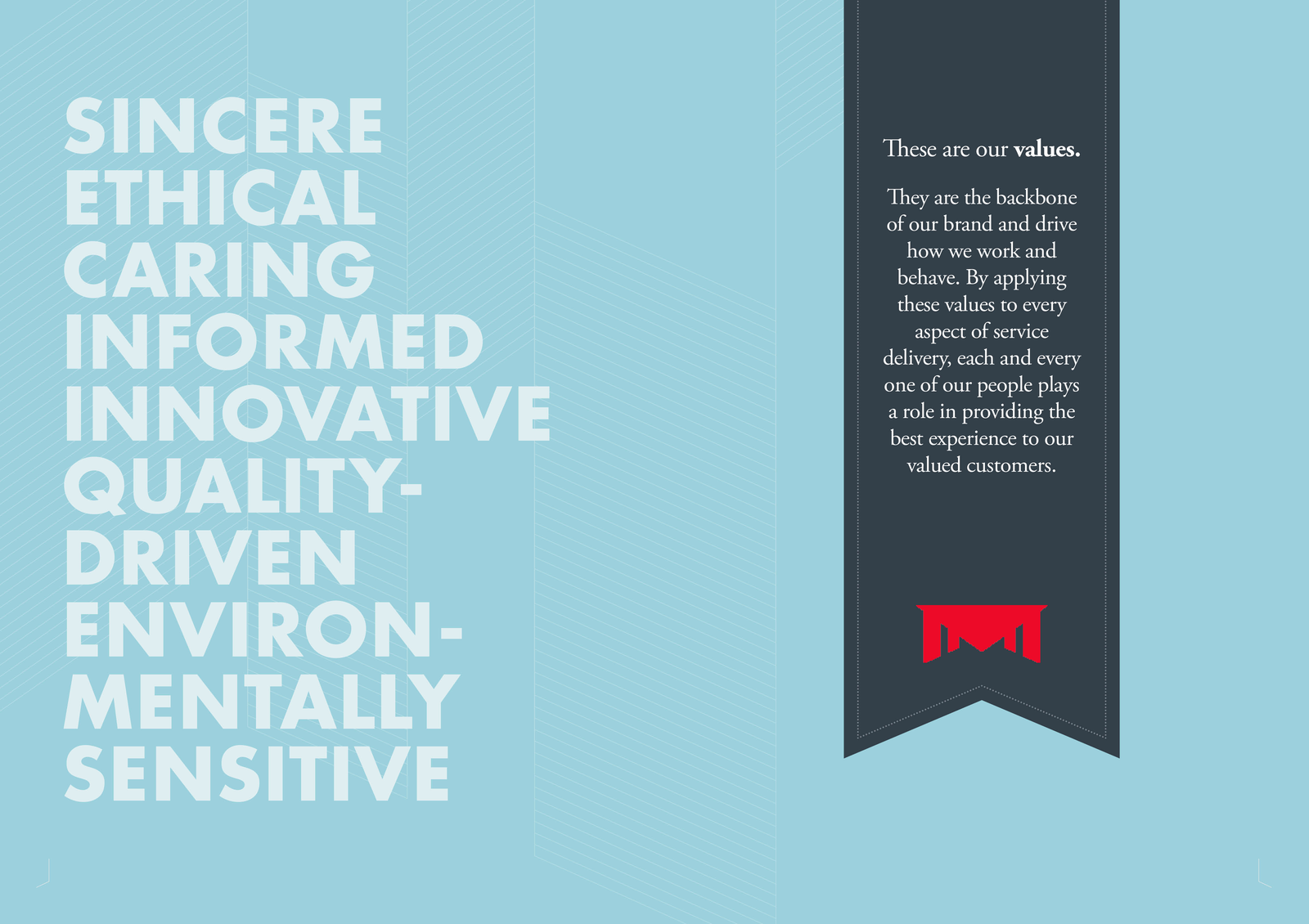
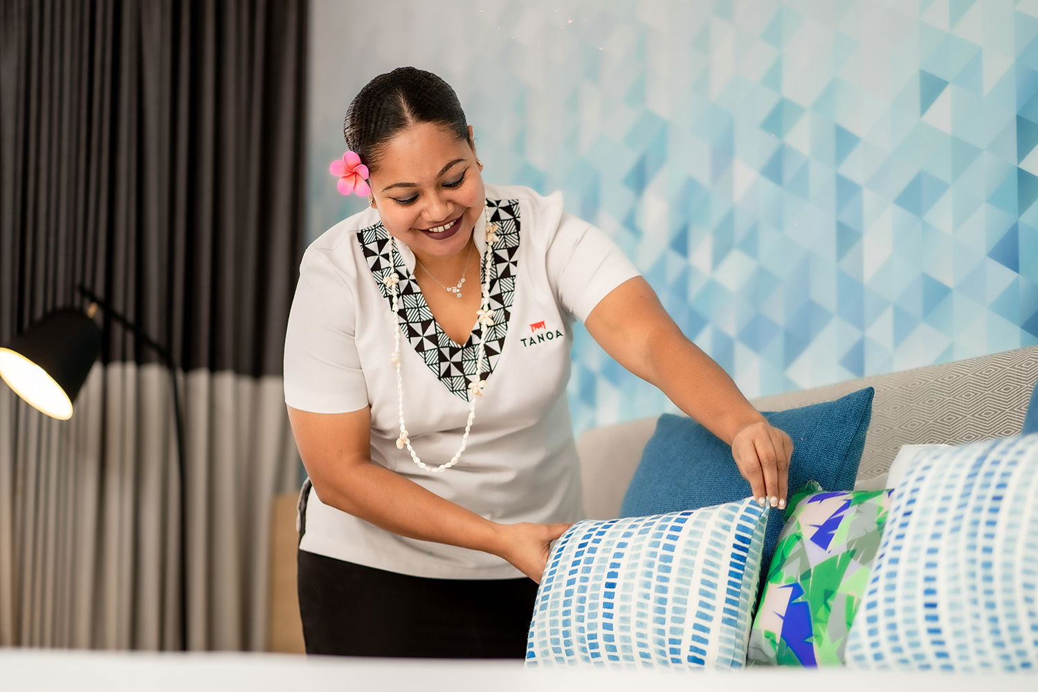
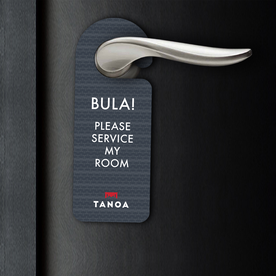
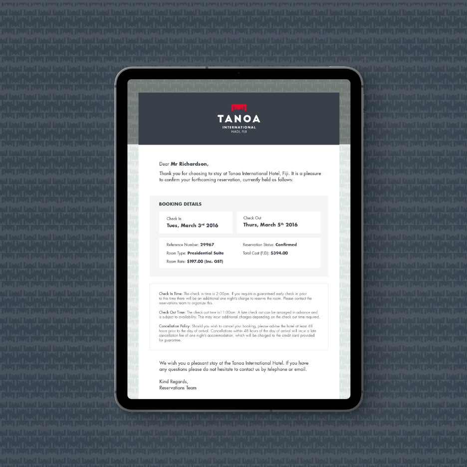
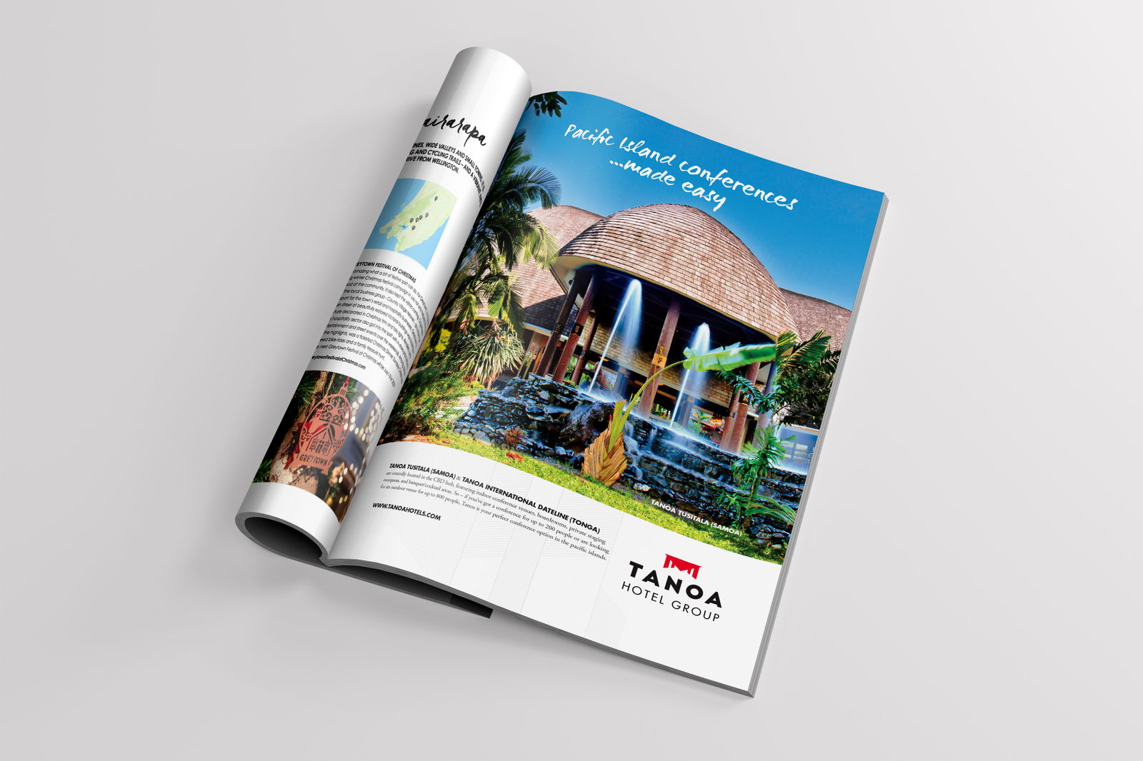
New brand guidelines were developed to ensure a consistent look and feel across the entire group. These included updated typography, fresh patterns, and vibrant imagery. They formed the foundation for a wide range of Tanoa assets, from magazine ads and conference brochures to stationery and restaurant branding, all drawing inspiration from the rich culture and traditions of the Pacific.
WHAT WE DID
Brand Refresh
Logo Design
Visual Communications
Advertising
Marketing Brochures
Environmental Design
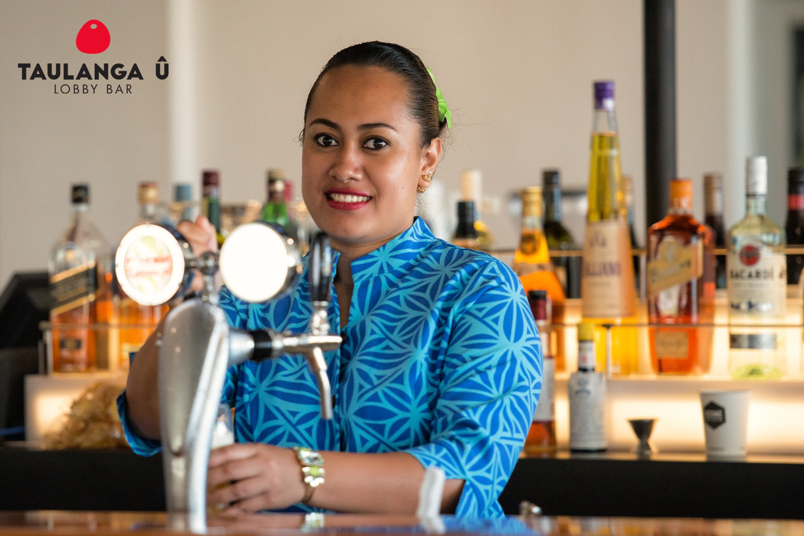
Restaurant Branding
Corporate Stationery
Forms and Templates
Corporate Brand Guidelines
Digital Marketing Templates
Brand Book
Logo Design
Visual Communications
Advertising
Marketing Brochures
Environmental Design
Restaurant Branding
Corporate Stationery
Forms and Templates
Corporate Brand Guidelines
Digital Marketing Templates
Brand Book

Related Projects
Contact Redfire
+64 9 3585692
hello@redfiredesign.co.nz
Design Services
Copyright © 2000- 2025 Redfire
All rights reserved.

