Get inspired: one brand for New Zealand's home inspiration hub.

CLIENT: Home Ideas 

INDUSTRY: Building, renovation and interior design

CATEGORY: Multi-brand showroom and inspiration centre, Hardware, Specfiers, Homes

LOCATIONS: Auckland, Wellington, Christchurch

PRIMARY AUDIENCE: Homeowners planning a build or renovation, architects, designers and builders, and the exhibitor brands on the floor.

MARKET: New Zealand

REDFIRE'S INVOLVEMENT:  Brand strategy, strapline, logo design, visual identity system, brand guidelines, brand language, exterior signage, wayfinding, website, digital marketing, advertising, marketing material, brand animation and print management, rolled out across three centres.

The Home Ideas Centre was New Zealand’s go-to destination for anyone building, renovating, designing or furnishing a home. With centres in Auckland, Wellington and Christchurch, it brought kitchens, bathrooms, cladding, lighting, flooring, hardware and landscaping together under one roof in each city.

That’s a big promise to make to visitors. It’s also a tricky brand to build. Each centre is home to hundreds of exhibitor brands, each with its own logo, colours and sales message. The host brand has to stand out enough to bring people through the door, without competing with the brands inside. And it has to feel like one network across three cities, even when each centre is run locally.

Redfire was brought in to give the Home Ideas Centre a brand that could do all of that. Strategy. Strapline. Logo. Identity. Brand language. Then the rollout across Auckland, Wellington and Christchurch, from street-front signage to the website and advertising.

The idea at the centre of it all was simple. Get Inspired.

PROJECT AT A GLANCE
The challenge
Give a national network of multi-brand showrooms one distinctive identity: one that draws visitors in, helps them find their way, lets exhibitor brands shine and holds together across
three cities.
 
The insight
People don’t visit a home showroom to buy a product. They come for ideas. The centre’s real offer was inspiration, and the brand needed to promise it from the first glance.
 
The strategy
Make inspiration the brand. Build a bold, simple identity around one idea, Get Inspired, with a system clean enough to frame the exhibitors’ brands and clear enough for every centre to
apply consistently.
 
What Redfire did
Brand strategy and strapline: Get Inspired
Logo design and visual identity system
Brand language and tone of voice
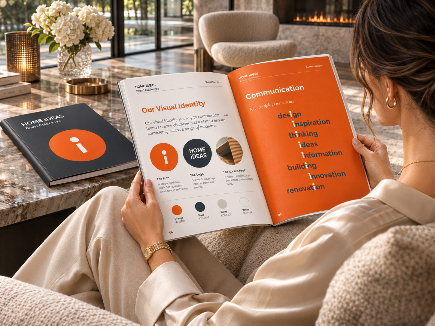
The orange dot brand device
Brand guidelines for a multi-centre network
Exterior signage and wayfinding across three centres
Website and digital marketing
Advertising and marketing material
Brand narrative and logo animation
Print management
 
The outcome
One confident identity, rolled out across Auckland, Wellington and Christchurch, giving the network a clear voice from the street front to the screen.
THE CHALLENGE
Many brands, three cities, one destination

A showroom like the Home Ideas Centre lives or dies on footfall. Visitors arrive with half-formed plans: a kitchen they’ve pinned online, a bathroom they want to fix, a build that’s still a sketch.
Inside, they meet dozens of brands at once. Each exhibitor has its own identity and wants the visitor’s attention. Without a strong host brand, a centre risks feeling like a collection of stands, not a destination worth the trip.
 
Then there’s scale. The network spanned three cities, and its centres weren’t all run by the same people. A brand that only worked when the Auckland team applied it wouldn’t hold up in Wellington or Christchurch.
 
The brand had to do four jobs: give people a reason to visit, help them find their way inside, sit comfortably alongside the exhibitors’ brands, and look and feel like one network wherever you walked in.
THE INSIGHT
Inspiration is the product

Nobody needs a showroom to buy a tap. They can do that online.
 
What they can’t get online is the moment of seeing it, touching it and picturing it in their own home. The centre’s real value was inspiration: the spark that turns a vague plan into a confident decision.
 
That gave the brand its promise and its strapline, and it worked the same in every city.
Get Inspired.
THE BRAND IDENTITY
Bold type, colour and the orange dot
 
We designed a new logo and identity built on bold typography, strong colour, striking imagery and clever brand language.
 
At its heart sits an orange dot taken from the brand mark. It became the system’s signature device: a full stop, a focus point and a spark, used across marketing and communications to draw the eye and tie everything together. It also shaped the wider design direction, keeping the brand clean and confident, with plenty of room for the exhibitors’ products and brands to take
centre stage.
 
Brand animations, including a digital brand narrative and a logo animation in different colours, brought the identity to life online and in digital advertising.
THE ROLLOUT
Three centres, one experience

A showroom brand is experienced in physical space first.
 
We rolled the identity out across Auckland, Wellington and Christchurch. Exterior signage made each centre announce itself from the street. Wayfinding inside helped visitors move easily between categories and exhibitors without losing their bearings, whichever centre they were in.
 
The same identity carried through the website, digital marketing, advertising and marketing material. Brand guidelines gave each centre a clear playbook to apply locally, and our print management made sure what was designed was what went up on the walls, in every city.
 
THE RESULT
A national network with one voice

The Home Ideas Centre gained a brand as clear and confident as the ideas it housed. One promise, Get Inspired, ran through every touchpoint in three cities, from the signage on the street to the ads on screen.
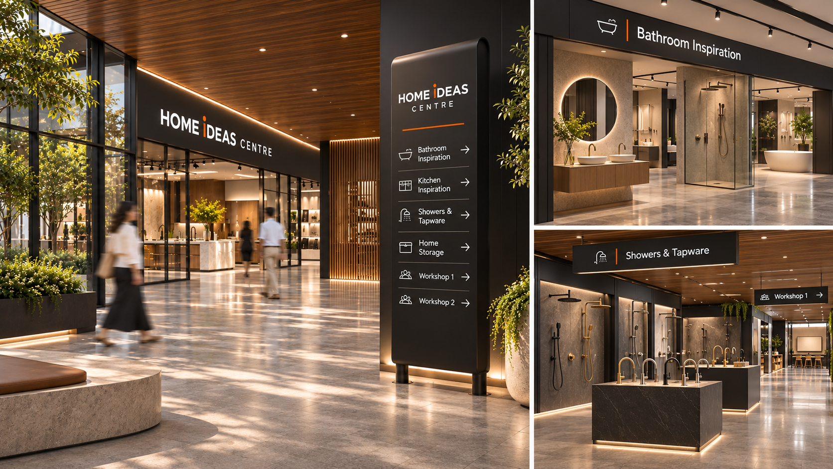
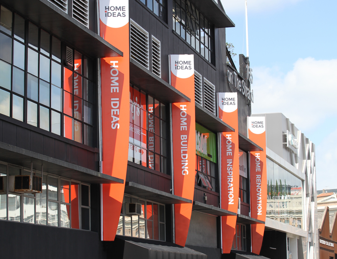
The identity gave the network a personality of its own while leaving room for the brands inside to sell. And it gave three locally run centres a shared system to stand behind. That balance, between host and tenants and between one brand and many sites, is the hardest part of branding any multi-tenant destination. It’s exactly what the system was designed to deliver.

For us, that’s what good brand strategy should do. Find the real reason people come, and build a brand that makes them want to come back, wherever they walk in.

Modern Home Ideas Centre Showroom
redfire-design-Home-Ideas-Brand-image-8
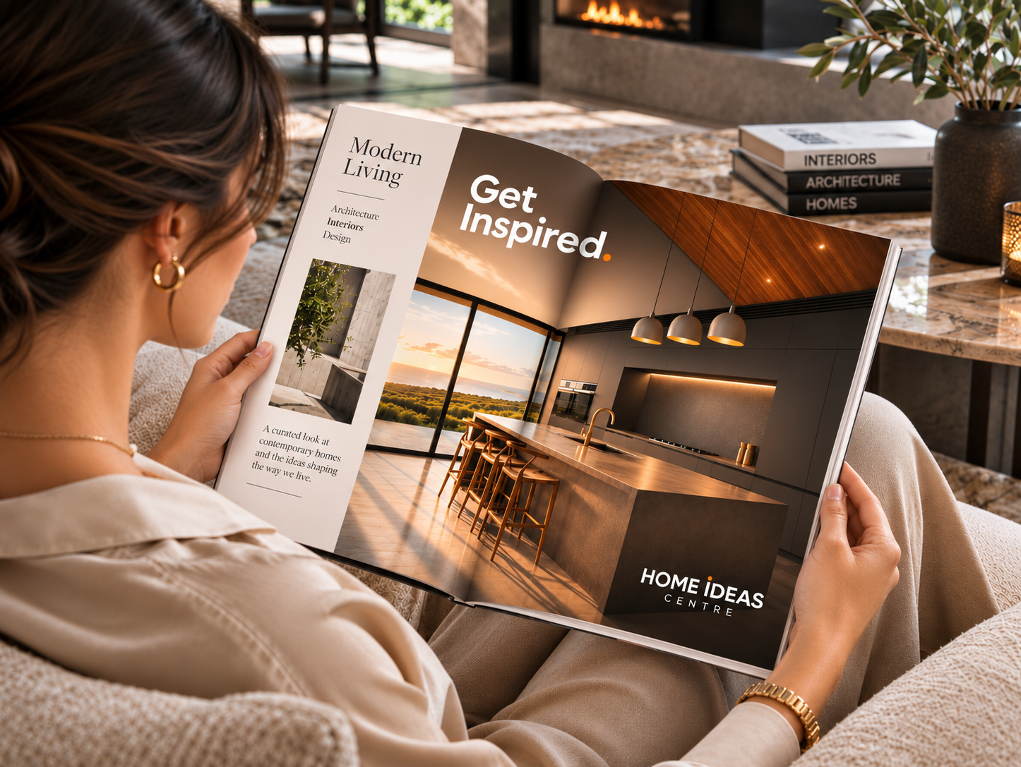
Cozy Modern Living Magazine Moment
Home Ideas Brand Guidelines png
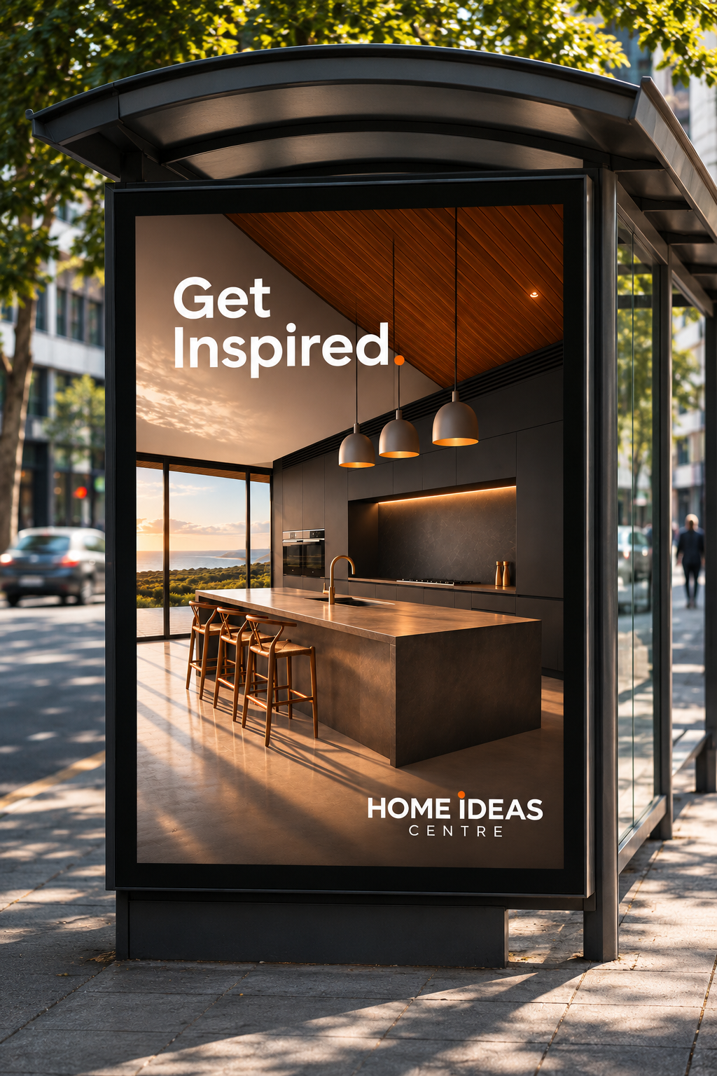
Get Inspired_ Modern Kitchen Living
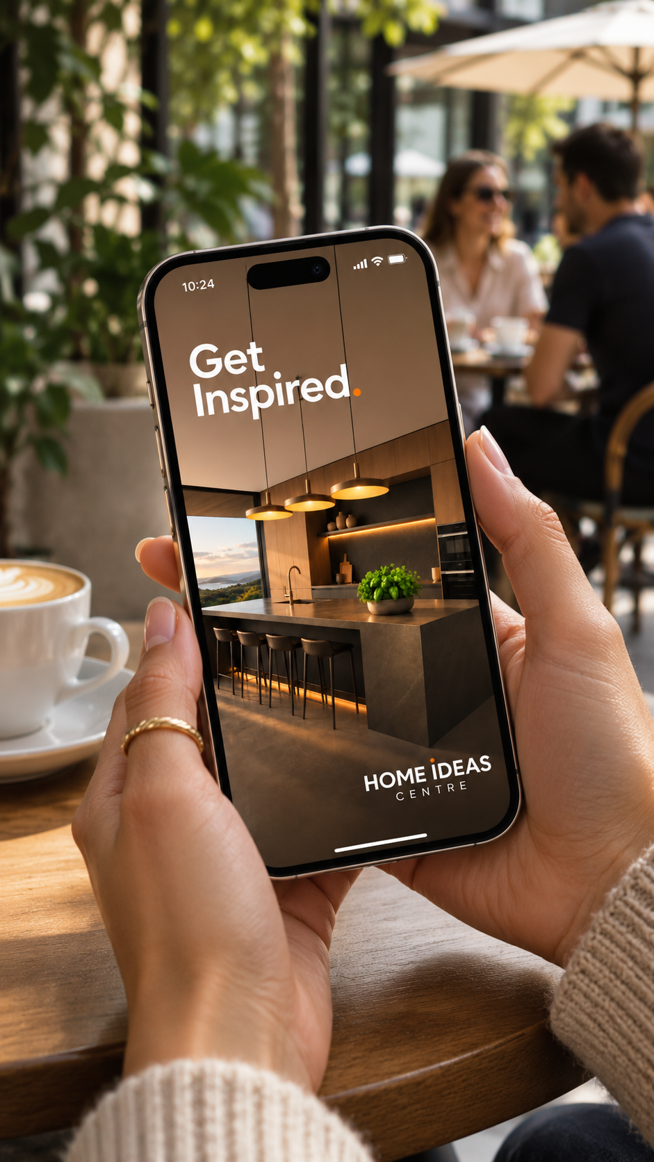
Modern Kitchen Inspiration at the Café

Related Projects

REDFIRE_jason_brandmarketing_photography_branding_packaging_digital_graphicdesign_advertising_brochure_designagency
REDFIRE_pal_photography_branding_packaging_digital_graphicdesign_advertising_web_designagency
redfire-black-robin-branding-01
c.h.-robinson-thumbnail
Contact Redfire
Design Services
Redfire_26 years of creativity

Copyright © 2000- 2026 Redfire

All rights reserved.

Back to top Arrow