

Building Strong Brands for Hardware that Perform & Sell
CLIENT: PAL - Paint Aids Limited
Strategic branding that speaks to tradies, retailers, and DIYers alike.
PAL is New Zealand's leading brand of painting and decorating tools and accessories.
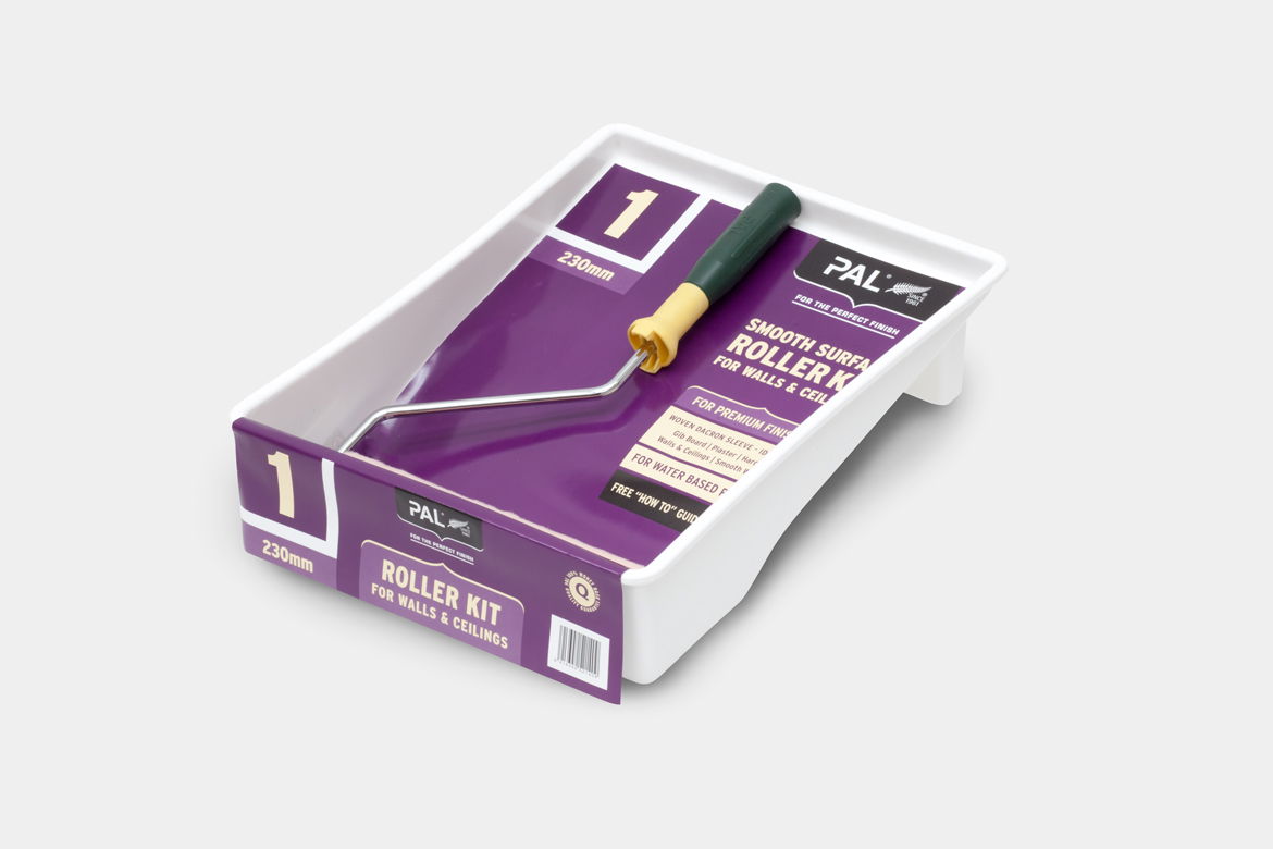
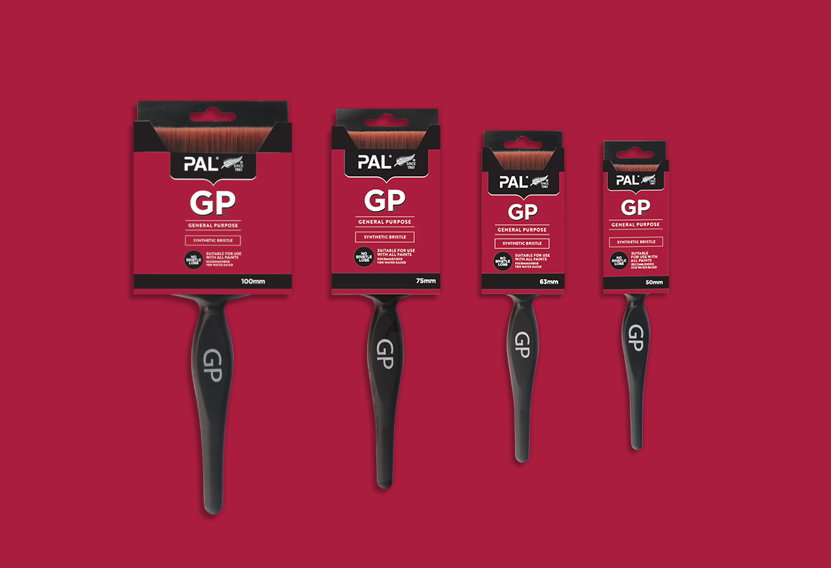
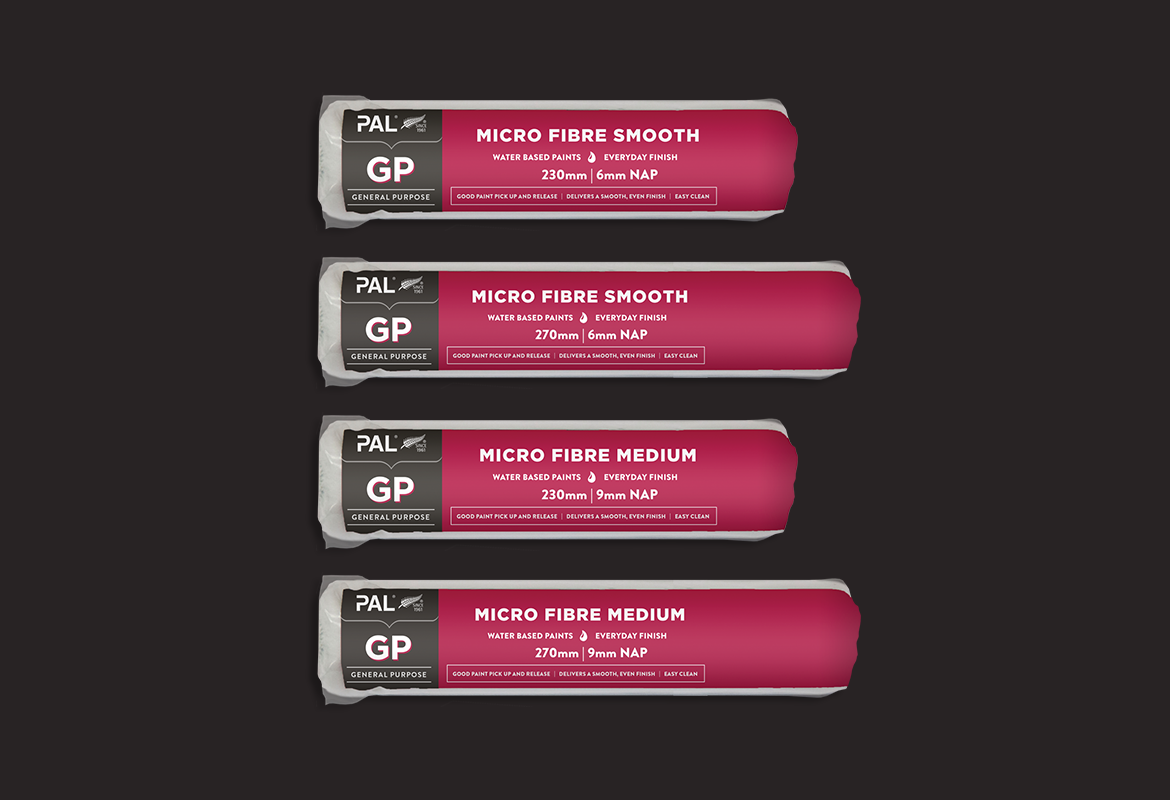
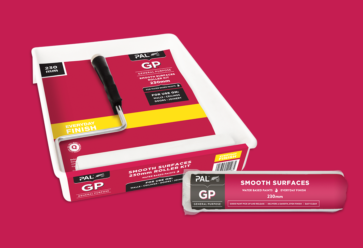
Redfire refreshed PAL's visual identity by simplifying the brand mark and visual expression, bringing through its iconic Kiwi heritage.
READ MORE
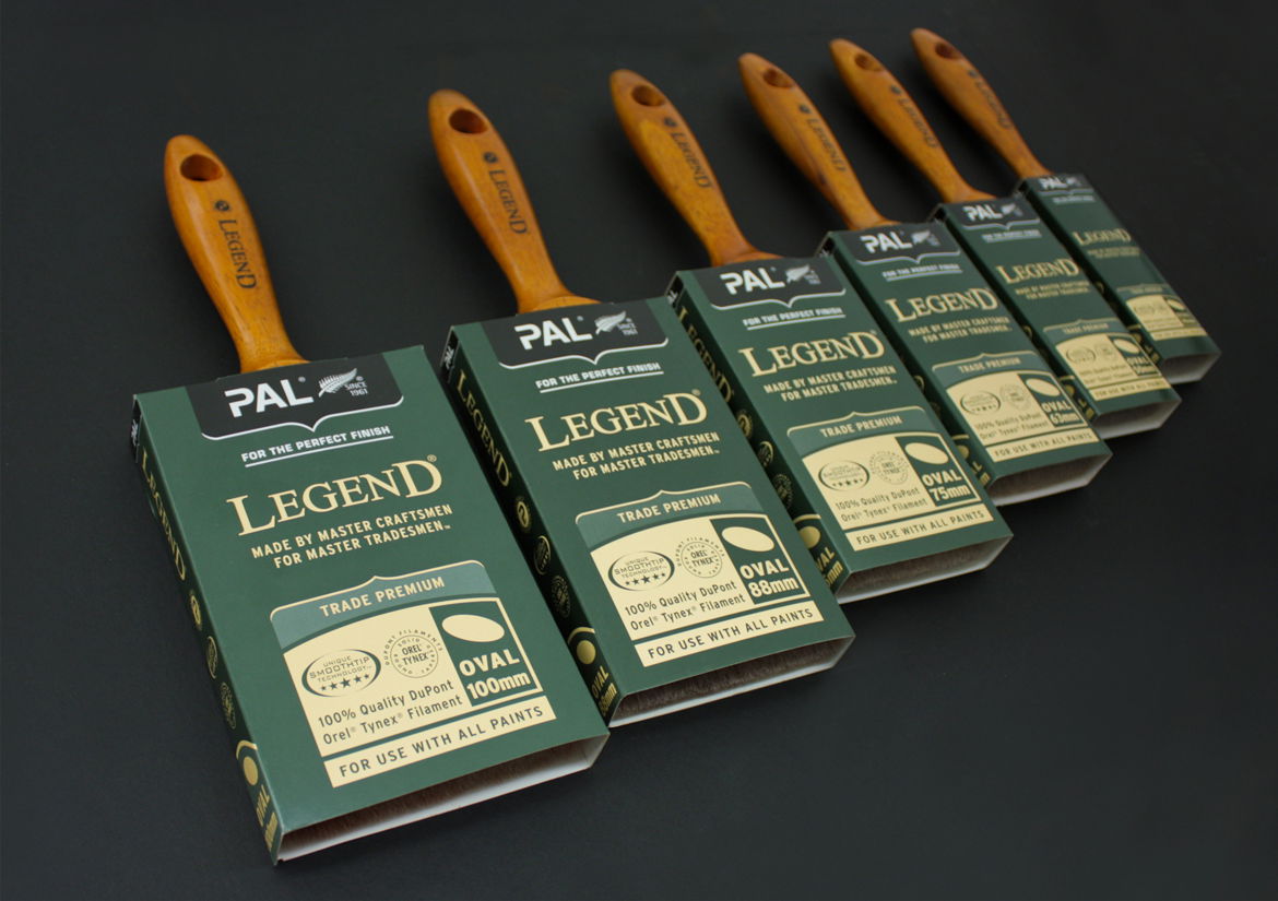
Part of the brand strategy and process uncovered a new positioning strapline - For The Perfect Finish as well as its distinctive brush fern mark now prevalent on all packaging.
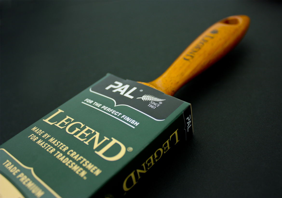
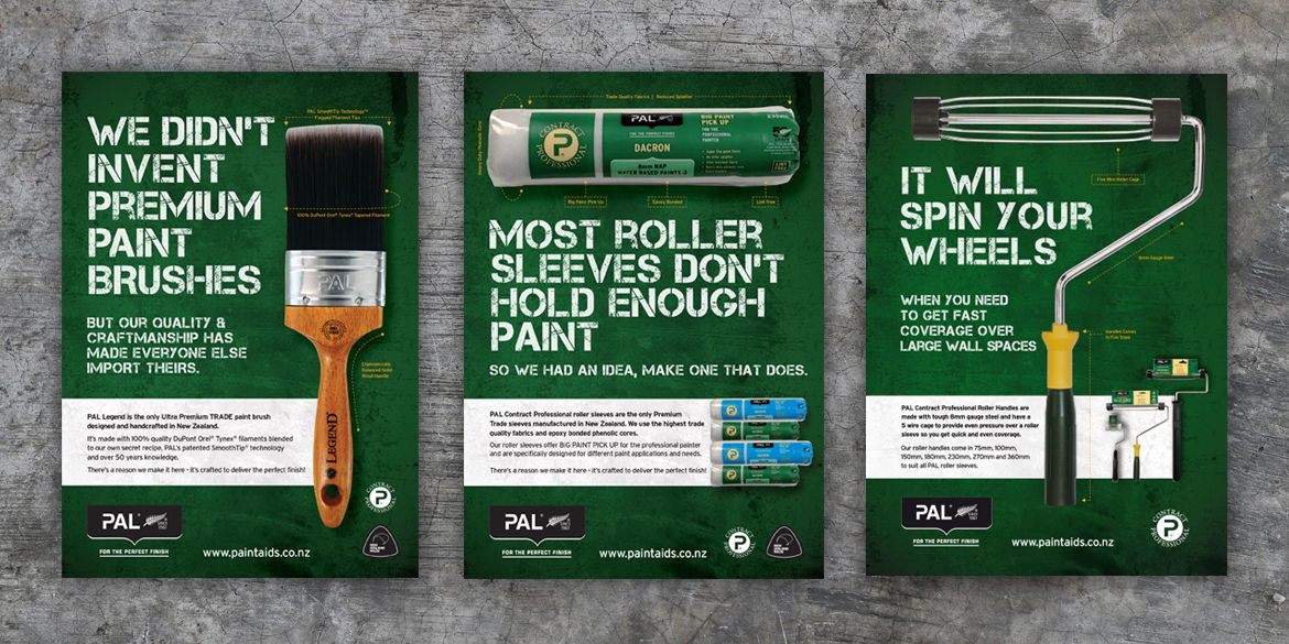
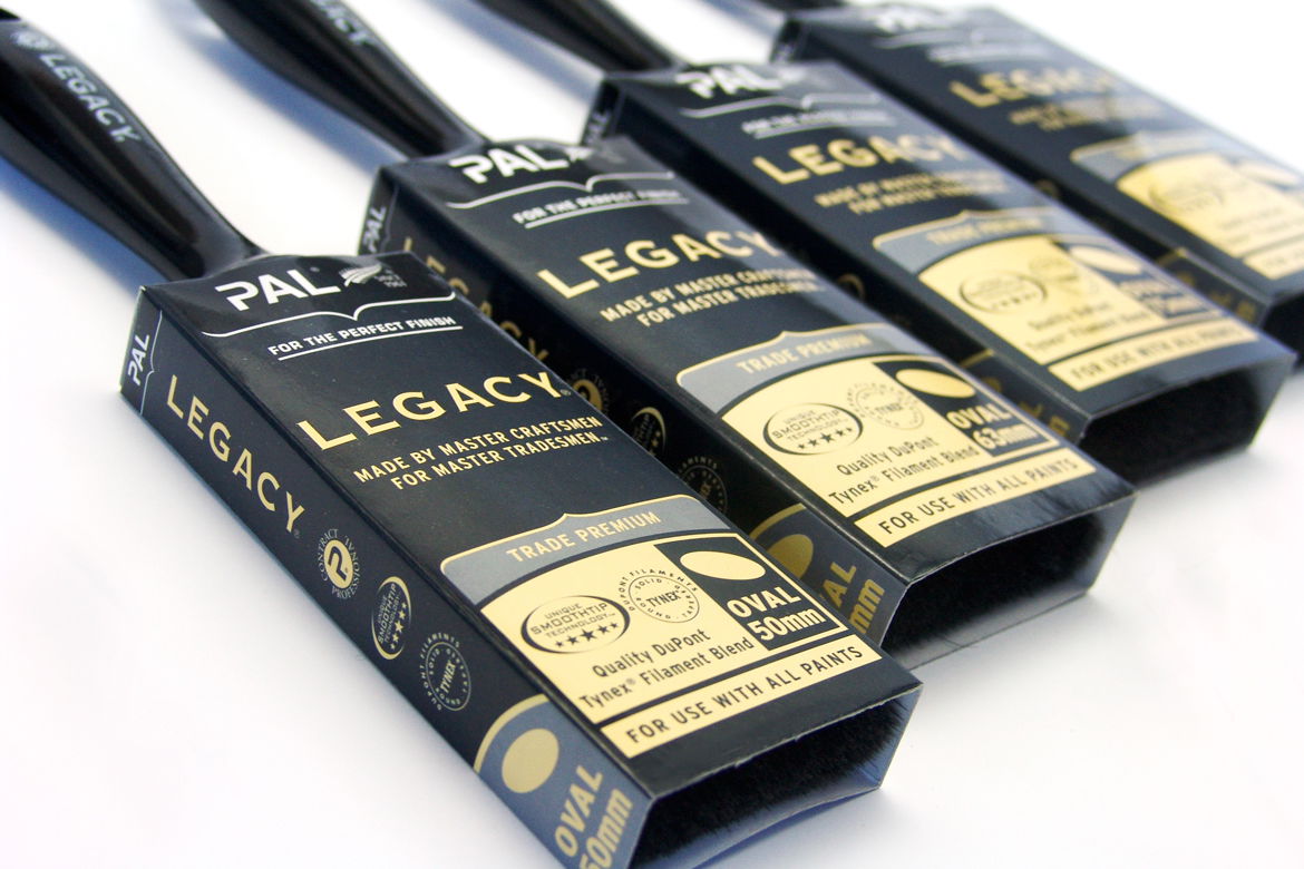
The new packaging design system and graphic elements along with iconography, are adaptable and responsive across both trade and DIY products, offering great flexibility in range extensions and new applications.
The PAL visual identity celebrates its remarkable heritage and builds on its market leadership of over 50 years.
WHAT WE DID
Brand Strategy
Product Naming
Packaging Design
Point Of Sale
Advertising
Marketing Communications
Brand Identity & Logo Design
Brand Architecture
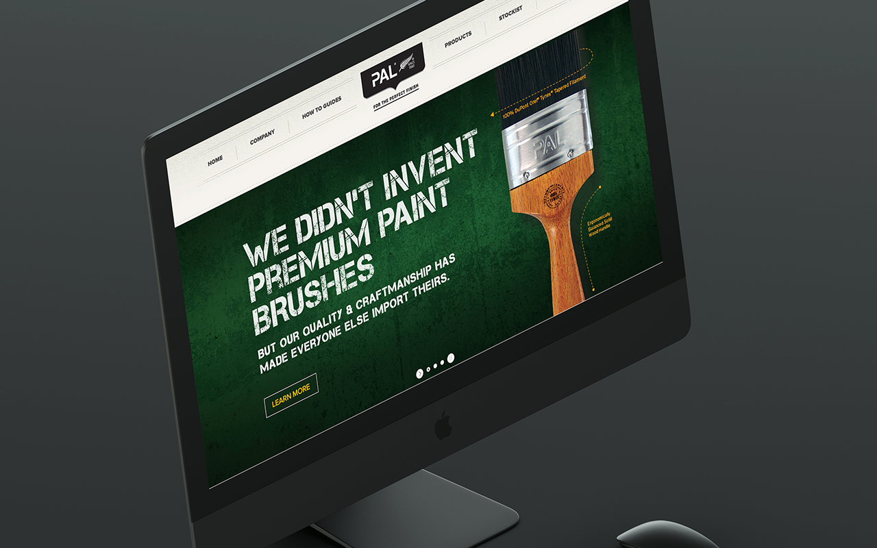
Website Design
Digital Marketing – IOS App
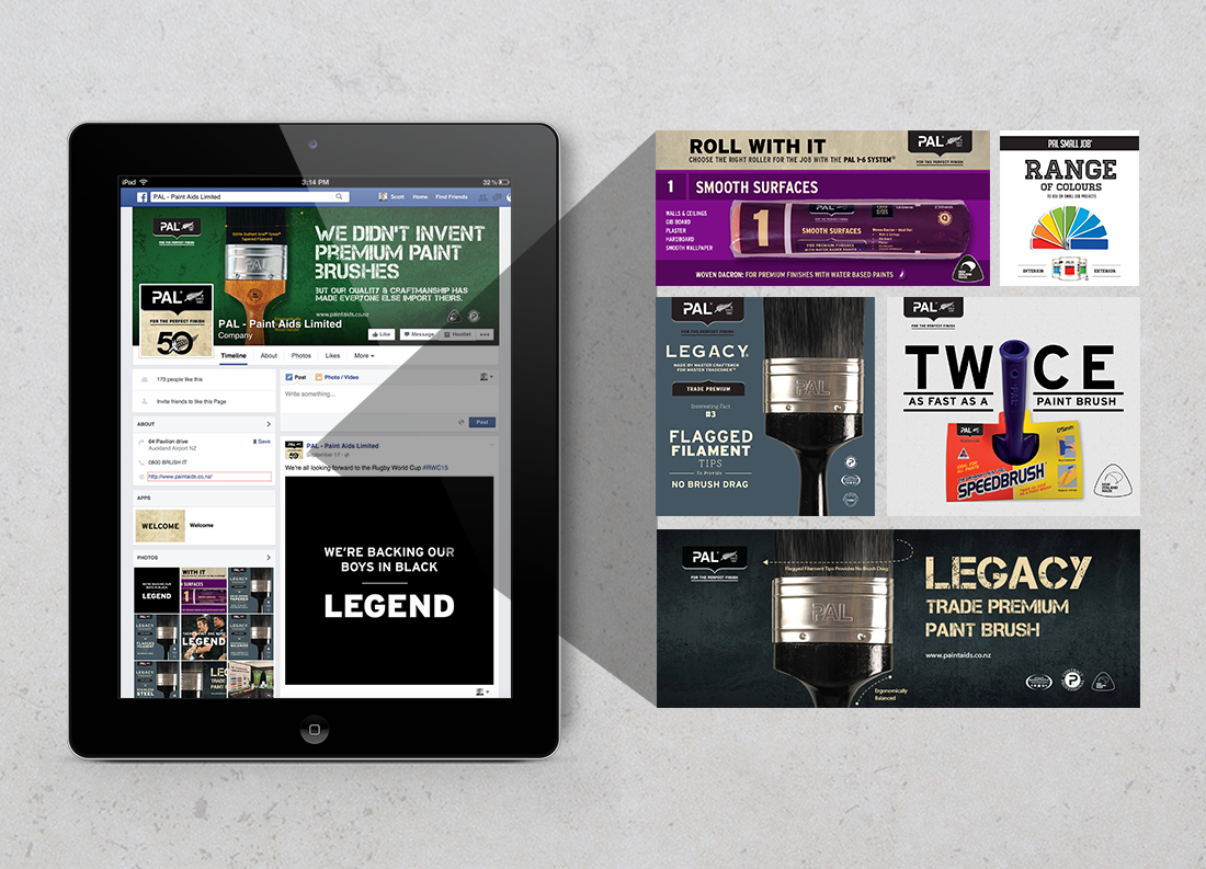
Social Media
E-Newsletters
Channel Marketing
Trade Displays
Market Research
Marketing Strategy
Outdoor Media
Print Management
Product Naming
Packaging Design
Point Of Sale
Advertising
Marketing Communications
Brand Identity & Logo Design
Brand Architecture
Website Design
Digital Marketing – IOS App
Social Media
E-Newsletters
Channel Marketing
Trade Displays
Market Research
Marketing Strategy
Outdoor Media
Print Management
Related Projects
Contact Redfire
+64 9 3585692
hello@redfiredesign.co.nz
Design Services
Copyright © 2000- 2025 Redfire
All rights reserved.


