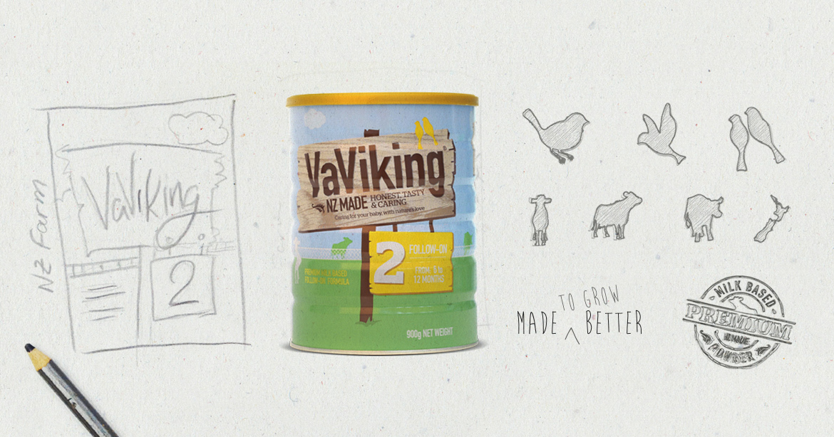
The friendly and family-oriented packaging we developed for VaViking articulates the company’s brand philosophy of quality, love and trust. These sketches show the beginning phase of the packaging illustration and design.
January 24, 2016 — Comments are off for this post.
VaViking packaging illustrations
January 21, 2016 — Comments are off for this post.
Transacting around the world
Savar has become a global brand with agencies in some of the world’s biggest and wealthiest markets. Their increased penetration into these markets meant their online presence had to be upgraded and streamlined. Their new site was built on the Magento platform to integrate with their CRM systems, which creates a scalable platform that can handle future growth into other global markets, as well as future branding updates.
January 19, 2016 — Comments are off for this post.
TOSQ Winery
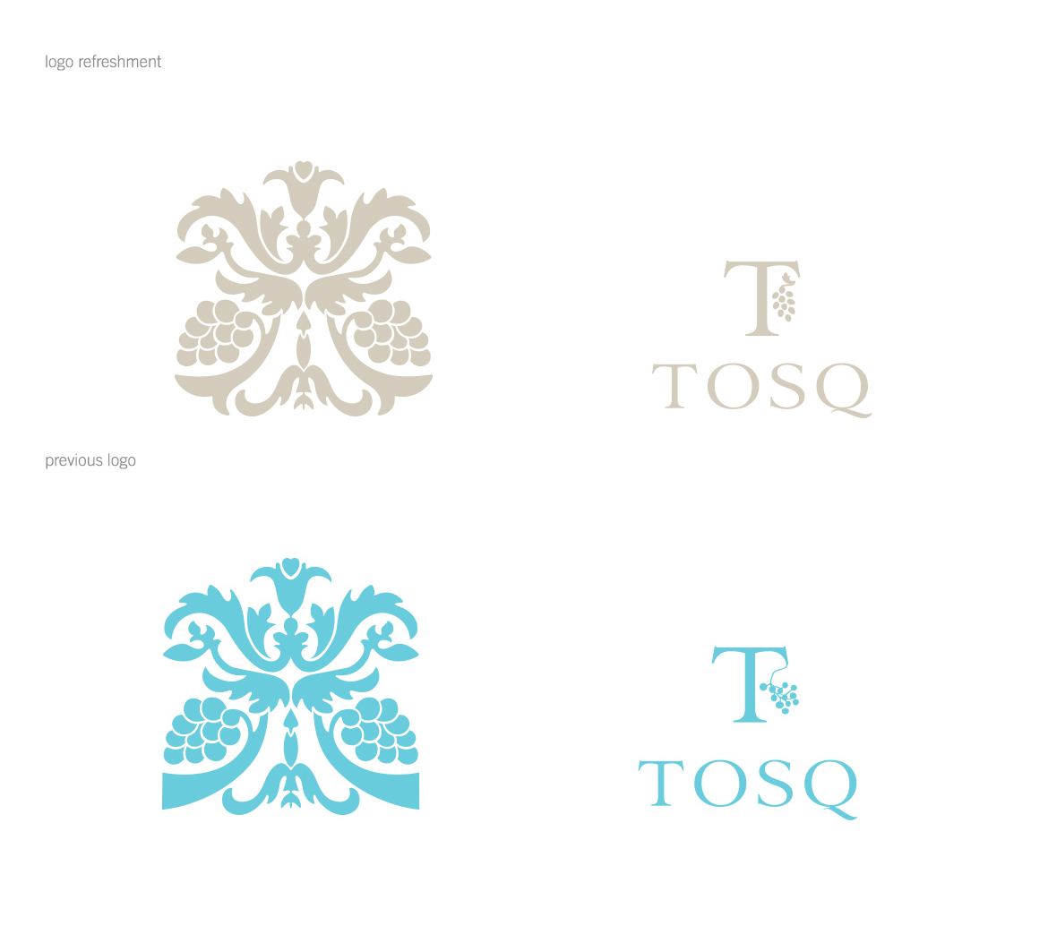
We made subtle changes to the shape and grouping of their logo to make it more polished and classic while keeping the brand’s vision for the future in mind. This logo and design aesthetic was deployed to updated bottle labels and boxes.
January 17, 2016 — Comments are off for this post.
Communi-tea for Puraty
Building a social tribe is important to any online business model. We created engaging and interesting content to keep our audience interested and engaged. The launch strategy for Puraty Organic teas used social media as the main channel to communicate with customers, using promoted posts and Facebook contests to increase reach and build an database for enewsletters. Samples were sent Facebook contest winners, and many posted positive feedback, fuelling conversations about the brand. We used the hashtag #puratylife in the campaign to aggregate customers’ experiences with the teas as well as the lifestyle choices that make them Puraty brand ambassadors.
December 22, 2015 — Comments are off for this post.
Biorem
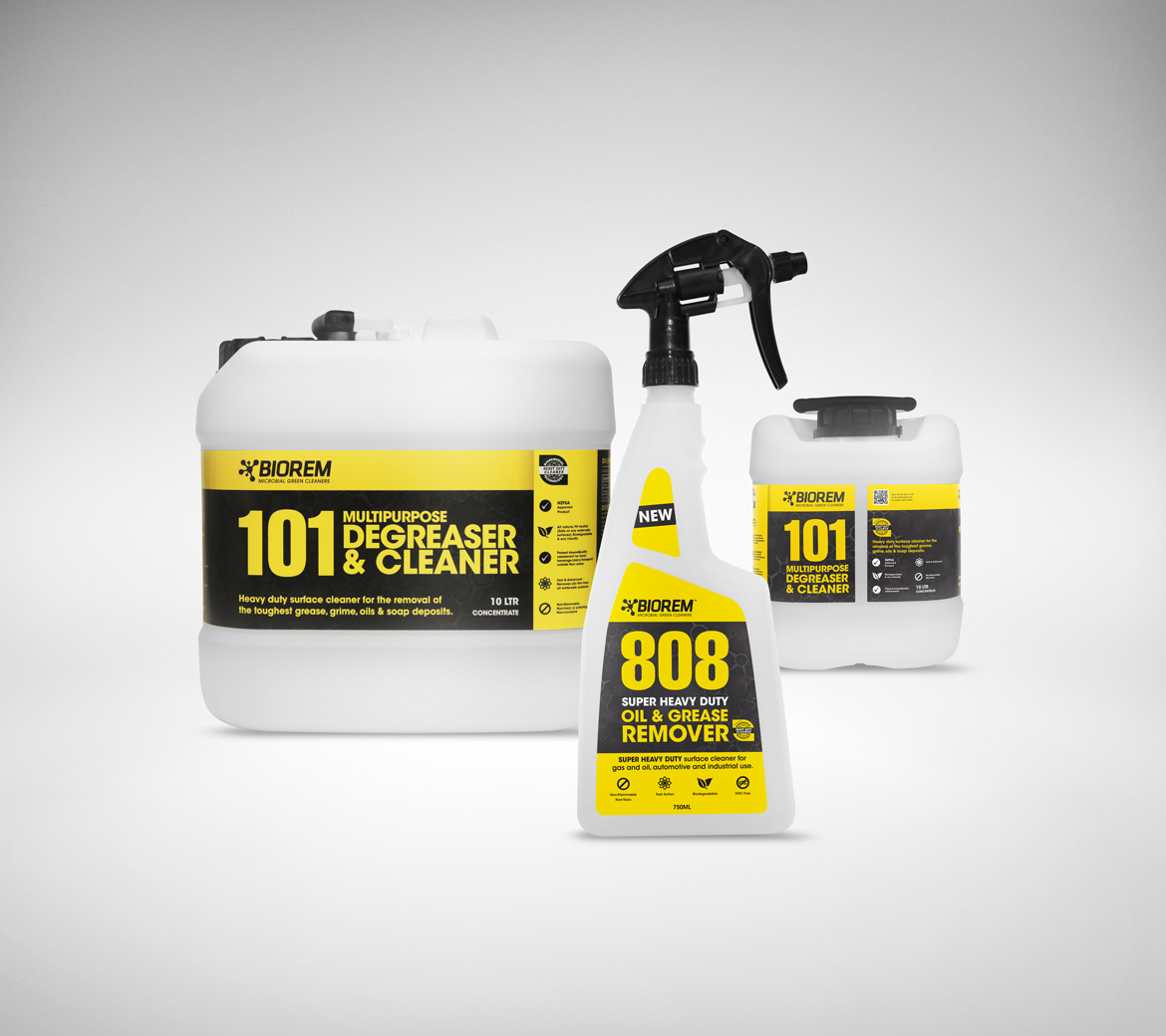
Biorem is an Australasian brand of green and bio-remediating industrial cleaning solutions. Many “green” products are perceived to sacrifice effectiveness to meet “green” standards. To confront this, the pivot of our branding strategy was to position the brand to look modern and industrial using colour and type, incorporating subtle “green” symbolism. We created marketing collateral, tradeshow displays to brochures to reinforce this brand message.
December 20, 2015 — Comments are off for this post.
London calling: Carnaby & Cross
Carnaby & Cross, a premium skincare company in the UK, wanted us to develop a brand for them to capture the chic essence of London. We found inspiration for the naming and brand story in Carnaby Street and the St. George’s Cross from the Union Jack. By superimposing geometric elements and fashion photography, we forged a brand for independent women who celebrate a free spirit and a love of design. The C&C logo is clean and sophisticated and tessellates as a pattern that we applied to products, advertising and collateral.
December 7, 2015 — Comments are off for this post.
A strong web presence is key in today’s digital world.
In order to play with the big dogs and grow your business a strong digital strategy is essential. To show case Context Architects professional services we designed and developed a responsive website. Implemented effective eBooks, created responsive eNews letters and run a thriving AdWords campaign. These actions continue to help drive traffic, gain subscribers, share news and communicate with audiences throughout New Zealand.
December 6, 2015 — Comments are off for this post.
Social Media to Increase Sales
Social media is a great way to increase sales. Our social media crew creates custom content for all social platforms. Facebook is a great way to drive traffic to your website. These Facebook apps were created for Savar Skincare to convert their social tribe to buyers. Each app promotes product favourites and highlights the calls to action leading them to their eCommerce site. View Savars Facebook
December 2, 2015 — Comments are off for this post.
Avoca Rebrand – Heaven on Earth
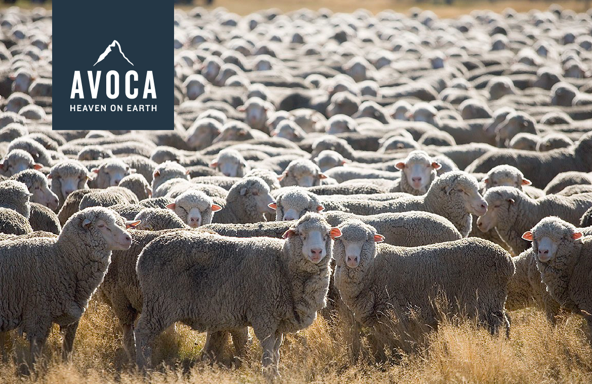
Bahhhha! New Zealand really is heaven on earth. This 100% Authentic New Zealand made brand came to us to consolidate a number of house brands. Our brand strategy included a cohesive brand identity, logo design, packaging design, marketing collateral, in-store point of sale, photography and website.
November 30, 2015 — Comments are off for this post.
Hand Crafted Design
For us good design is in the details. These hand crafted icons and logos for Bundy Juice's packaging give the brand a friendly and inviting tone. These hand drawn details give the packaging an organic and fresh vibe creating irresistible packing that stands out on the shelves. View Bundy Juice Packaging
We are a creative agency for challenger brands, specialising in strategy and design across all platforms.


