Luxury Branding & Packaging Design for Health & Beauty Brands
CLIENT: Savar Skincare Co.
From Strategy to Shelf – Luxury Branding for Health & Beauty
Savar, a recent grand finalist in the 2017 New Zealand Exporter of the Year awards has become a truly international brand. Their prominence as a premium natural skincare company has continued to grow with innovative products including a new Femwash designed to address specific hygiene needs.
We wanted to elevate a female wash from a basic pharma product to a high-end lifestyle.
READ MORE
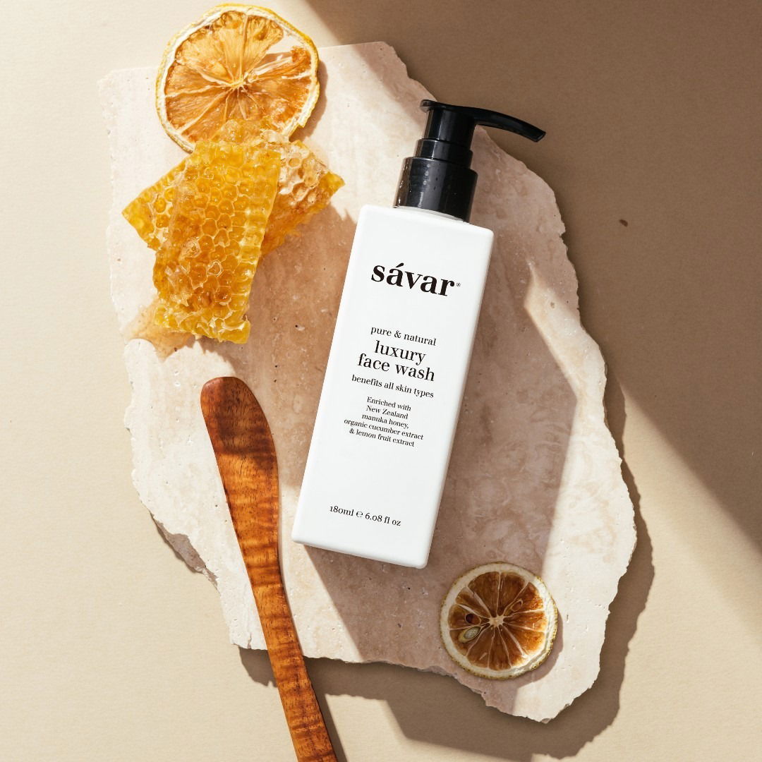
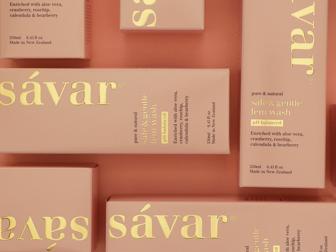
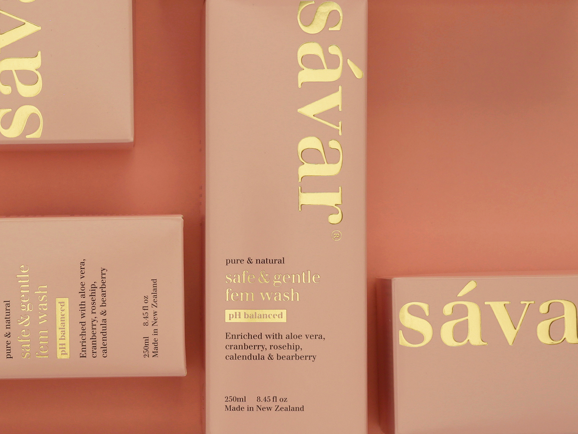
Strategically we had to ensure the new packaging would work and co-exist alongside the entire Savar product portfolio. A new colour system was introduced for differentiation and to create a standout on store shelves, providing increased visibility and reflecting Savar’s premium proposition.
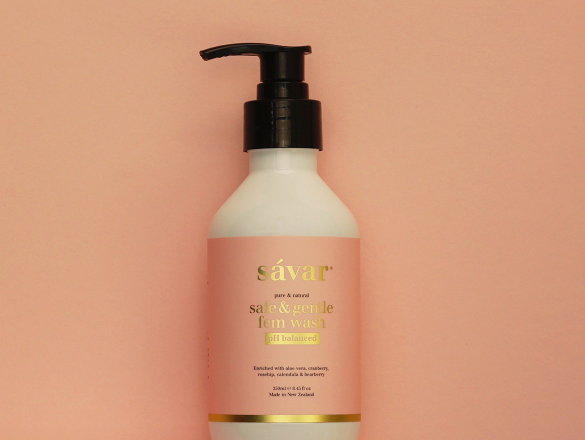
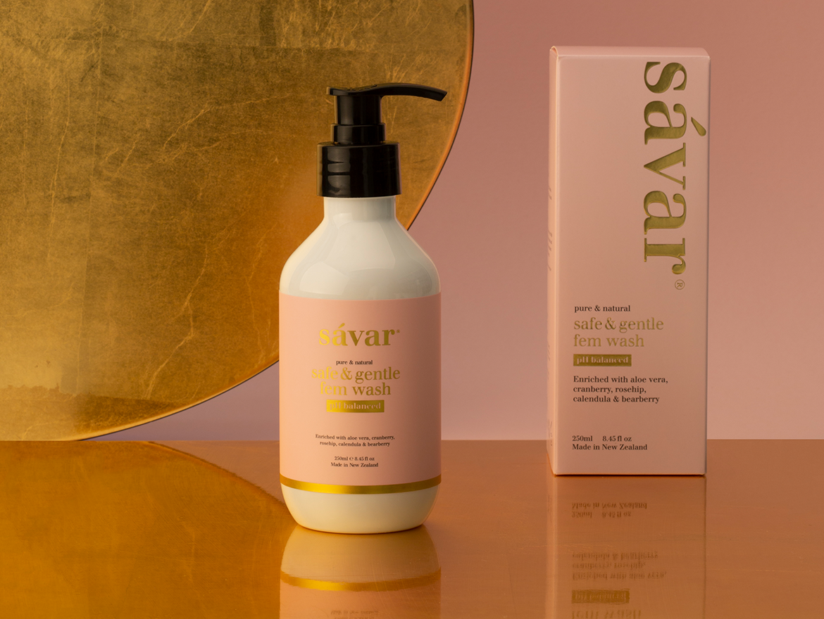
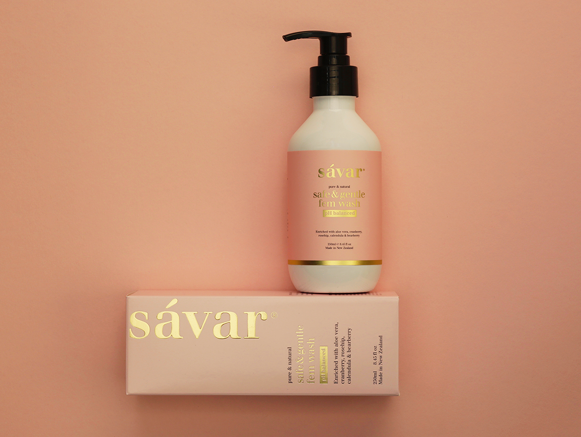
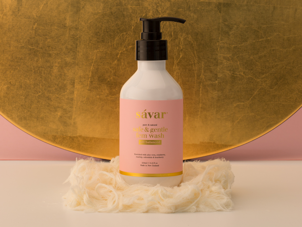
The new-look packaging maintains the Savar system giving a cohesive look and feel. The forms remain consistent with the Savar brand, however, the colours change for this line. Embellishments lift the packaging and make it beautiful with the soft blush colour and gold foiling.
The packaging captures the balance between design and aesthetics, providing a feminine hygiene product in a very elegant and design-driven manner.
These products are designed to be left out on the counter and not hidden away in a drawer - important for a premium skincare brand.
WHAT WE DID
Brand Strategy
Naming
Visual Identity
Packaging Design
Branding
Point Of Sale
Marketing Communications
Print Management
Naming
Visual Identity
Packaging Design
Branding
Point Of Sale
Marketing Communications
Print Management
Related Projects
Contact Redfire
+64 9 3585692
hello@redfiredesign.co.nz
Design Services
Copyright © 2000- 2025 Redfire
All rights reserved.
