

Clarifying brand purpose through rebranding & packaging design
CLIENT: Home Essentials
Clarifying your purpose, refining your message, and realigning your brand for growth.
You know that feeling when you walk into a store, glance at the shelves, and nothing stands out? That was Home Essentials—functional, but forgettable. We were brought in to change that.
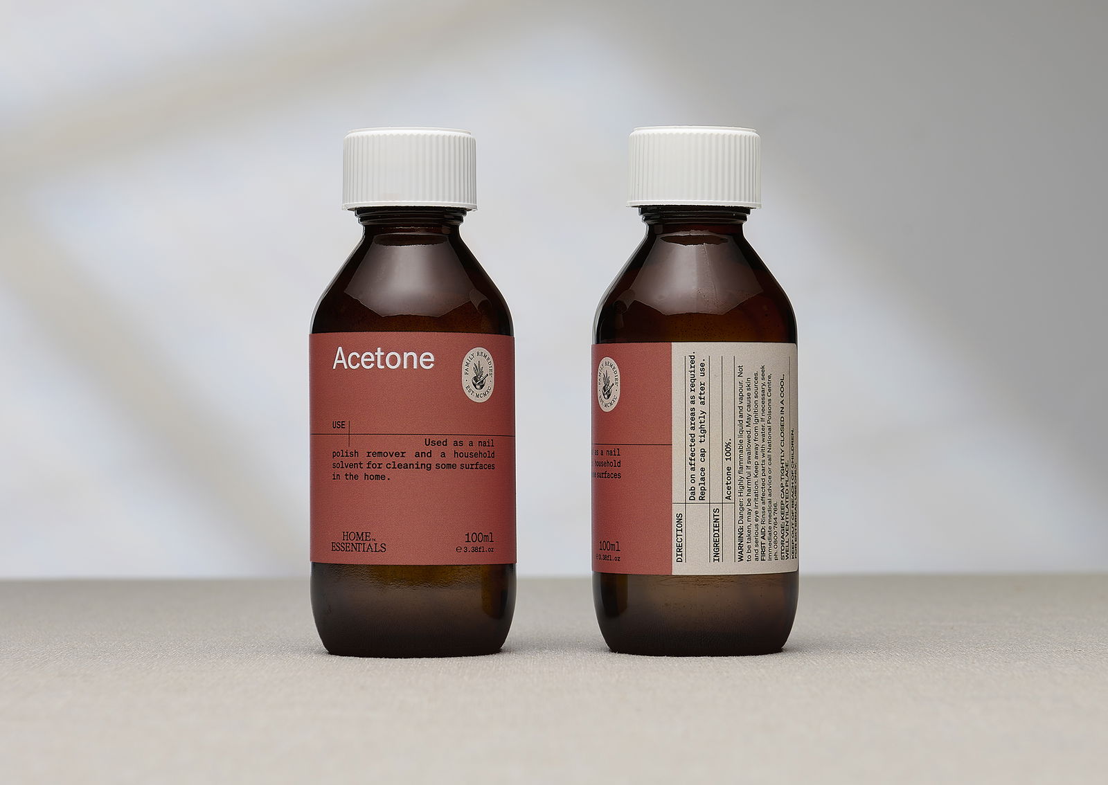
Through a complete brand transformation—covering strategy, visual identity, packaging design, tone of voice, and digital—we reimagined Home Essentials to be more than just another household name. We created a brand that not only looks beautiful on shelf but also connects with purpose and clarity.


Brand Story & Positioning: Purpose that connects
At the heart of this rebrand was a redefined brand story—a new narrative rooted in everyday simplicity, self-reliance, and modern practicality. We positioned Home Essentials as a brand that honours natural traditions while embracing contemporary life. It’s no longer just about what’s in the jar—it’s about how the brand makes people feel: equipped, confident, and at home.
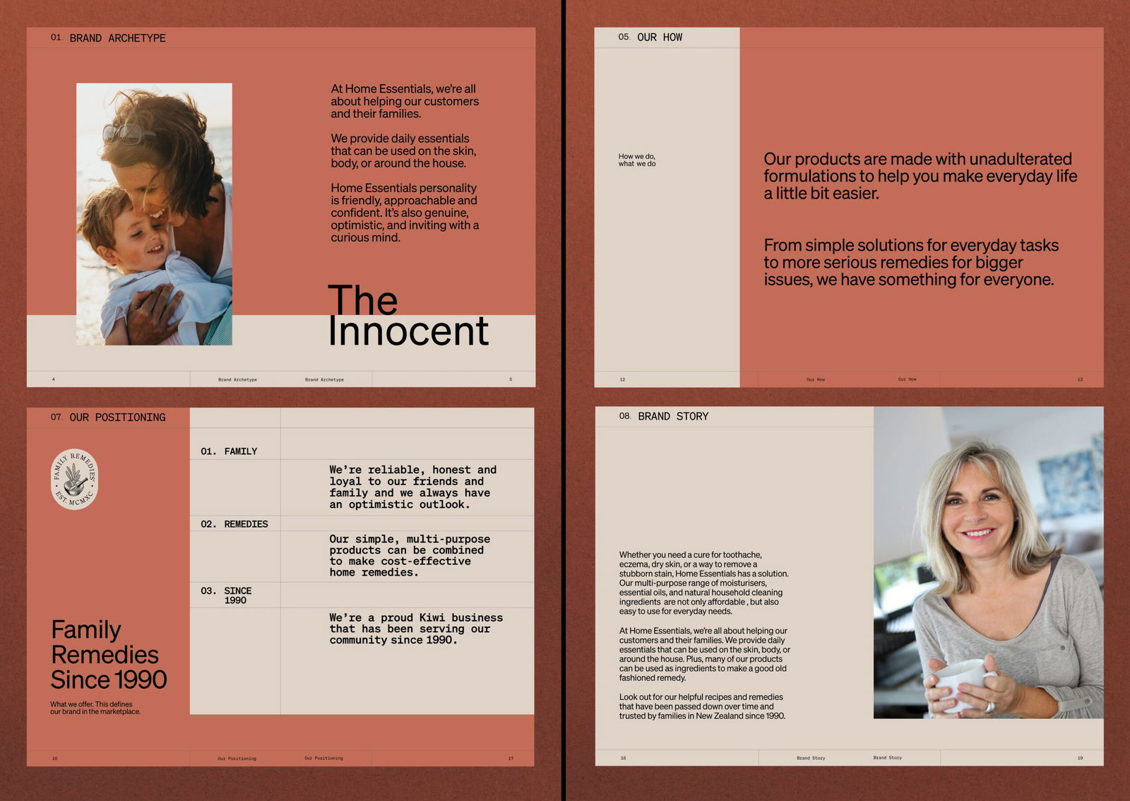


Brand Guidelines: A cohesive toolkit for growth.
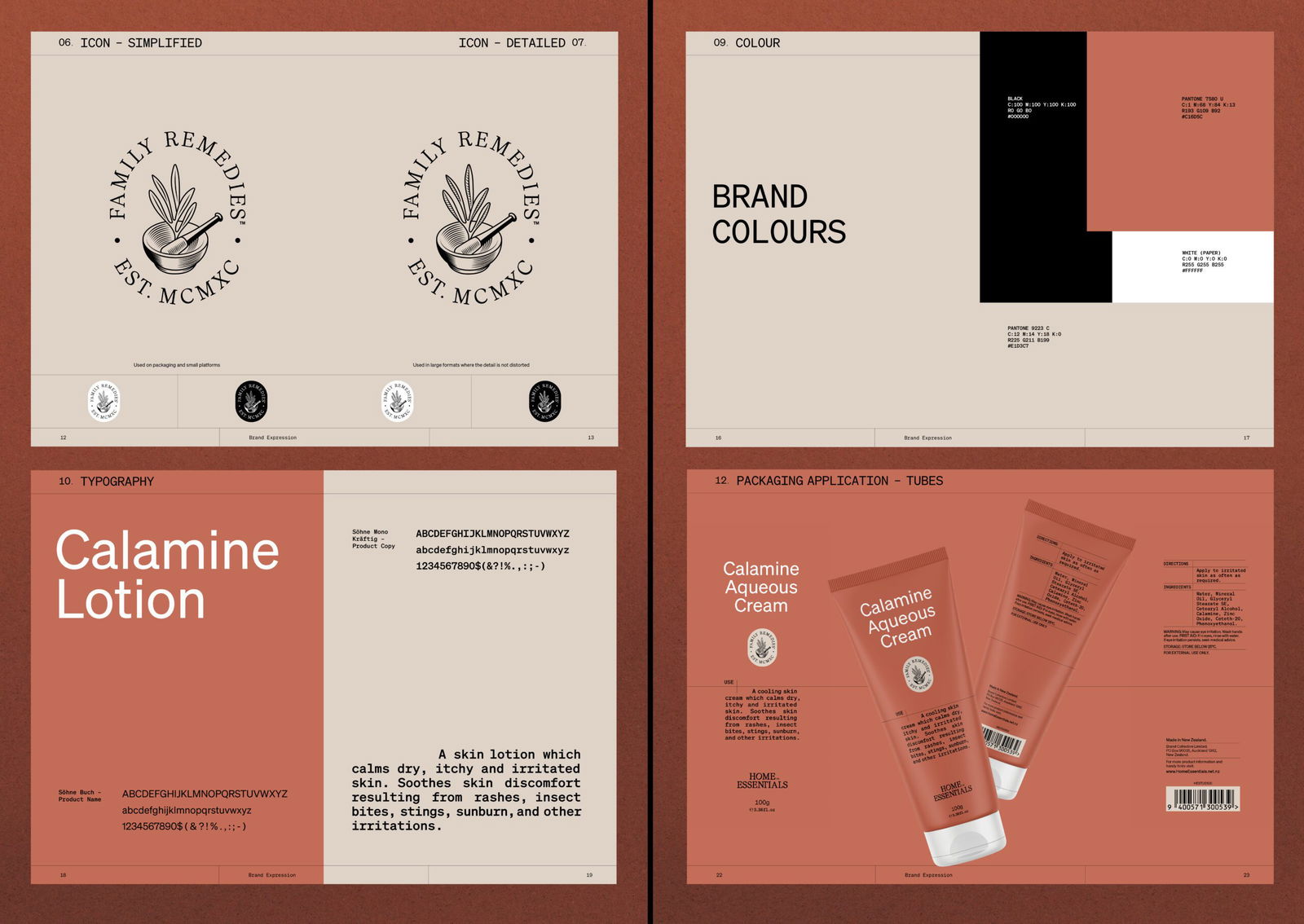
We developed a comprehensive brand guidelines document to ensure consistency across every touchpoint—from packaging and social media to in-store signage and digital campaigns. This toolkit defines everything from logo usage and colour palette to tone of voice and typography—empowering internal teams and partners to bring the brand to life with clarity and confidence.

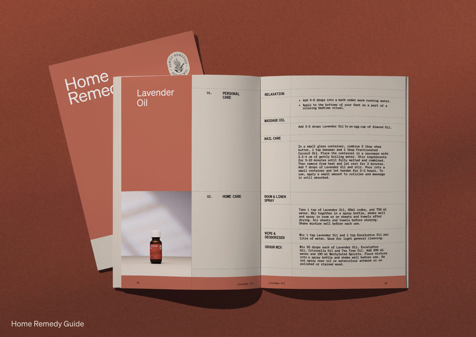
Remedy Booklet: Building brand utility and engagement
To deepen brand engagement and drive product education, we created a beautifully designed Remedy Booklet—a practical, value-add piece that highlights everyday uses for Home Essentials products. This not only reinforced brand trust but also positioned Home Essentials as a helpful voice in the customer’s home. It's part content marketing, part brand storytelling—and 100% useful.





Related Projects
Contact Redfire
+64 9 3585692
hello@redfiredesign.co.nz
Design Services

Copyright © 2000- 2025 Redfire
All rights reserved.


