NZ Skincare Branding & Packaging Design
CLIENT: SUB&TARCTIC Skincare Co.
Crafting export-ready brands that blend natural origins with modern elegance.
The purity of the Subantarctic waters and the pristine Southern Alps provide the perfect environments for Sub&Tarctic to wild harvest and source unique, natural ingredients for their skincare formulations. Nestled in the deep south of New Zealand, the brand draws inspiration from the untouched beauty of the Antarctic, harnessing its power to create products that are as pure as they are effective.
Brand Positioning
Visual Identity
Branding
Packaging Design
Print Management
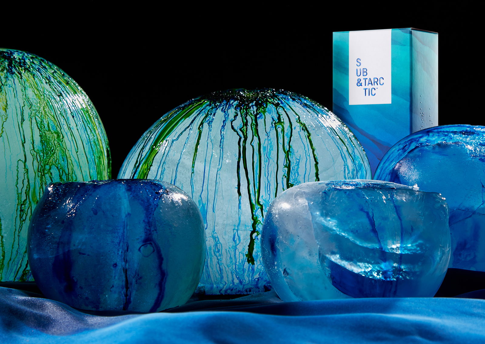
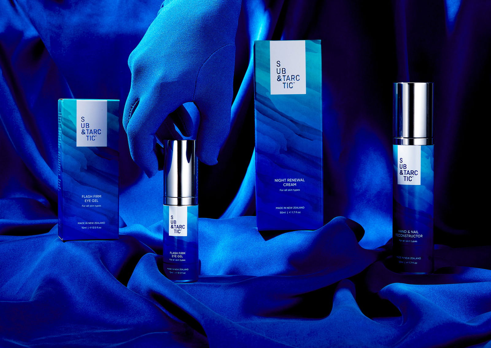
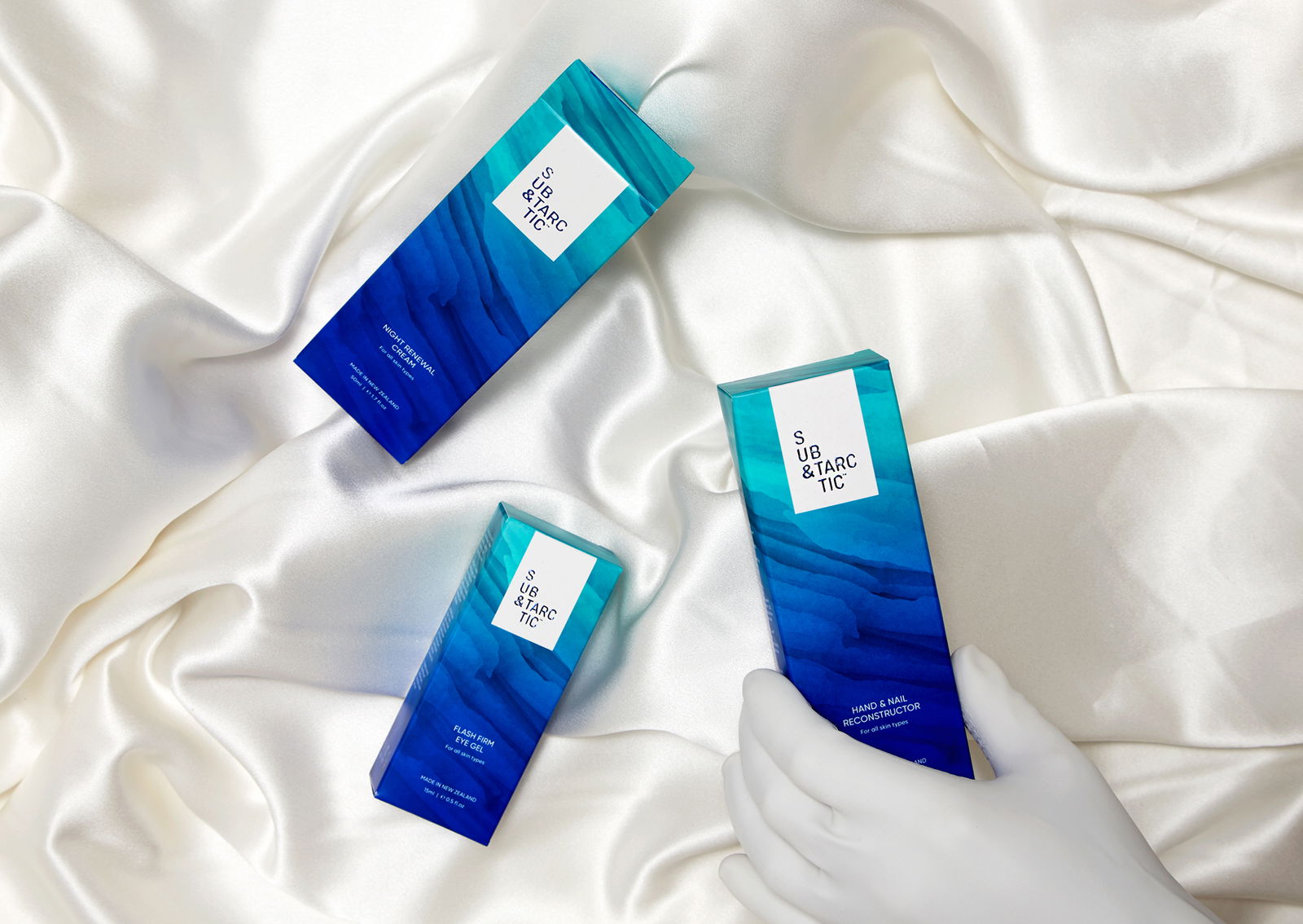
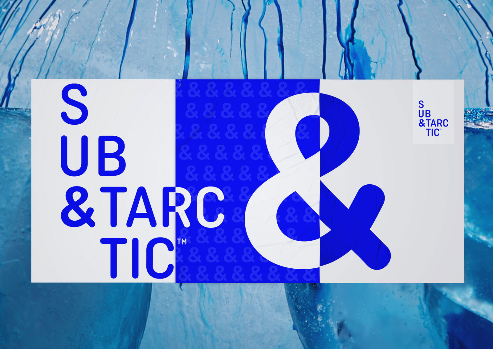
Inspired by the Antarctic, we crafted a brandmark that mirrors the majesty of icebergs – a stacked design that feels bold and timeless. The colours of teal, blue, and aqua, with their soft gradients, echo the ever-changing hues of the Southern Ocean, while the overall aesthetic speaks to the brand’s connection to nature and its commitment to sustainability.
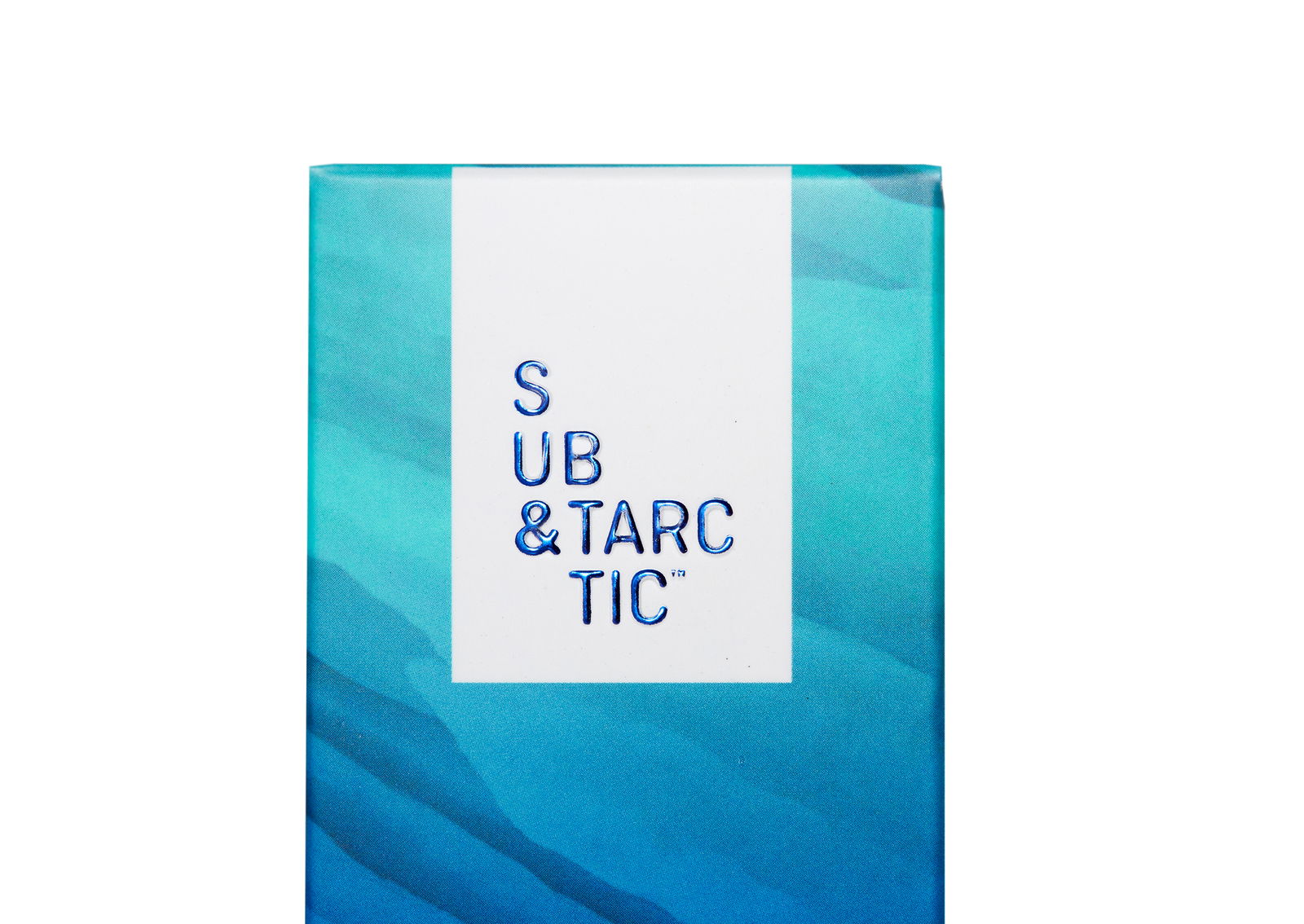
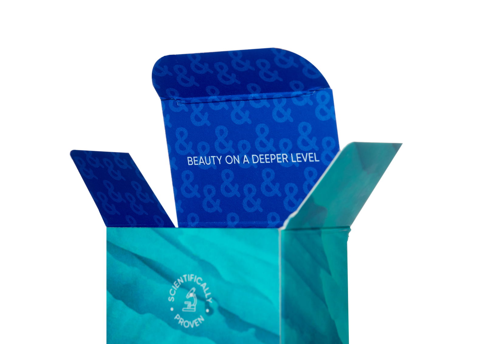
But it’s not just about what’s on the surface. Sub&Tarctic’s brand proposition, Beauty on a Deeper Level, is a nod to the idea that true beauty lies beneath – much like an iceberg, which reveals only a fraction of its grandeur above water. This metaphor is woven into every aspect of the brand, from the formulations (which feature Antarctic seaweed as a key ingredient) to the thoughtful details on the packaging.
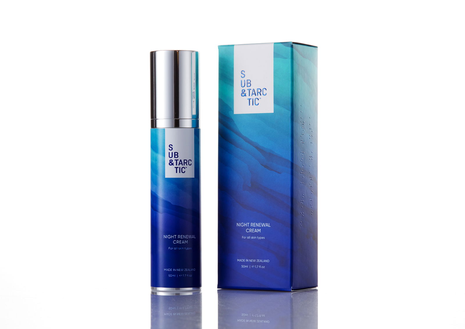
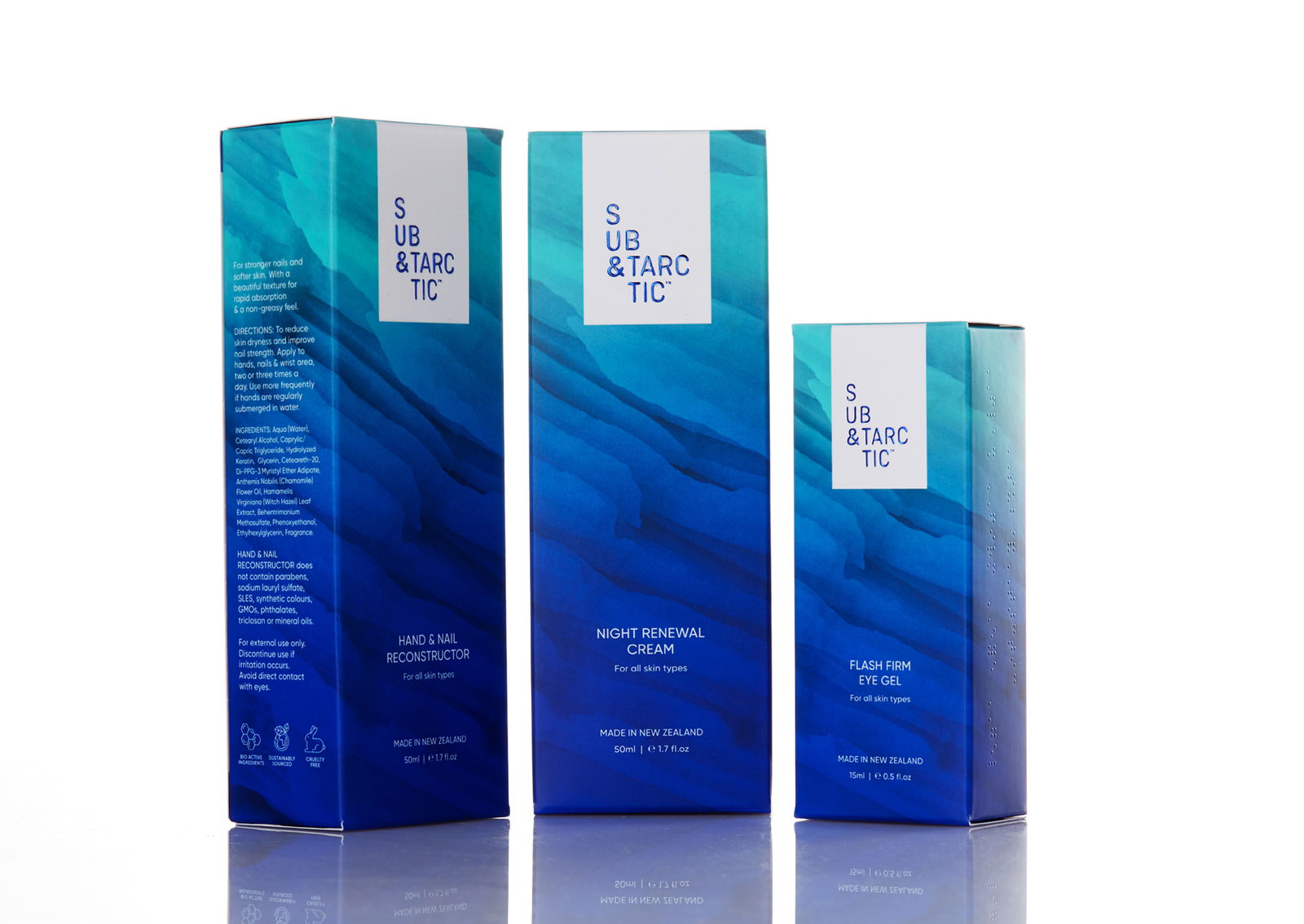
Speaking of packaging, we made sure it wasn’t just beautiful but also inclusive. By incorporating braille on the boxes, Sub&Tarctic ensures their products are accessible to the visually impaired, reflecting their belief that skincare should be for everyone.
Related Projects
Contact Redfire
+64 9 3585692
hello@redfiredesign.co.nz
Design Services

Copyright © 2000- 2025 Redfire
All rights reserved.


