Bold Brand Strategy & Packaging Design for NZ Mānuka Honey
CLIENT: Honuka
From Hive to Shelf – Branding & Packaging for Mānuka Honey
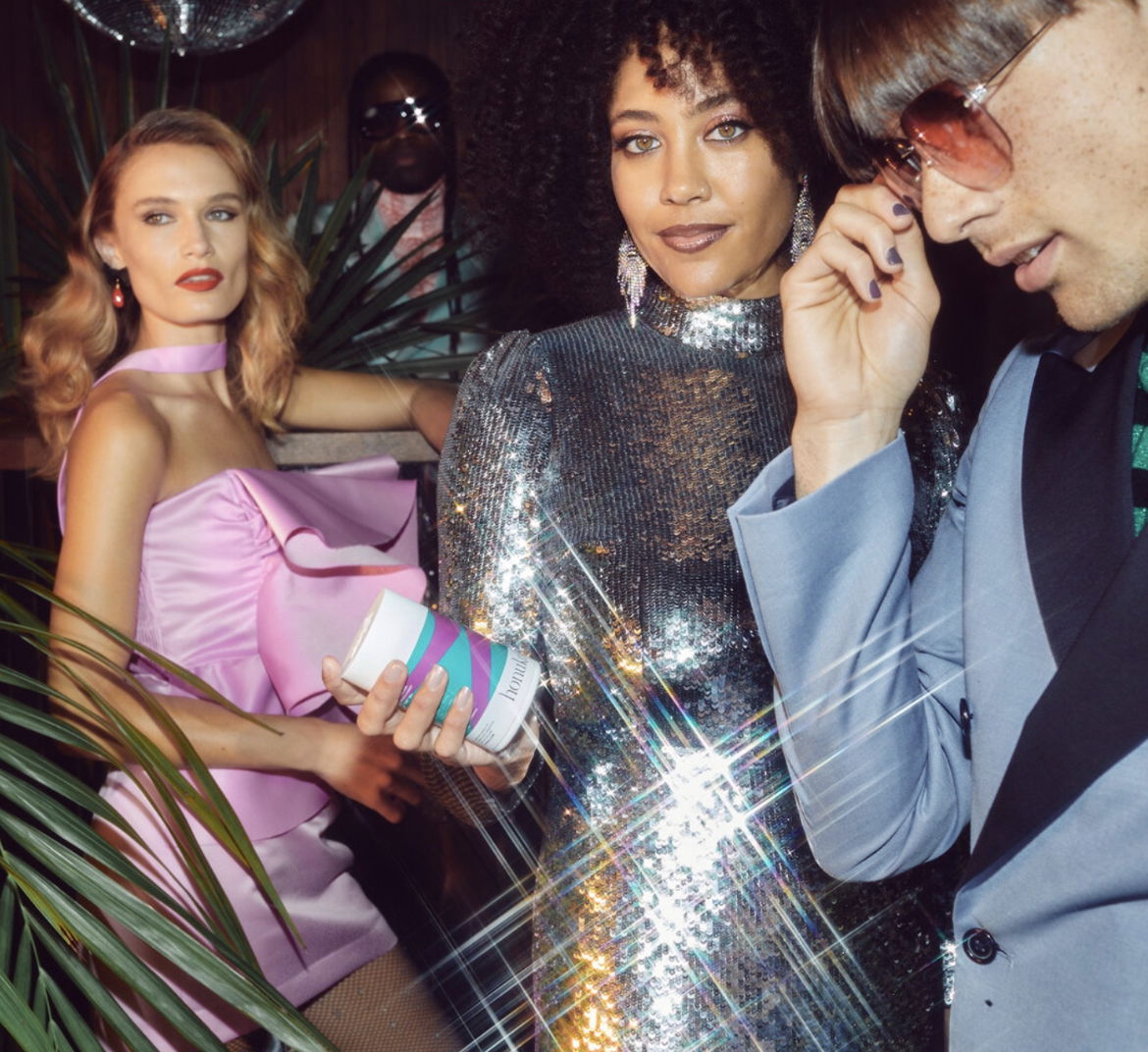
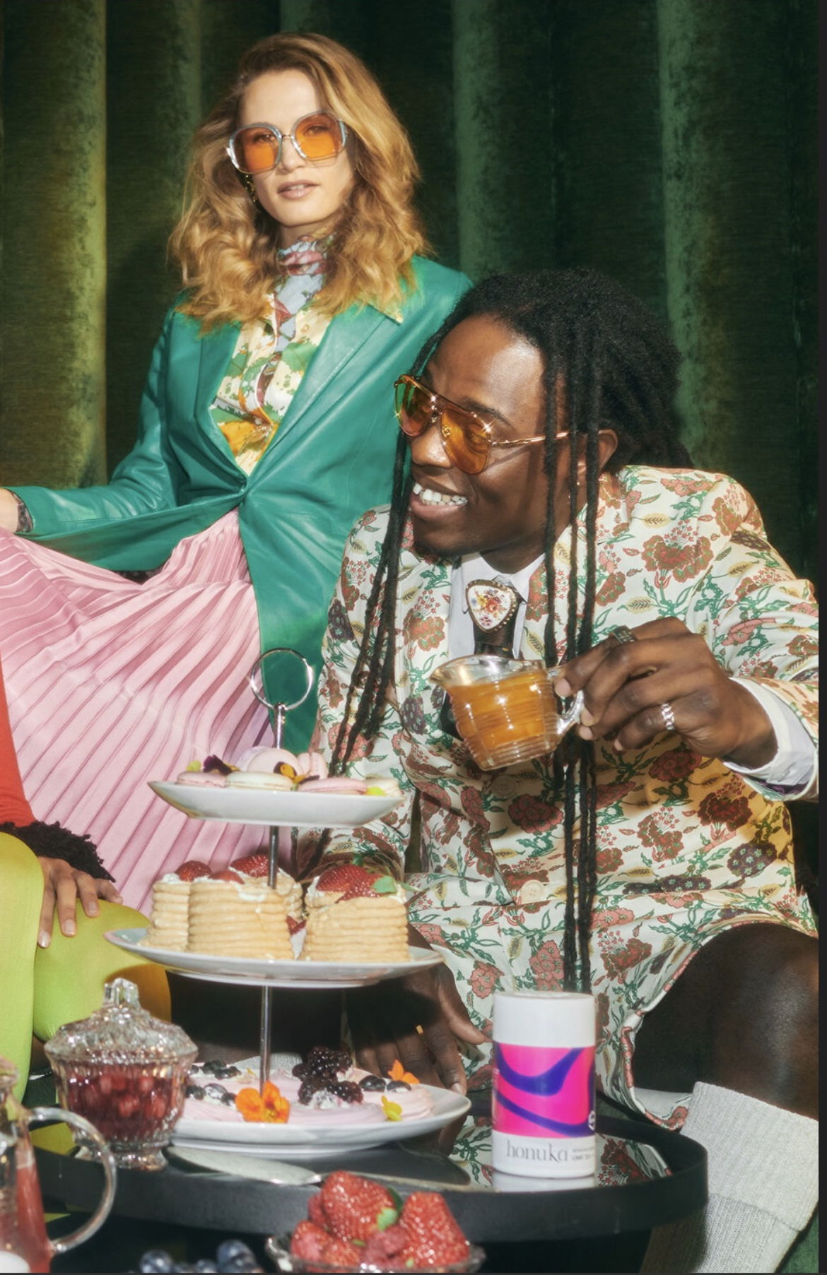
At Redfire, we don’t just design brands - we create brand experiences people feel, remember, and talk about. Honuka gave us the chance to shake up the Manuka honey market with bold brand strategy, storytelling, and packaging design that’s as beautiful as it is sustainable.
A Brand Story Inspired by Nature
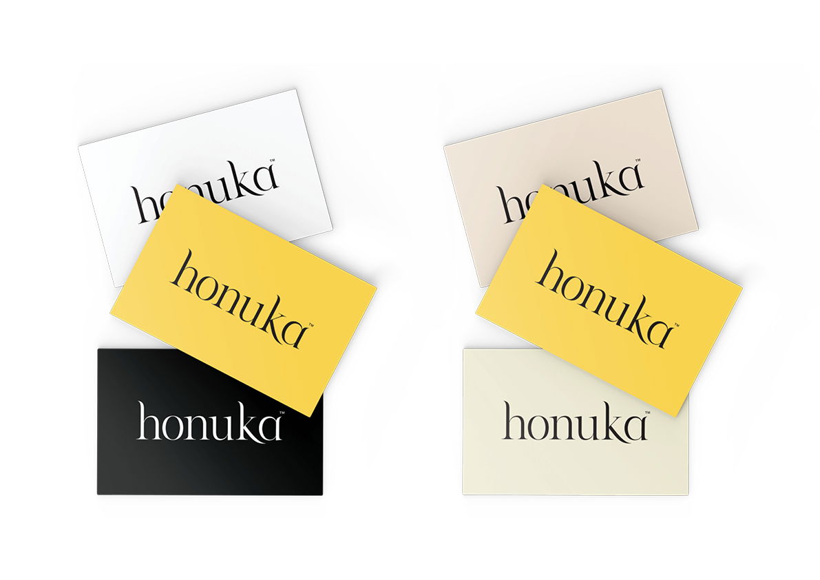
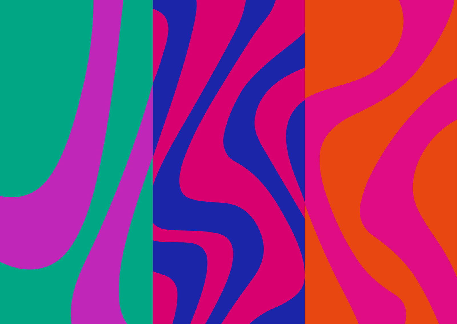
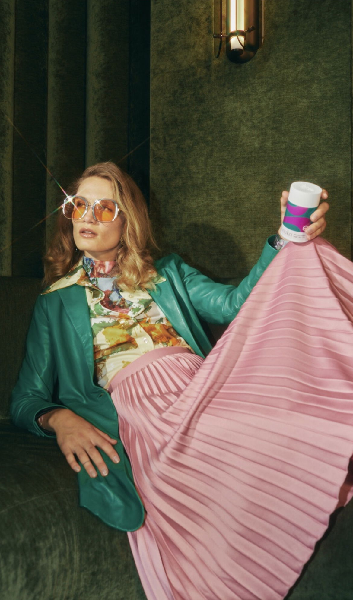
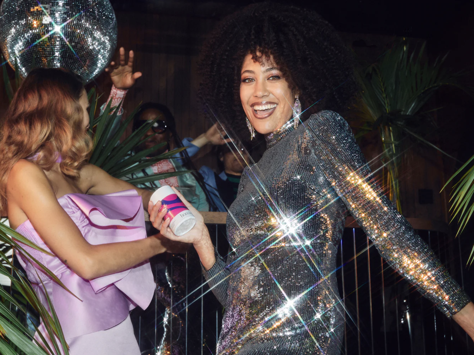
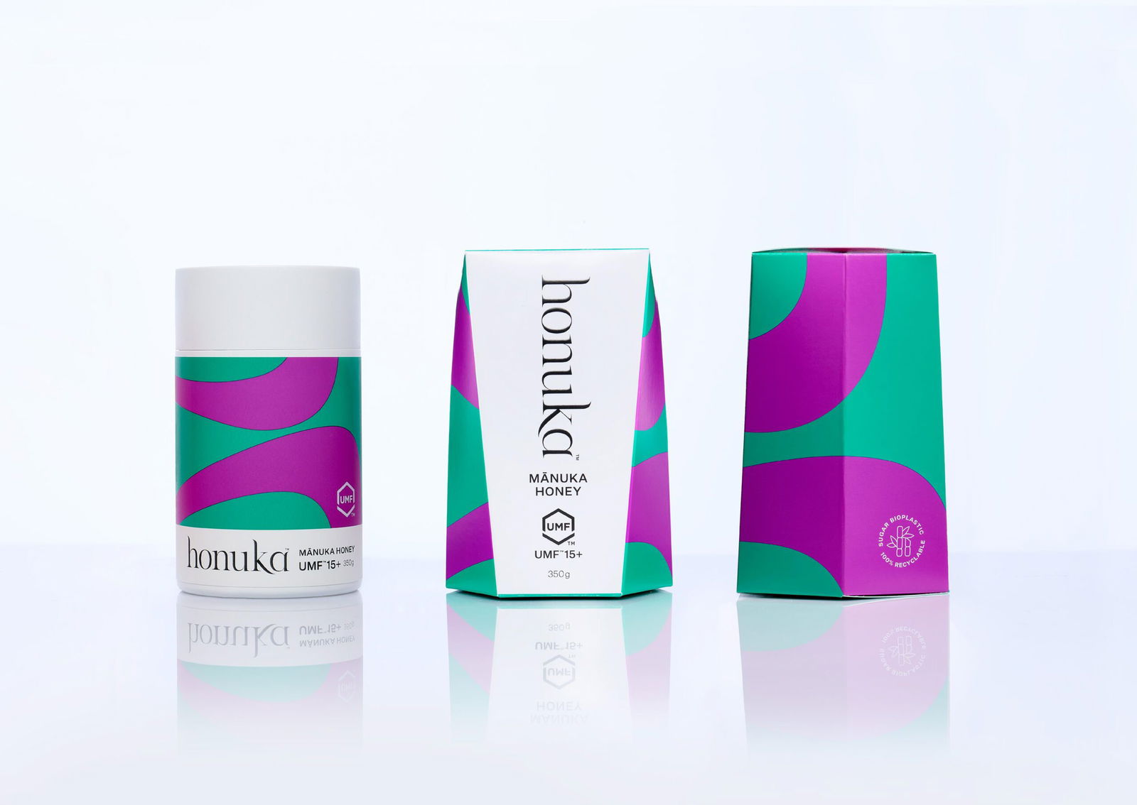
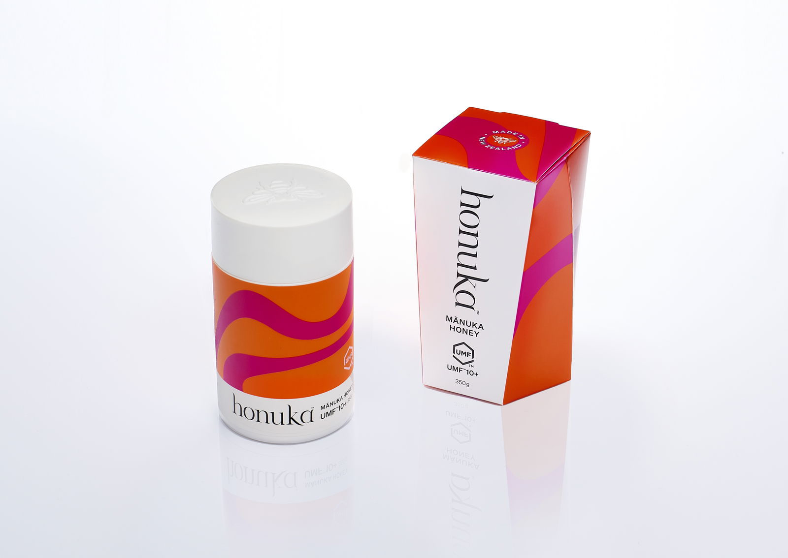
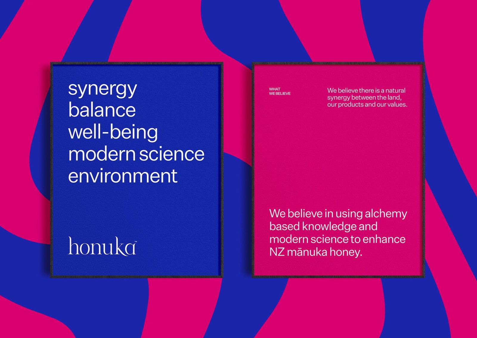
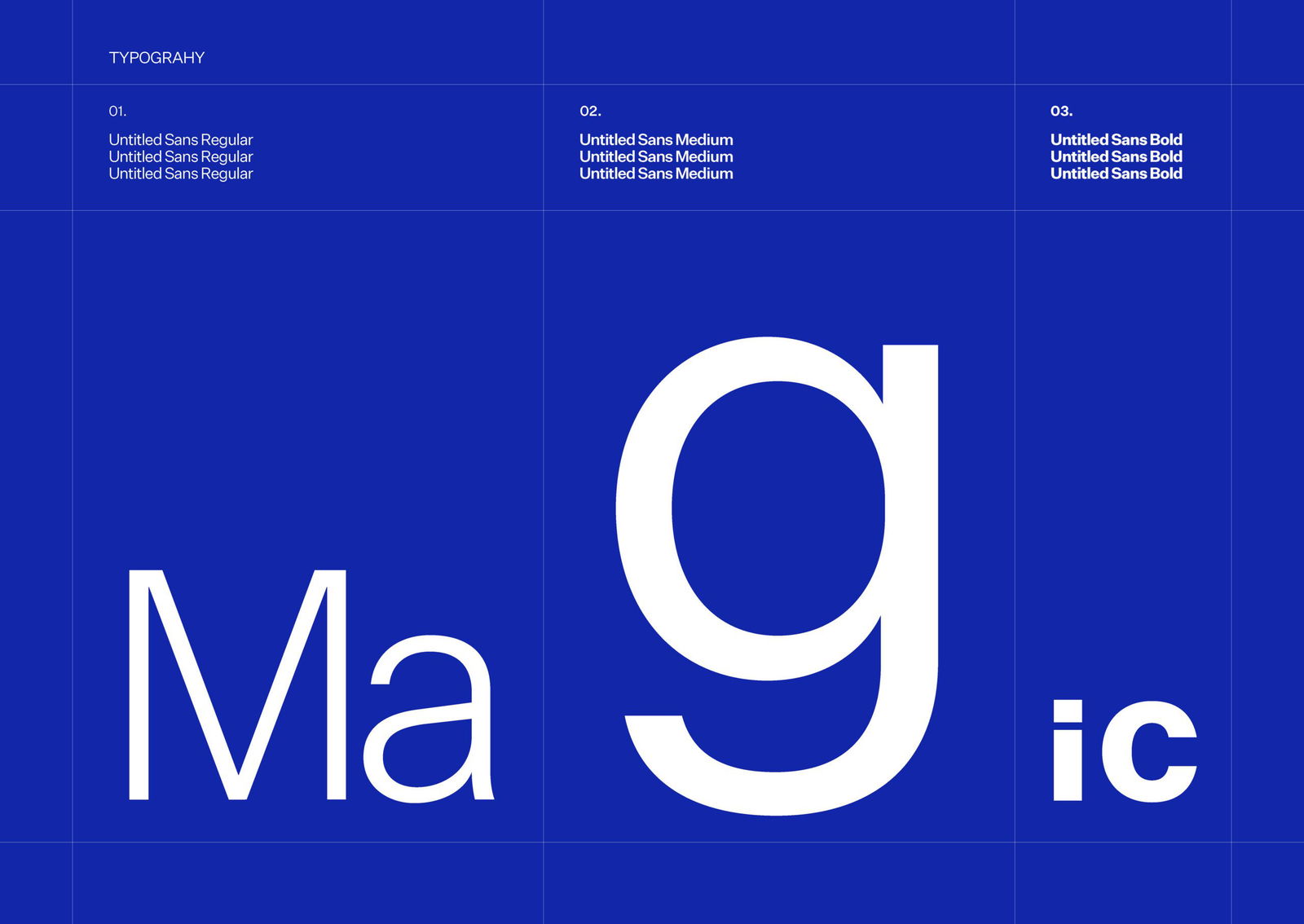
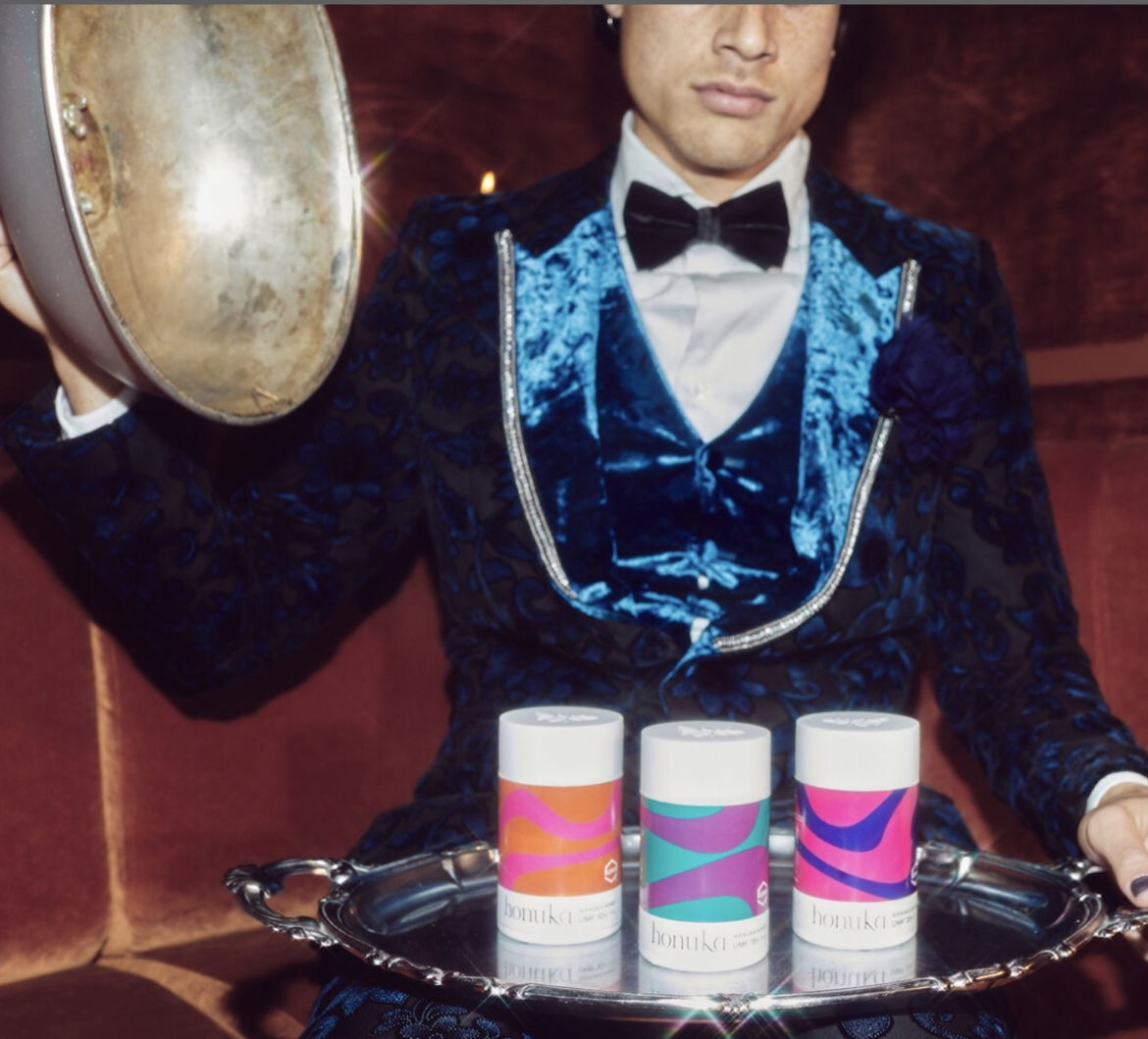
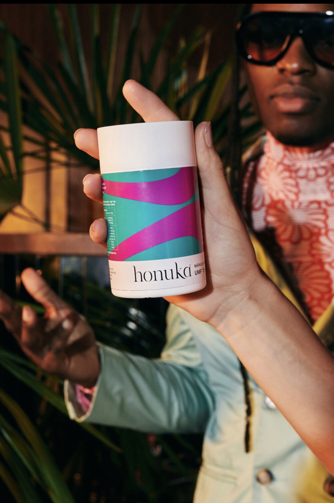
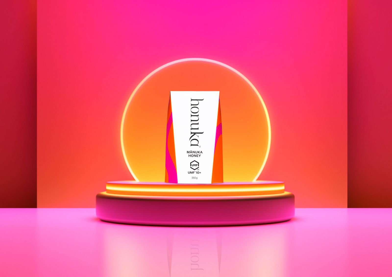
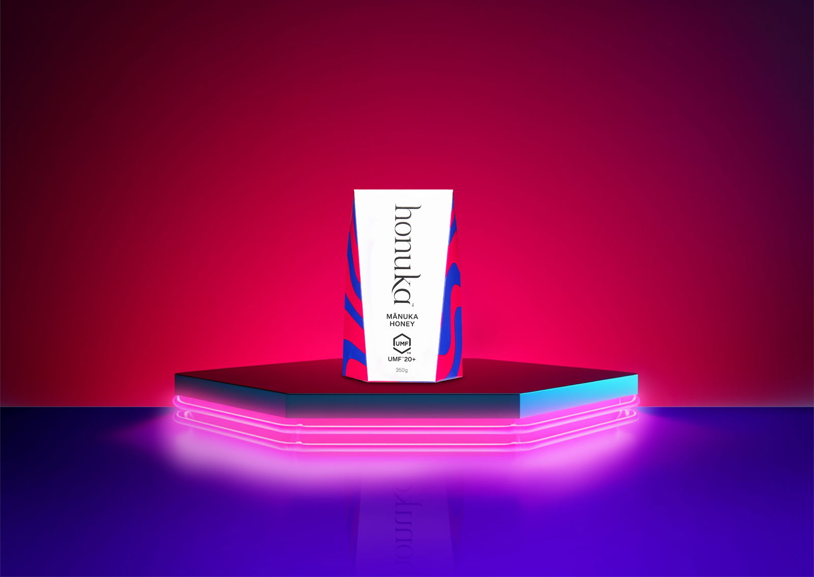
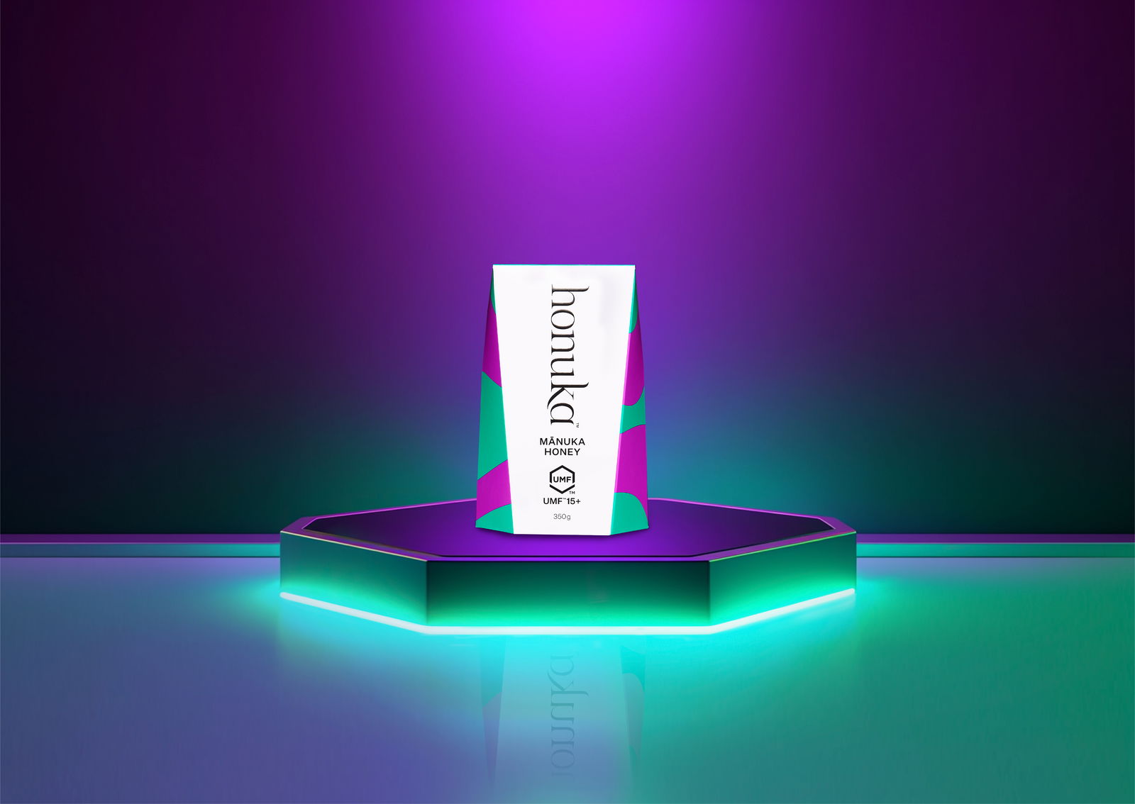
Honuka’s brand identity is rooted in nature’s flow - think of bees dancing through the air. We turned this into a vibrant visual style: rich waves of unexpected colour that stand out from typical honey brands. The logo and typography mix a modern look with an organic, handcrafted vibe, keeping the brand authentic and premium.
Honuka’s packaging had to make a statement on the shelf - and tread lightly on the planet. We designed a unique jar: a square top that flows into a hexagonal base, nodding to nature’s honeycomb and giving the brand serious standout power.
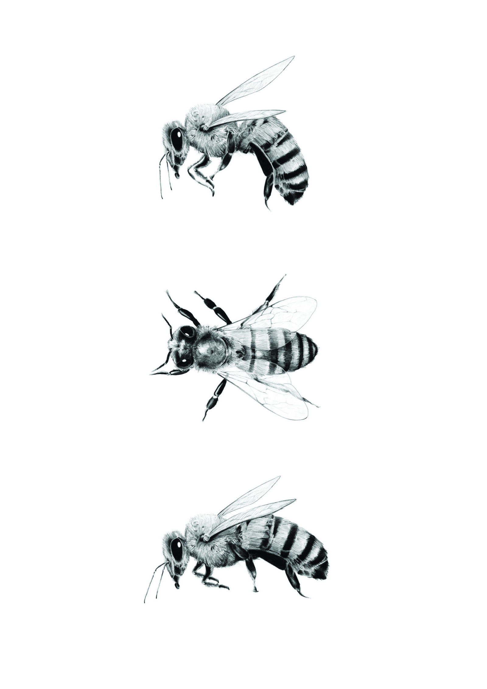
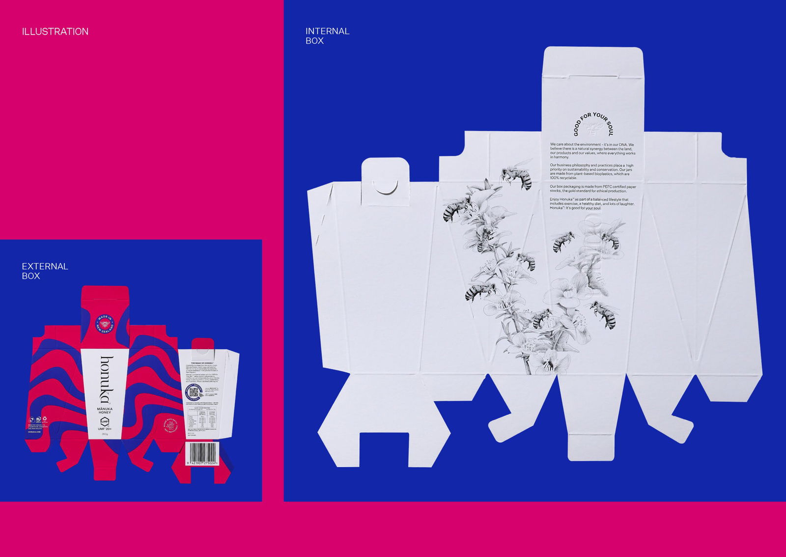
Inside the box, a black-and-white illustration tells the timeless story of bees and Manuka blossoms. It’s a small moment of surprise and connection that makes unboxing feel special.
Sustainability runs through every detail:
- PEFC-certified materials for responsible sourcing.
- Vegetable-based inks for lower environmental impact.
- Rockstock stone labels that use less water and energy.
- Sugar-based bioplastic jars that merge sustainability with premium appeal.
Let’s create something extraordinary together.
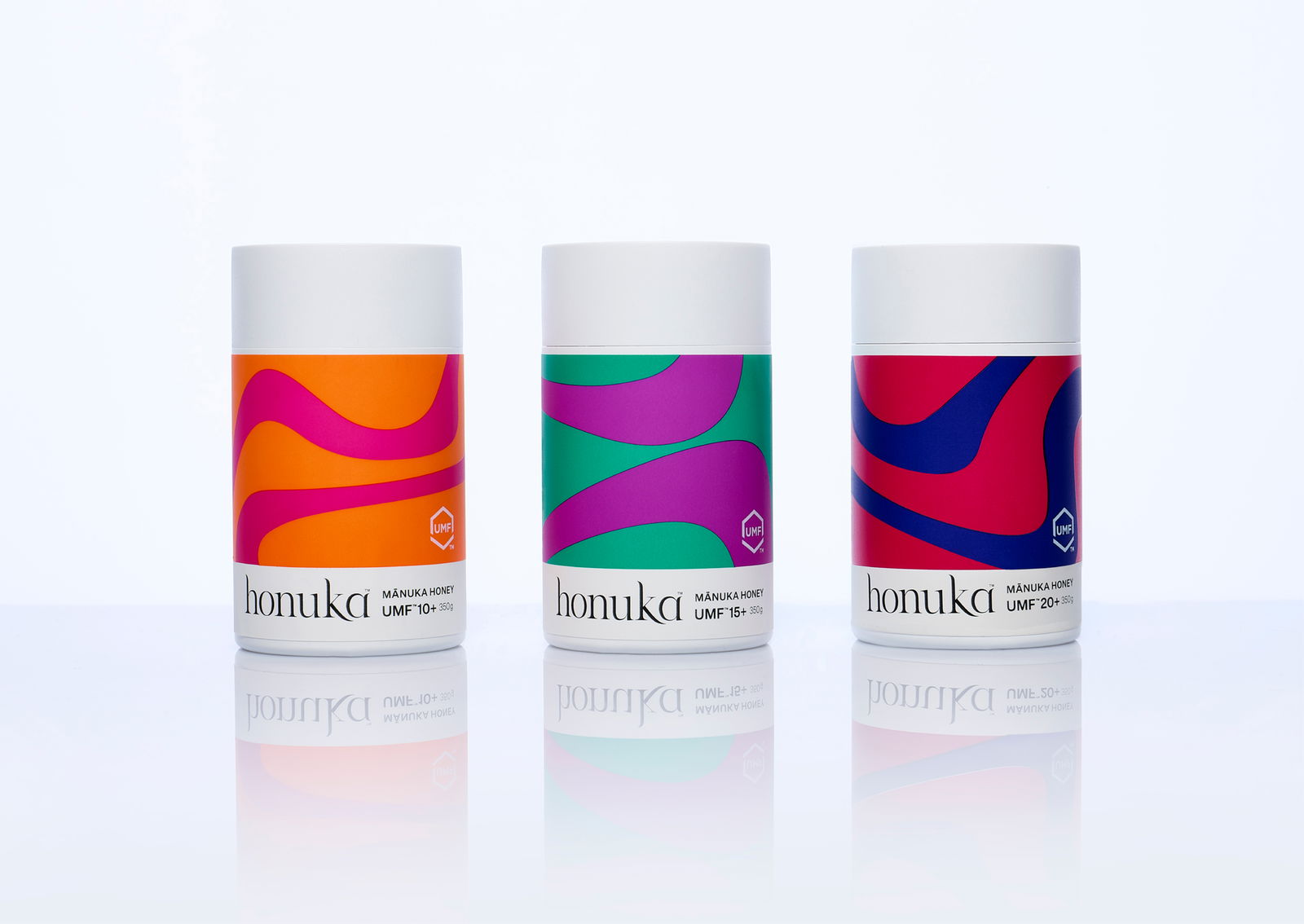
Sustainability is at the heart of Honuka and our design approach.
We used white sugar bioplastic jars to push the boundaries of sustainable packaging, combining eco-friendly materials with a premium look and feel. All packaging uses PEFC-certified materials for responsible sourcing and vegetable-based inks to minimise environmental impact. Rockstock stone labels add another layer of innovation and help reduce waste, staying true to Honuka’s commitment to sustainability.
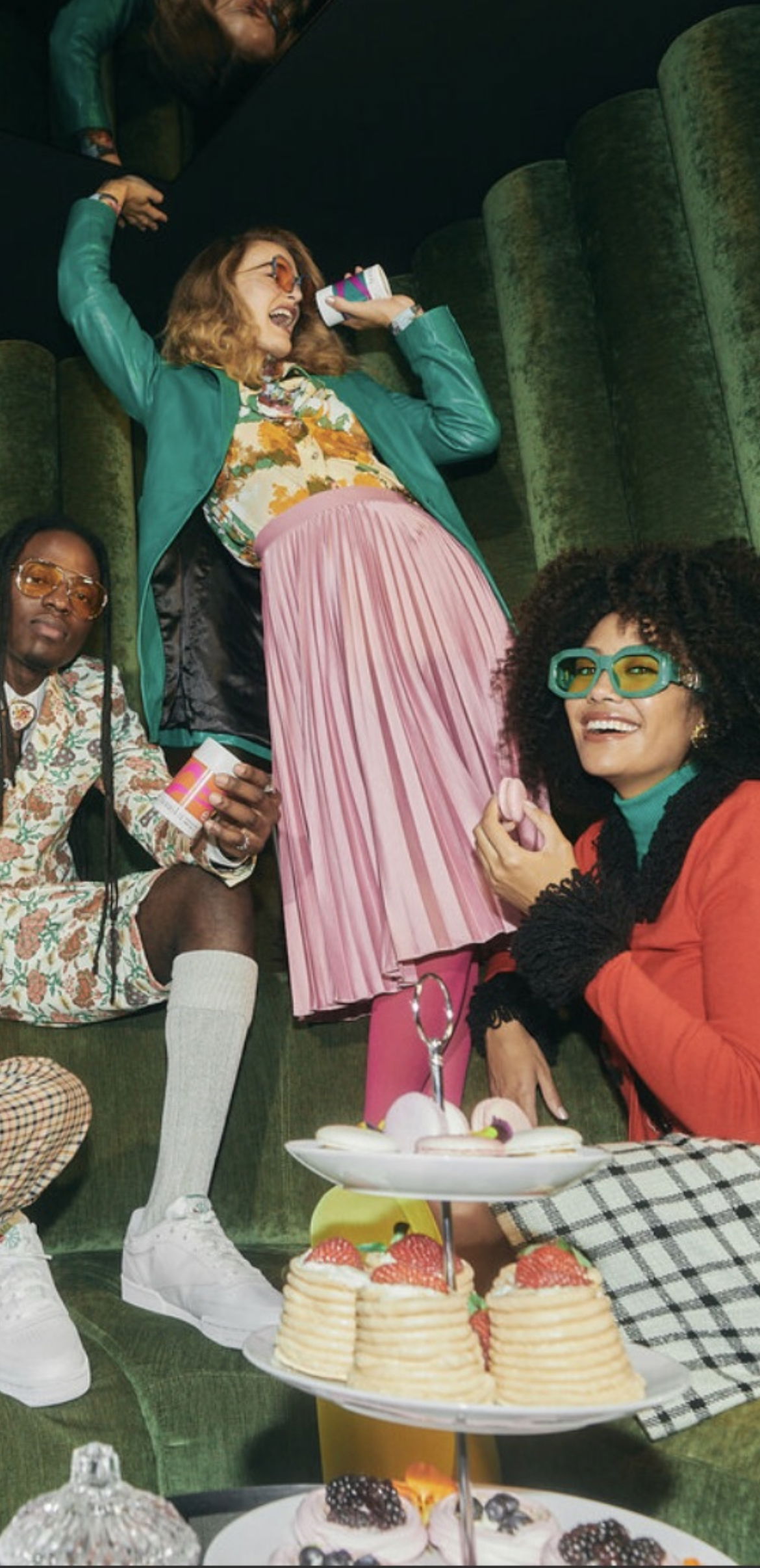
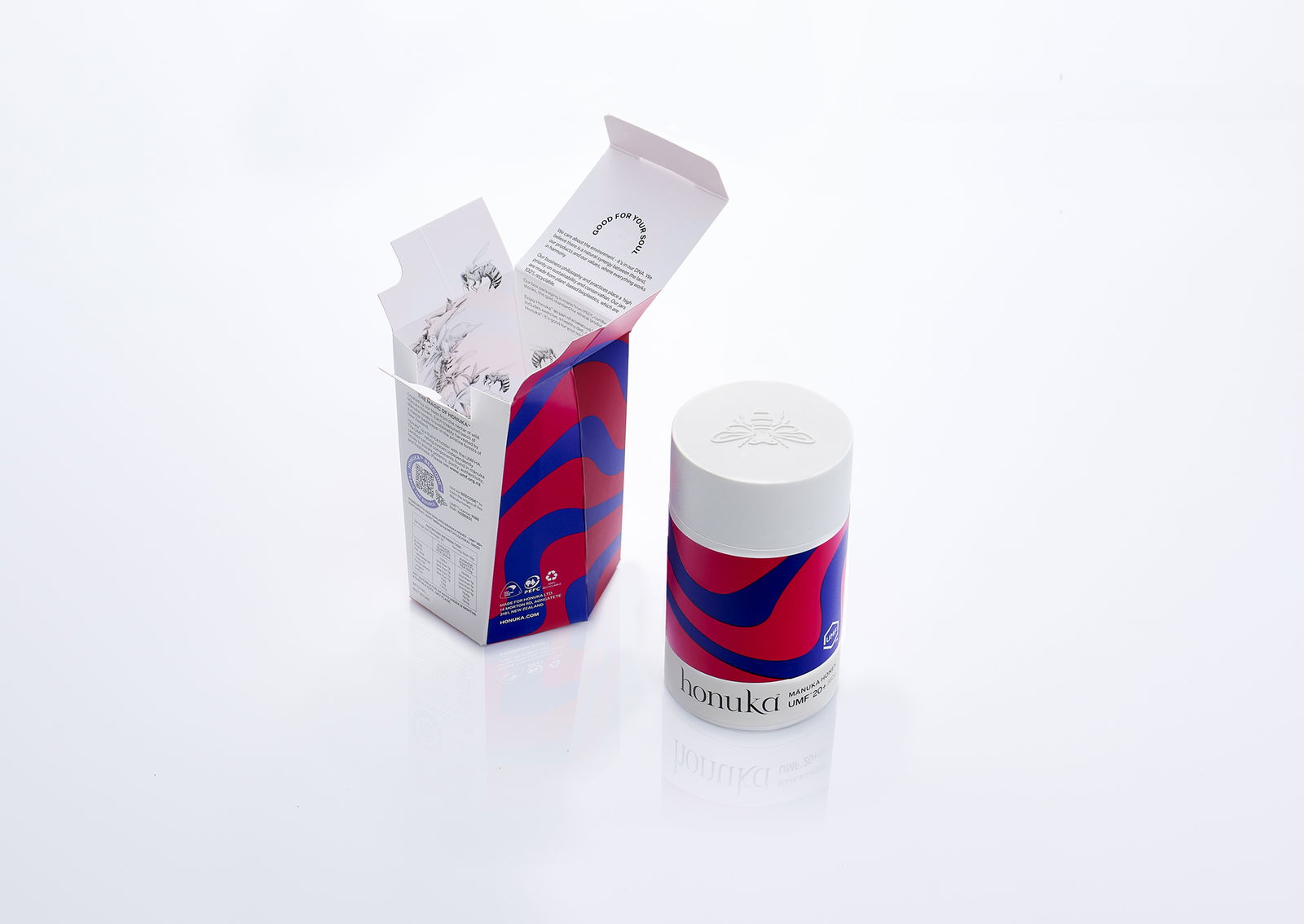
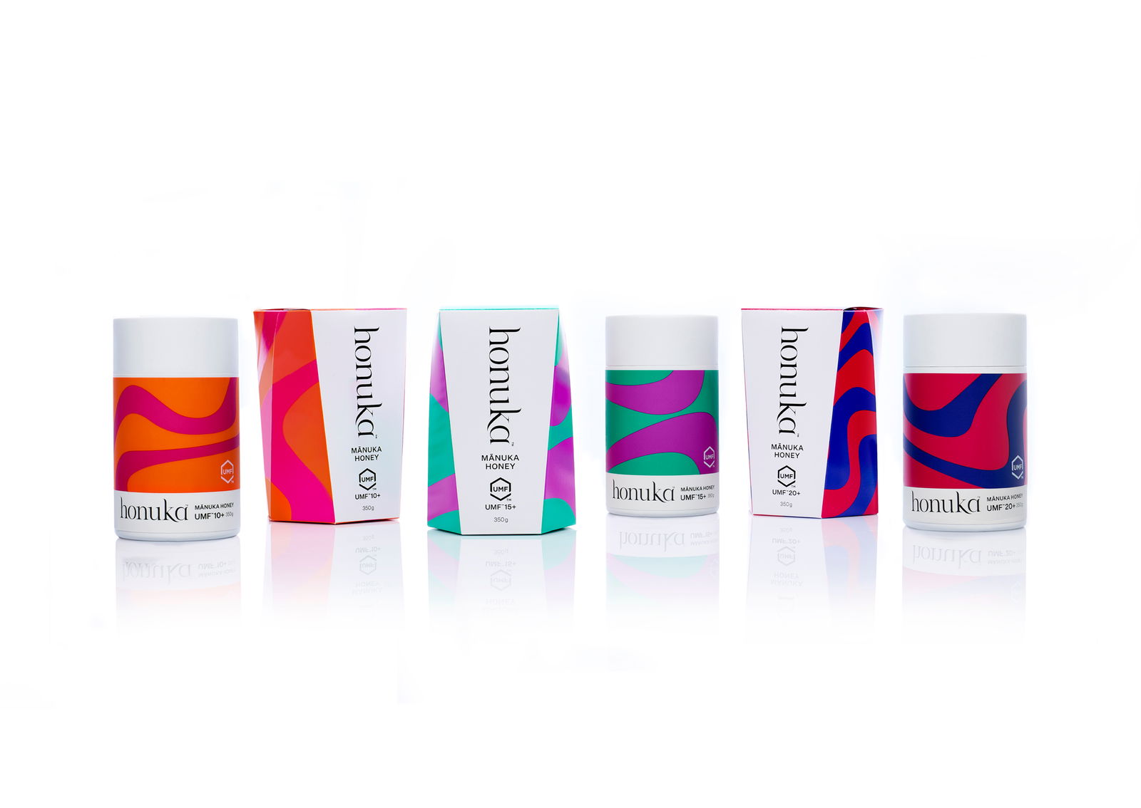
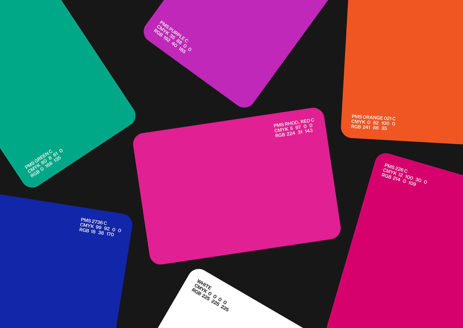
Honuka’s brand identity is inspired by the natural, flowing movement of bees in flight. We turned this idea into a bold visual language - fluid waves of colour that break away from traditional honey design. The unexpected colour palette challenges the usual look of Manuka honey, helping Honuka stand out on the shelf and tell a fresh story.
A Category-Defining Manuka Honey Brand
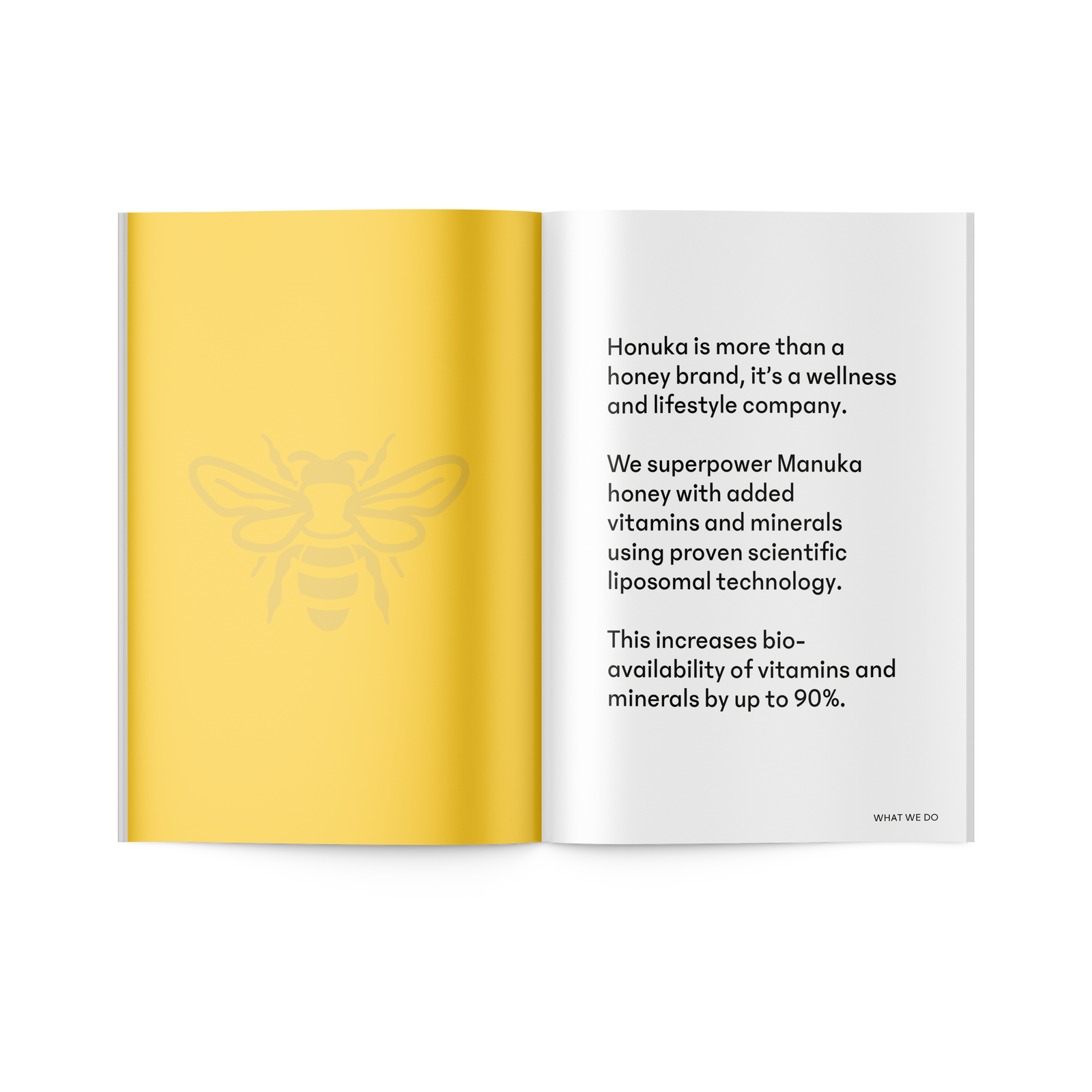
Honuka isn’t just another Manuka honey - it’s a design-led brand that sets a new standard for the category. With smart brand positioning, bold design, and rich storytelling, we created a honey brand that’s as eye-catching as it is meaningful.

Related Projects
Contact Redfire
+64 9 3585692
hello@redfiredesign.co.nz
Design Services
Copyright © 2000- 2025 Redfire
All rights reserved.

