
From Name to Shelf – Complete Branding & Packaging for Skincare
CLIENT: Lords + Angels
Strategic storytelling and design that brings your skincare vision to life.
Lords + Angels is a premium science-based beauty brand.
Our brief for this start-up was to define and activate a brand purpose including brand strategy, positioning, naming, visual identity and packaging design.
We positioned Lords + Angels as an Alchemist archetype, blending science and spiritual empowerment. This drove our brand purpose - to celebrate personal growth and foster positive change through science-based beauty.
READ MORE
We drew inspiration from the Notre-Dame and an architectural concept for rebuilding the old cathedral after the fire in 2019. This blend of old and new was a catalyst for our overarching brand identity and design.
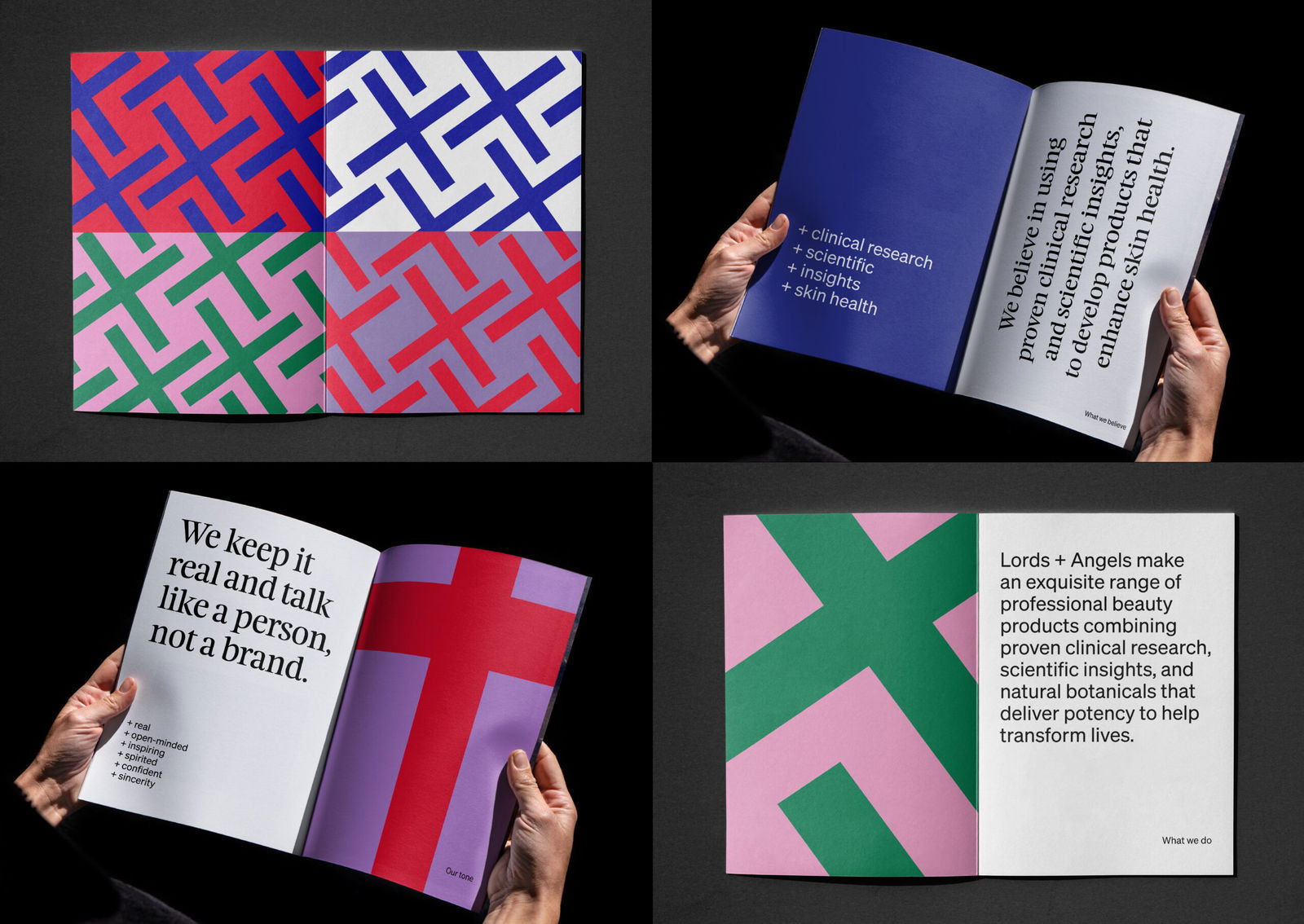
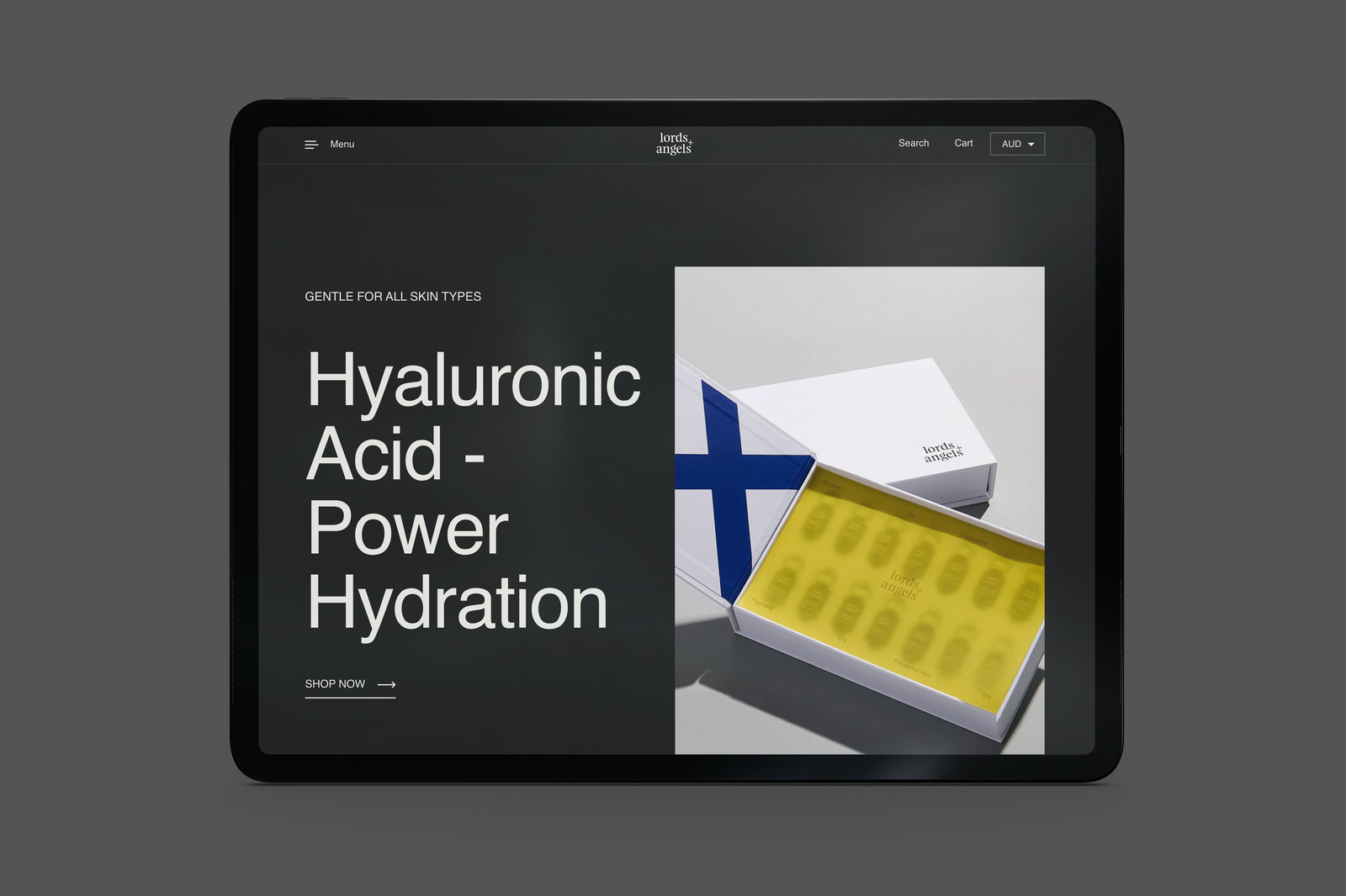
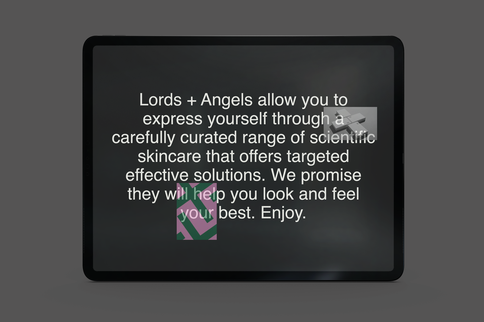
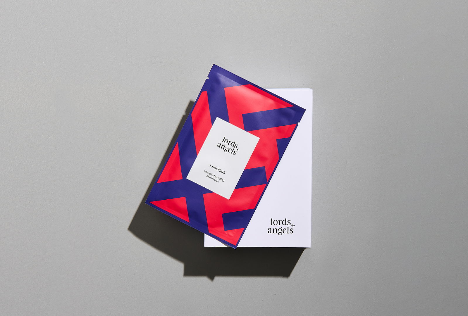
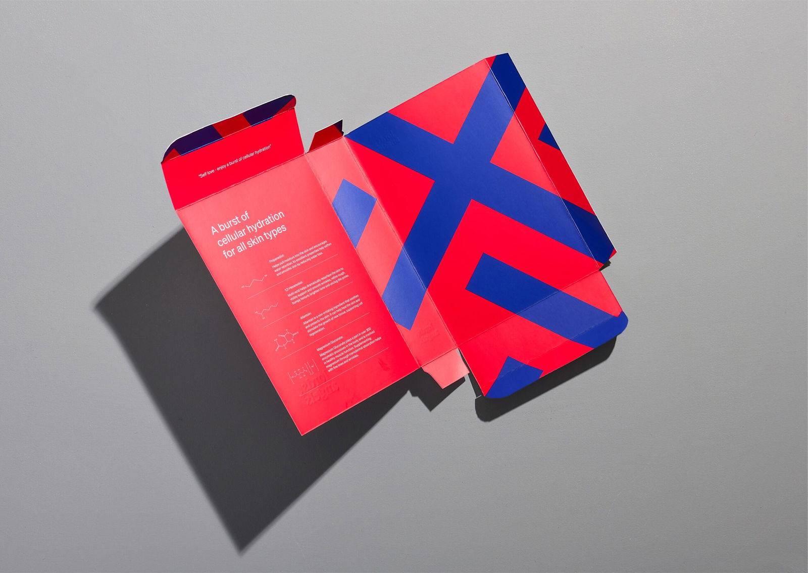
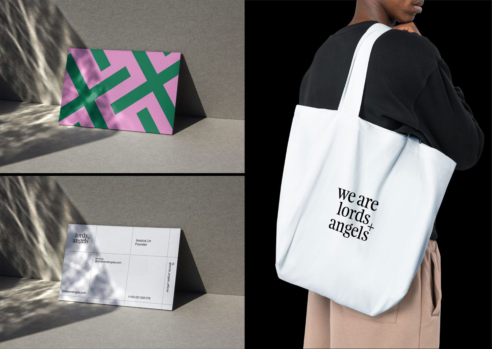
The Lords + Angels brand identity blends old-style Feijoa typography, with sans-serif Söhne ( by Klim Type Foundry) representing science. The random cross hatch pattern derived from the + in the identity and bold colour system inspired by stained glass windows is used across all brand touchpoints.
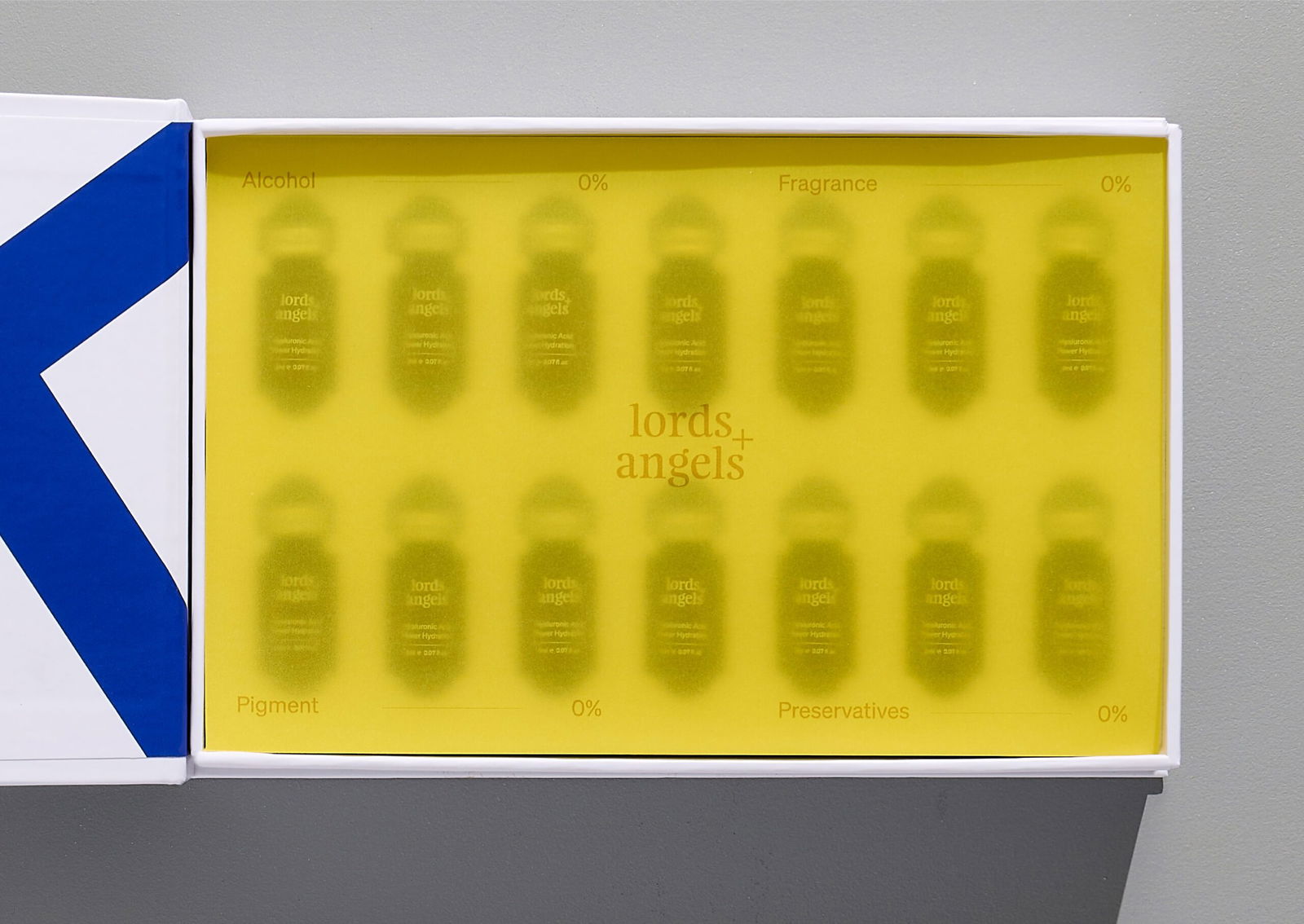
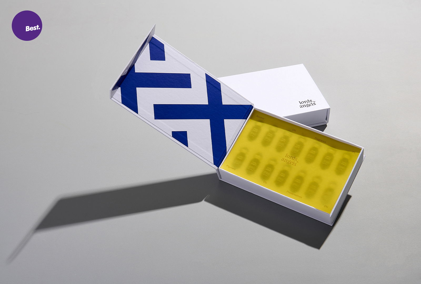
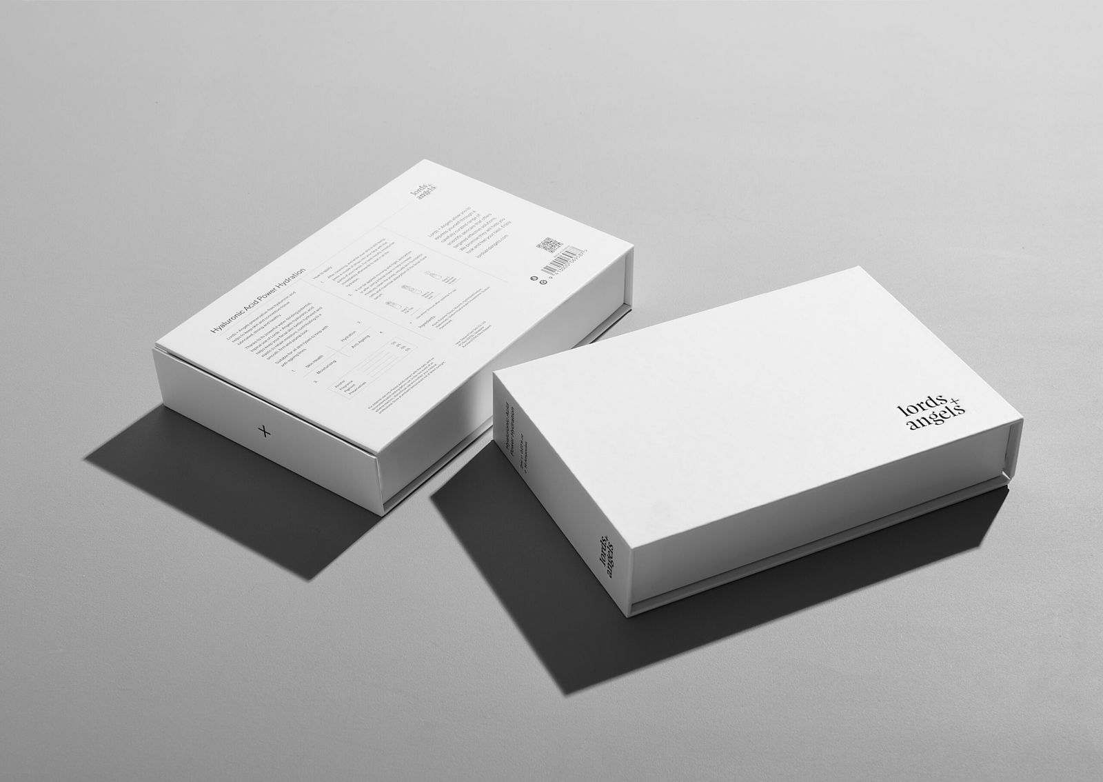
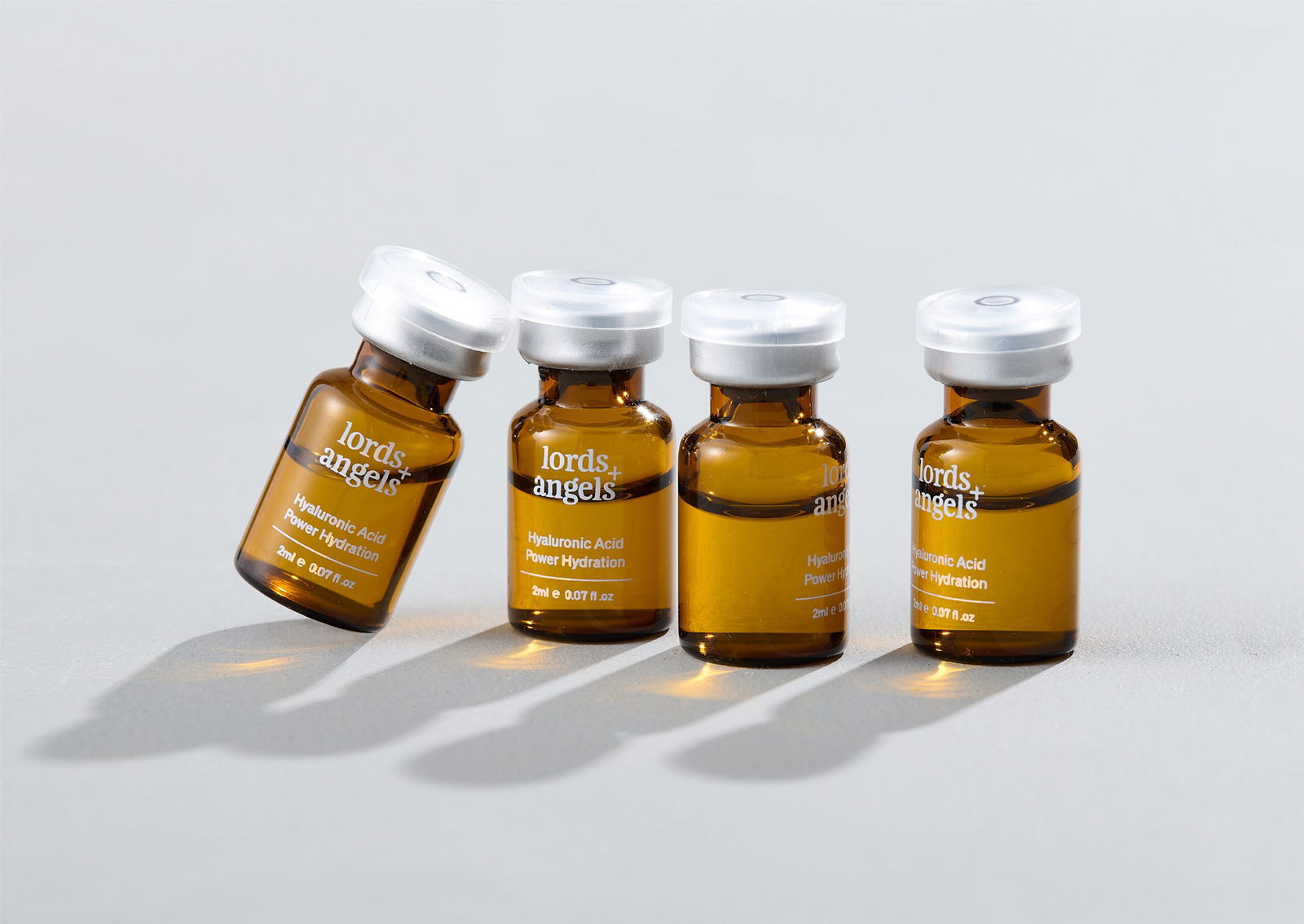
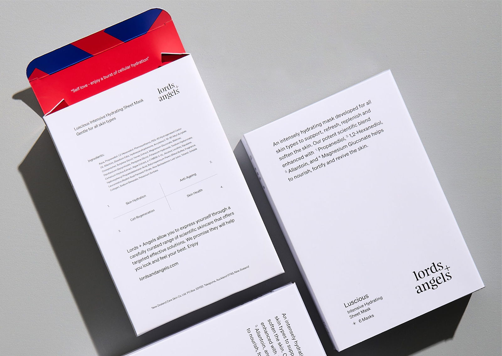
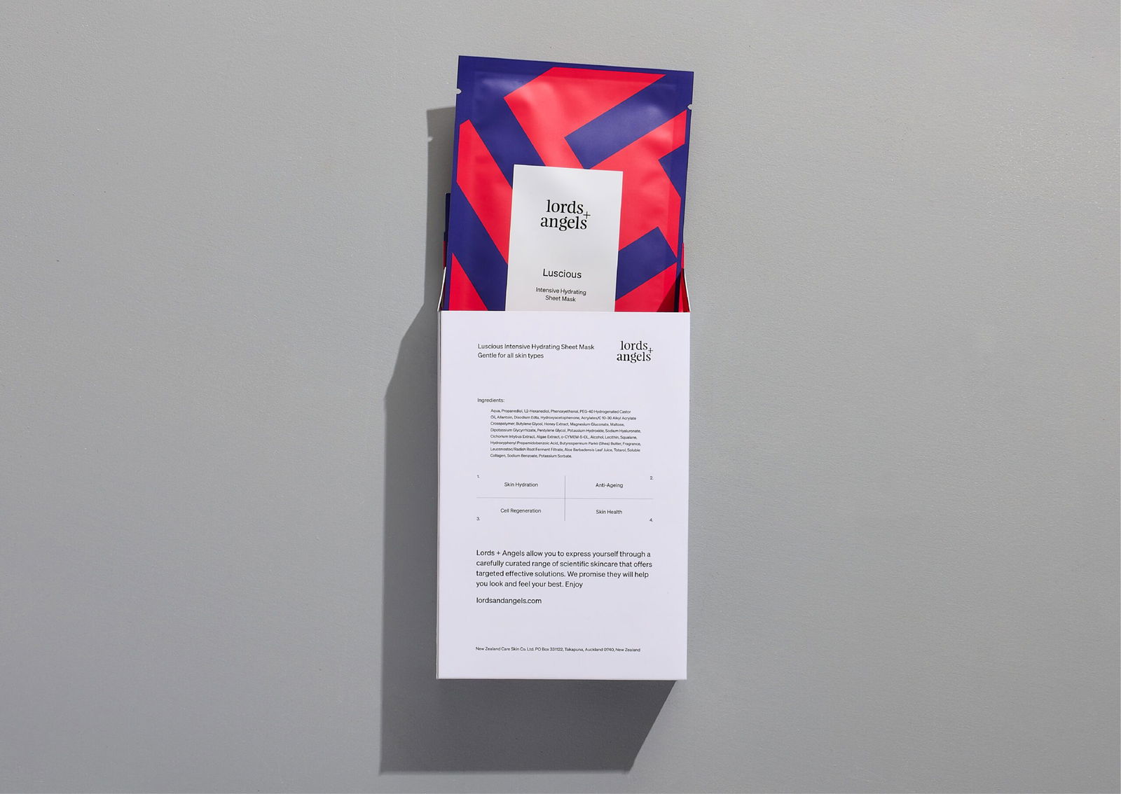
Premium packaging provides a sensory experience and delight when opened. The outer packaging is clinical white and supported with a scientific narrative but delivered conversationally with confidence and sincerity. The inner pack brings surprise through bursts of colour and represents the inner beauty within us all.
WHAT WE DID
Brand Strategy
Brand Purpose
Naming
Brand Story
Brand Design
Visual Identity
Packaging Design
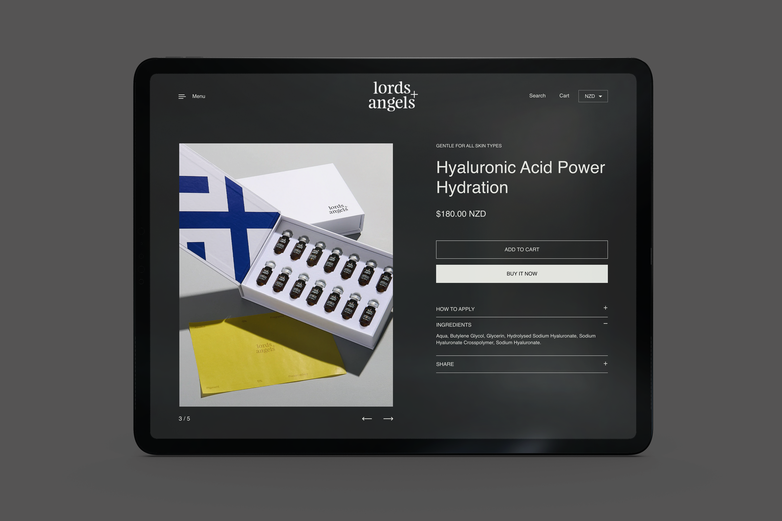
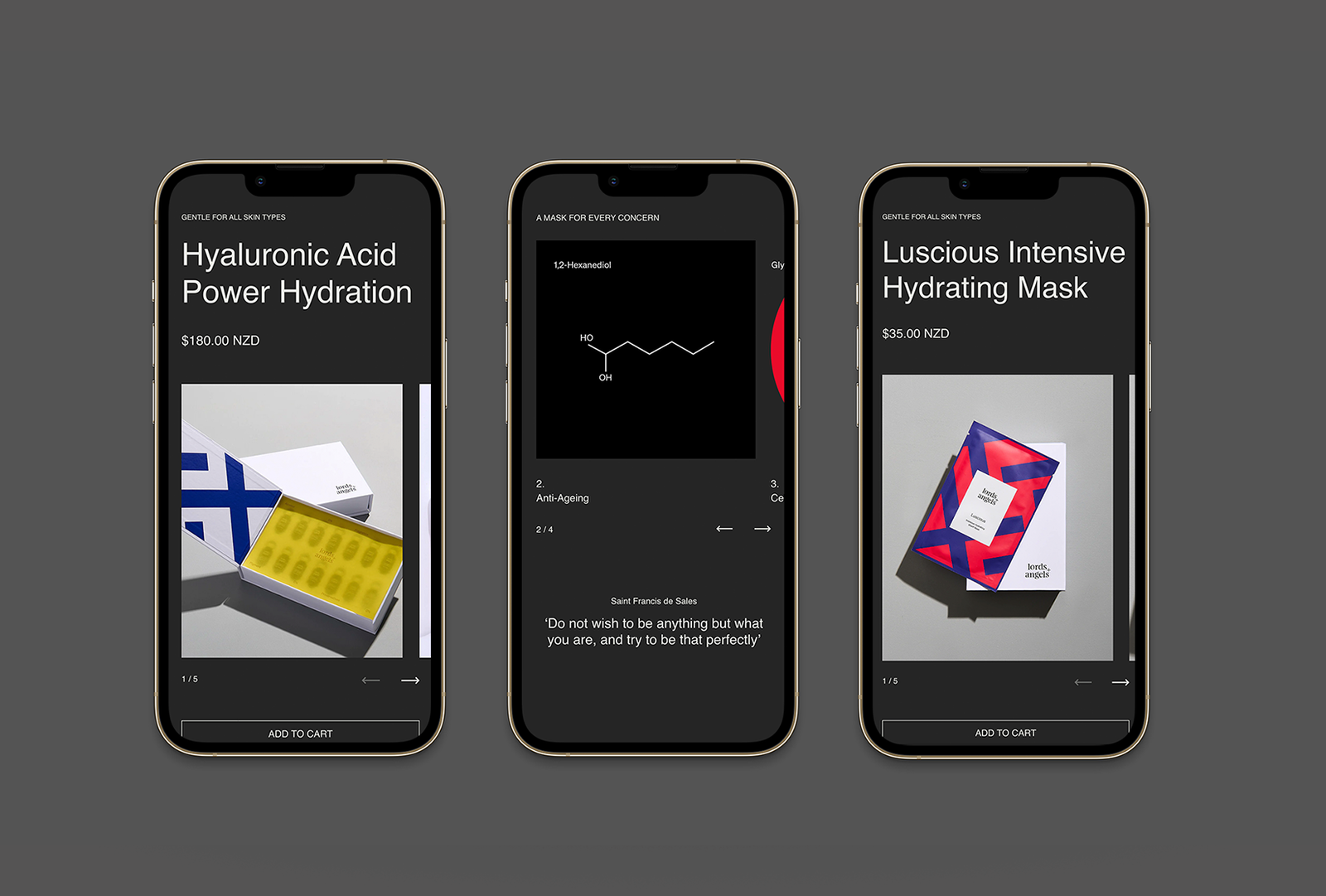
Digital Design
Photography
UX / UI
Shopify E-commerce
Website Development
Brand Purpose
Naming
Brand Story
Brand Design
Visual Identity
Packaging Design
Digital Design
Photography
UX / UI
Shopify E-commerce
Website Development
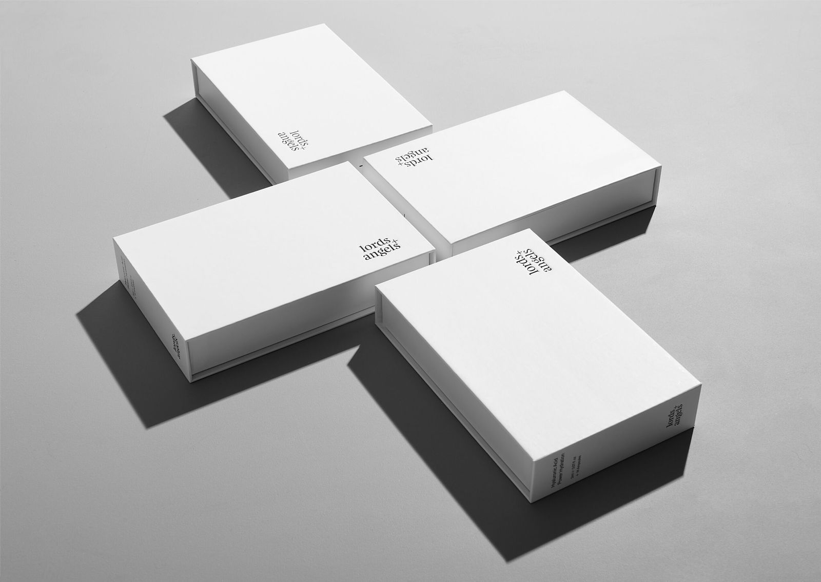
Charisma and personality shine through the minimalism design, and colour creates an enjoyable brand experience with style, personality and purpose.

Related Projects
Contact Redfire
+64 9 3585692
hello@redfiredesign.co.nz
Design Services
Copyright © 2000- 2026 Redfire
All rights reserved.


