Family Office Branding & Communications
CLIENT: Reddy Group
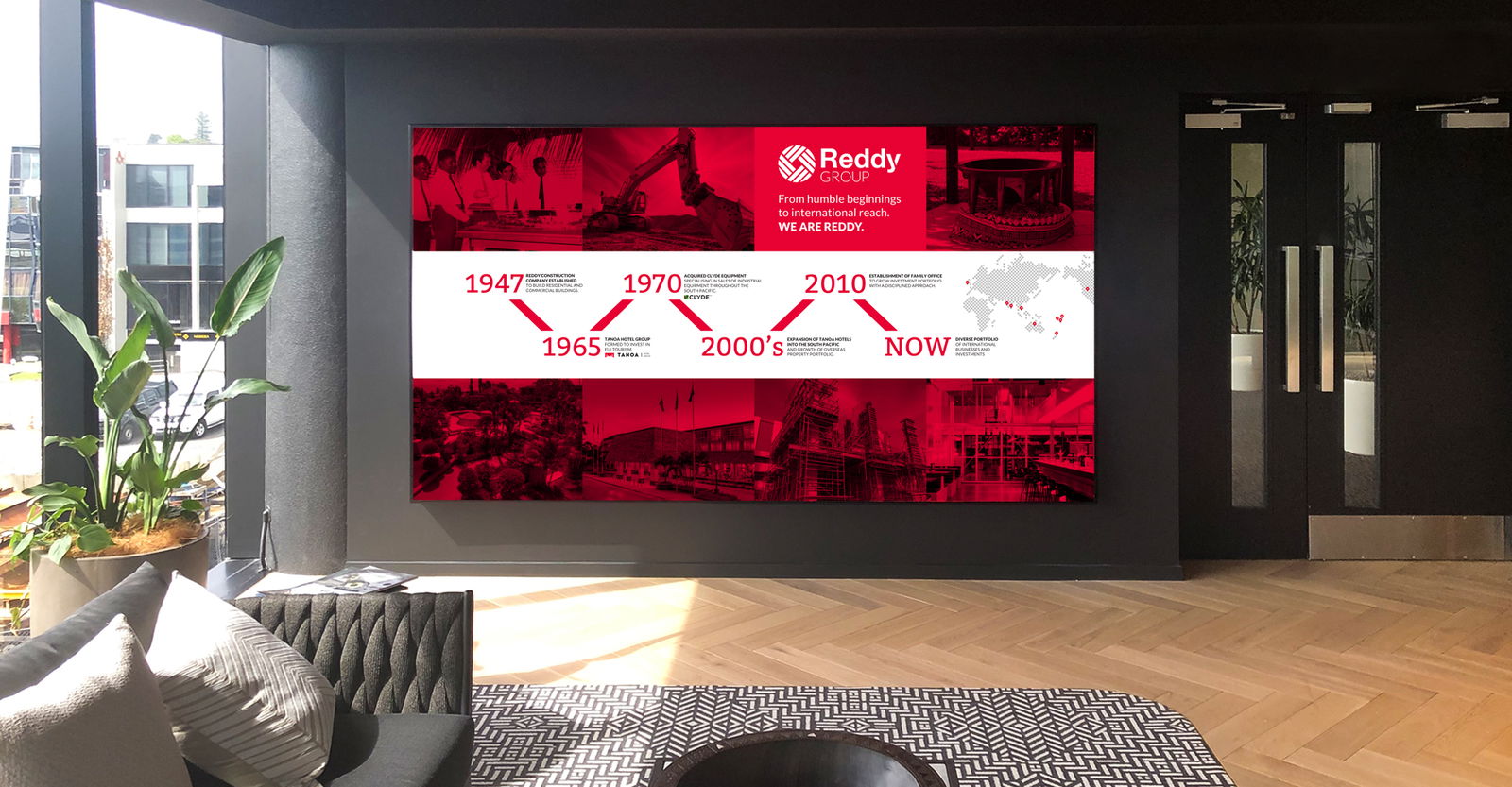
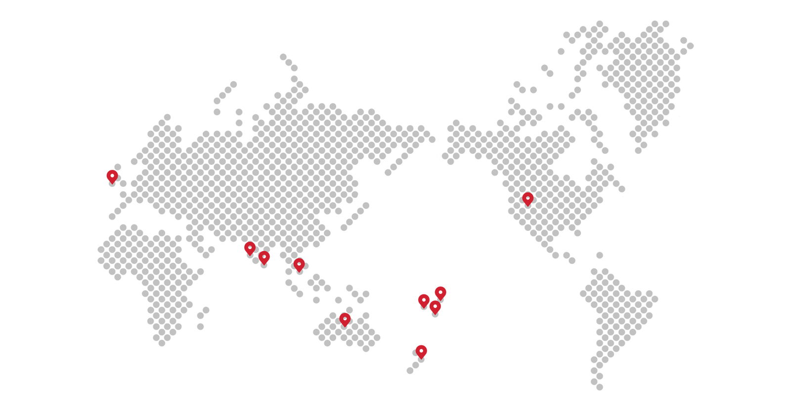
We refreshed the brand identity for Reddy Group - a thriving, entrepreneurial, privately held family business with a diverse global portfolio. This includes hotel investment, hospitality, education, construction, engineering equipment, retail, financial services, insurance and real estate.
READ MORE
This was the first significant change to the brand since Reddy Group was established. The update coincided with the launch of their global strategy and signified a strategic shift as they prepared to embark on growing their portfolio globally, over the coming years.
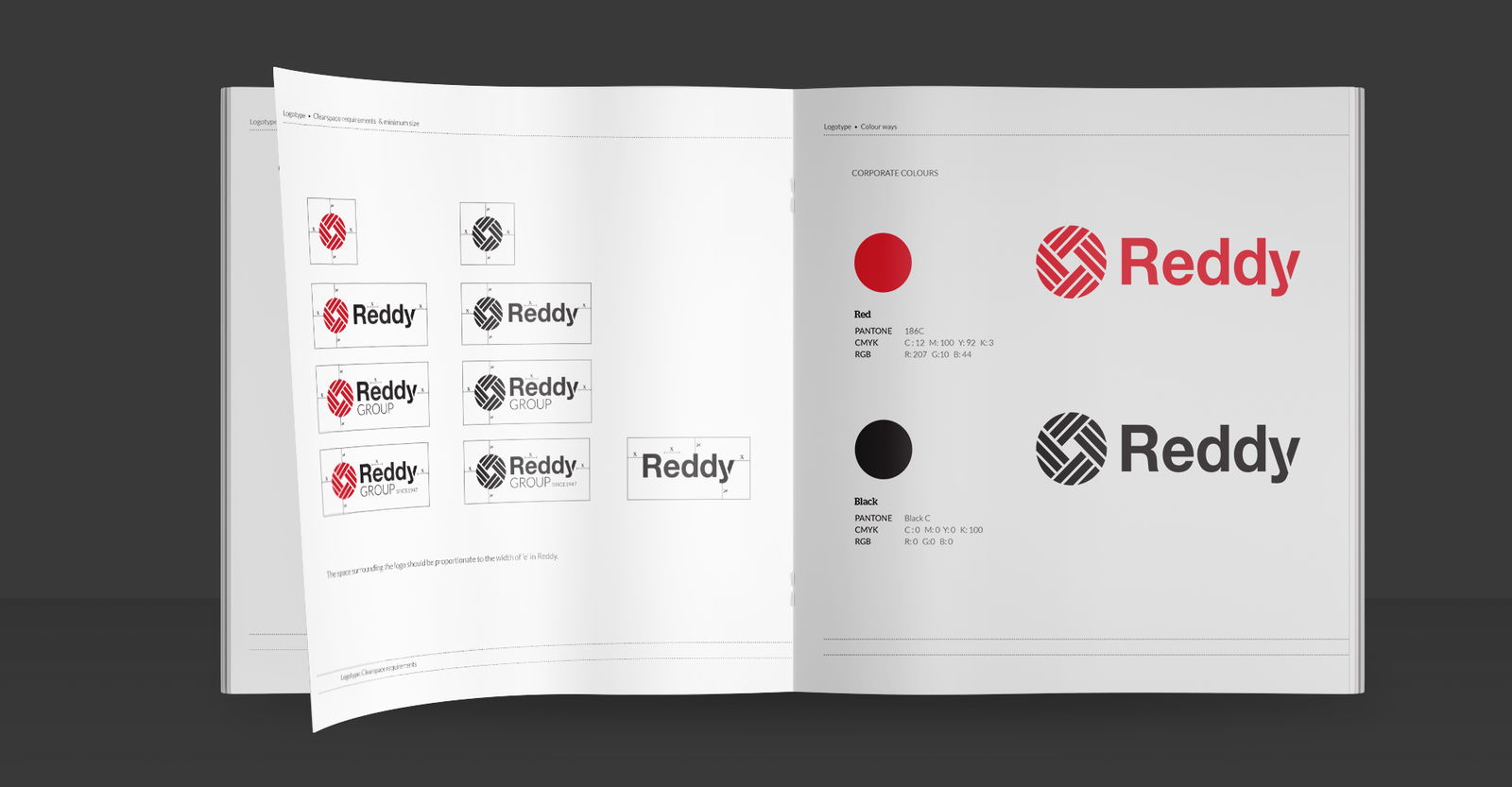
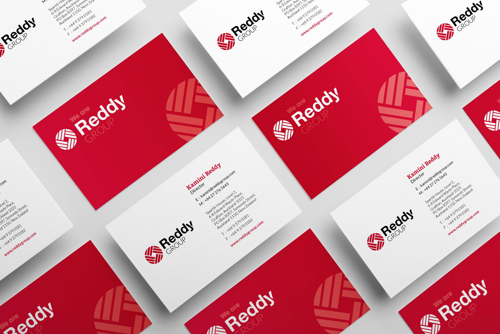
The refreshed logo is more straightforward and more flexible than what preceded it. The design is neatly visualised with a monogram - a global ball housing a network of weaves, reflecting partnerships that were derived from the stylised Y in the wordmark.
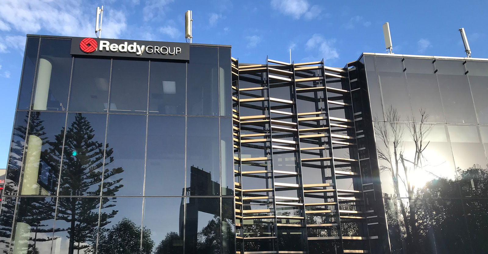
"We are Reddy" was crafted as a catch call and of course, the identity appears in red. The logo design was optimised to work across various platforms and scales from digital phones through to the side of a building. It is distinctive, bold, confident, clean and easily read.
WHAT WE DID
Visual Identity
Branding
Brand Guidelines
Corporate Collateral
Environmental Branding
Website Design
Branding
Brand Guidelines
Corporate Collateral
Environmental Branding
Website Design
Related Projects
Contact Redfire
+64 9 3585692
hello@redfiredesign.co.nz
Design Services
Copyright © 2000- 2025 Redfire
All rights reserved.


