
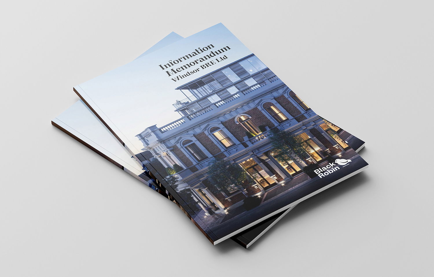
Premium Property Marketing & Branding
CLIENT: Black Robin
We created a bold, modern brand identity for Black Robin, a startup set on redefining property investment through an innovative wholesale investor model. Entering a crowded and competitive space, they needed more than just a logo - they needed a brand that could convey trust, expertise, and fresh thinking from day one.
Our solution was a strategic and striking brand built around the Black Robin - a rare, resilient bird native to New Zealand. This symbol became the heart of the identity, representing perseverance, adaptability, and bold confidence - values that align perfectly with Black Robin’s approach to investment.
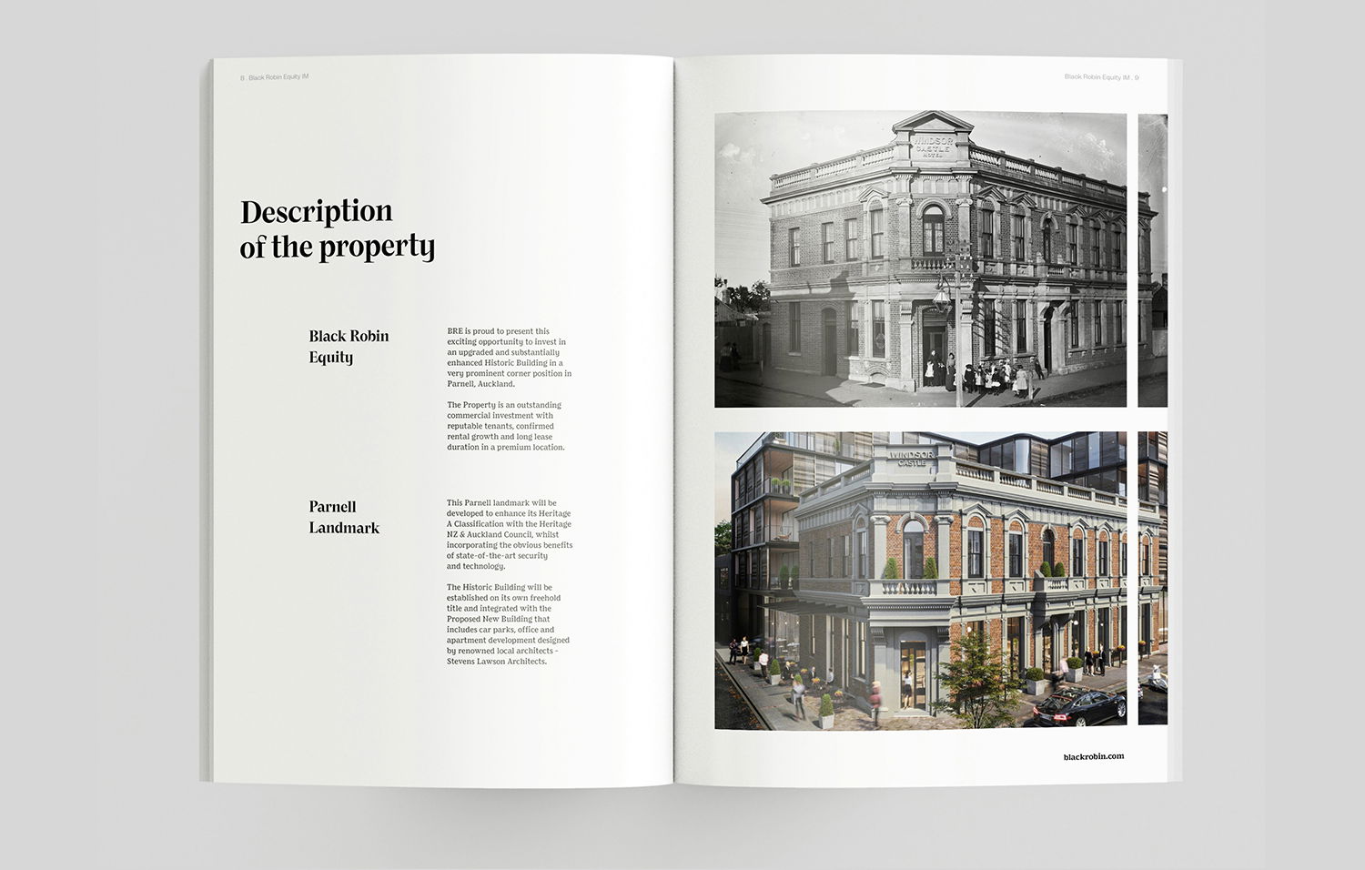
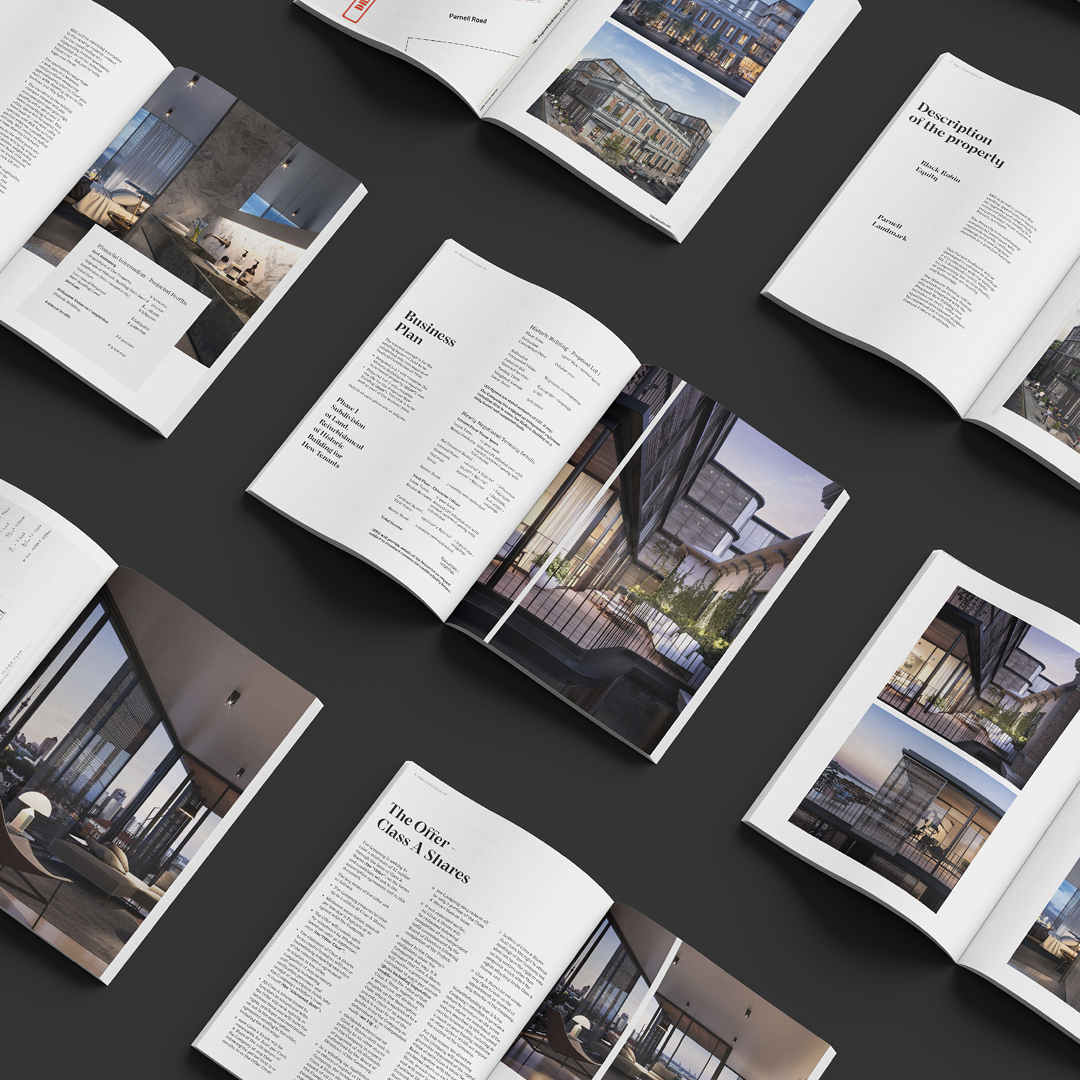
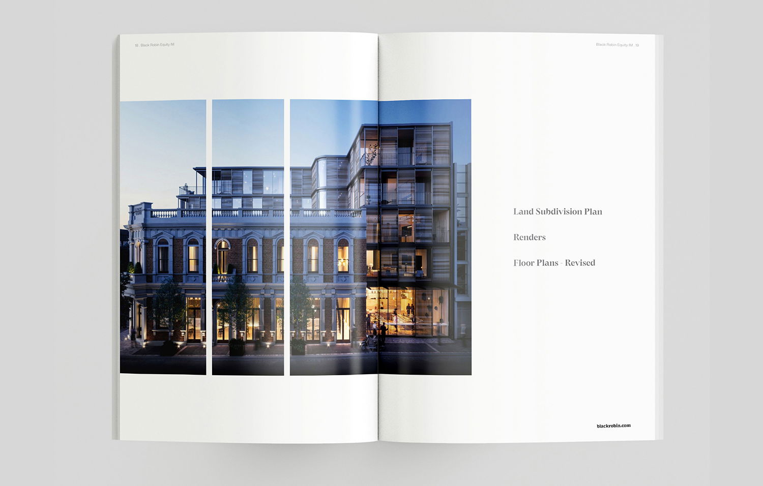
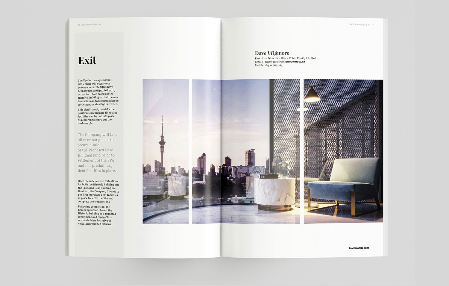
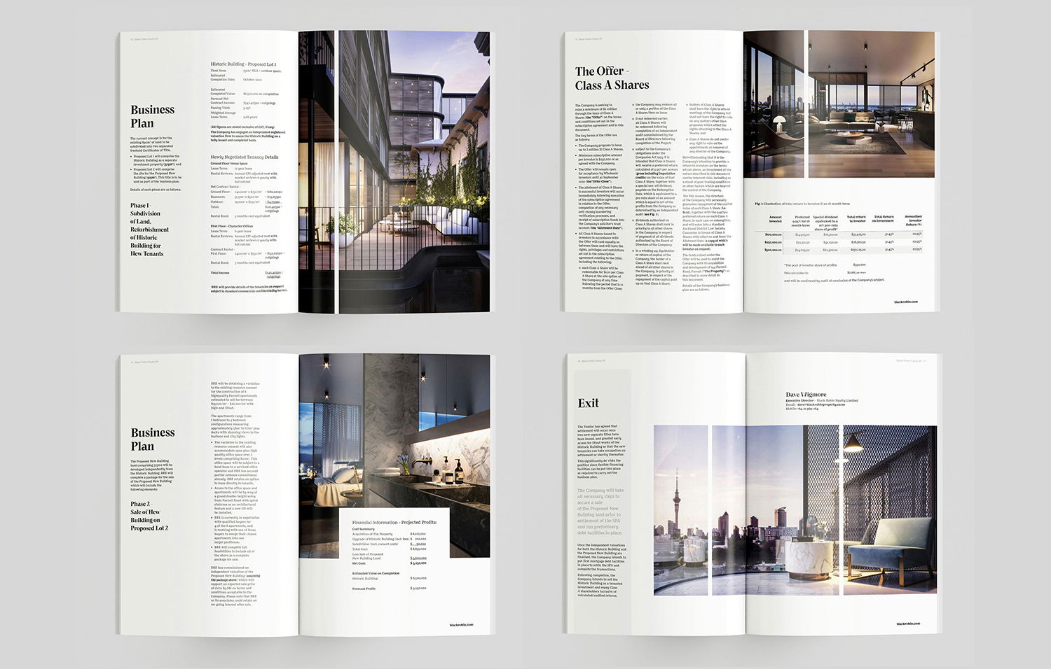
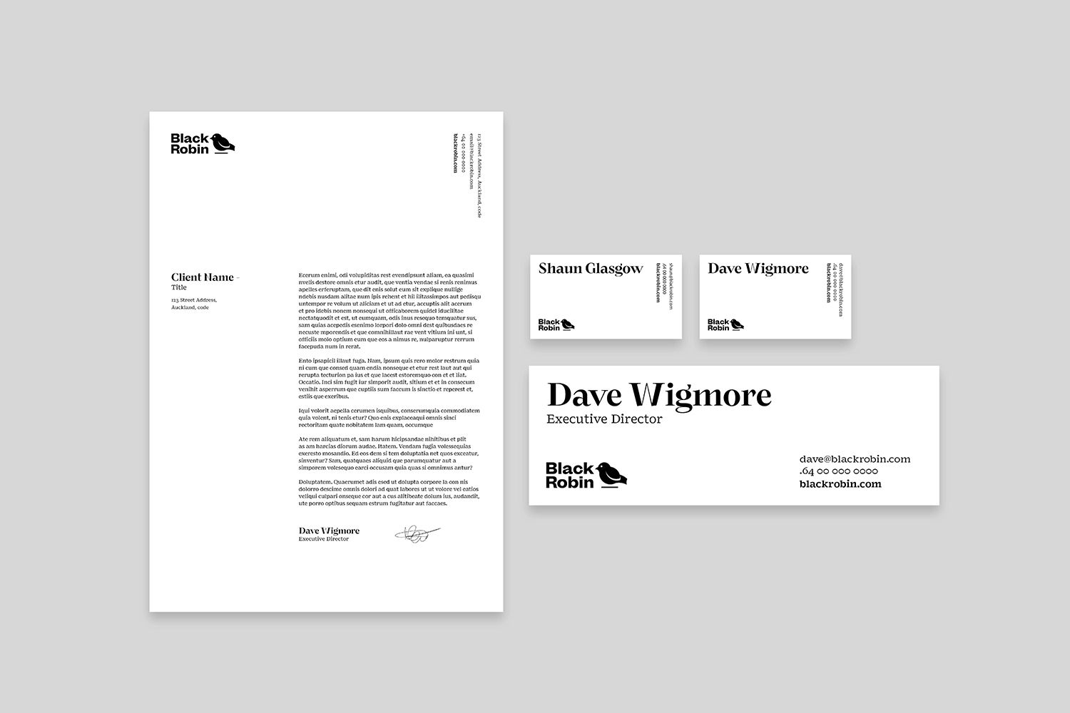
We delivered a premium property marketing strategy supported by confident typography, refined art direction, and a suite of professional corporate collateral — all designed to attract serious investors and communicate credibility. Every touchpoint, from logo design to pitch decks and digital assets, was crafted to project clarity and trust in a high-stakes financial environment.
The result? A powerful visual identity that elevates Black Robin above traditional investment brands and positions them as a future-focused player in the property sector.
Looking to build a brand that stands out in the property or investment space? Let’s talk.
Visual Identity
Visual Communications
Corporate Collateral
Marketing Collateral


Related Projects
Contact Redfire
+64 9 3585692
hello@redfiredesign.co.nz
Design Services
Copyright © 2000- 2025 Redfire
All rights reserved.


