

Brand Strategy & Positioning
CLIENT: Home Essentials
You know when you walk into a shop, glance at the shelves, and just… feel nothing? That was Home Essentials before we got our hands on it. Functional? Yes. Memorable? Not so much. So, we set out to change that.
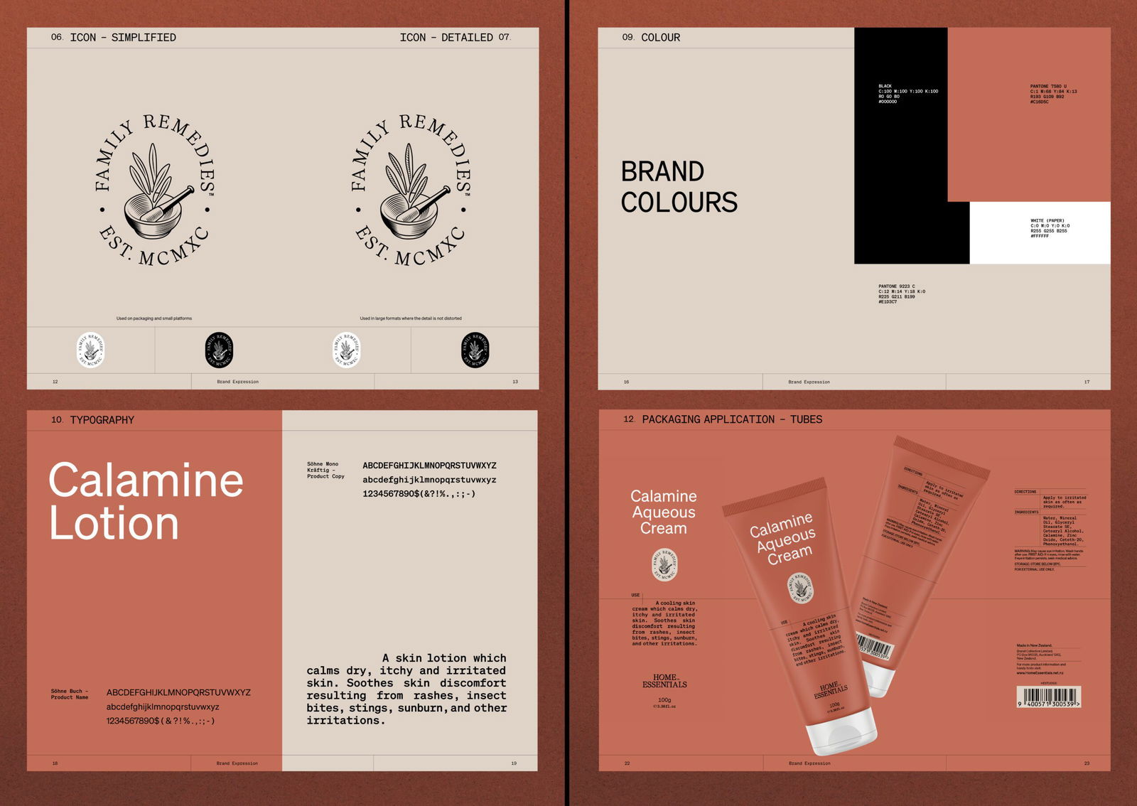
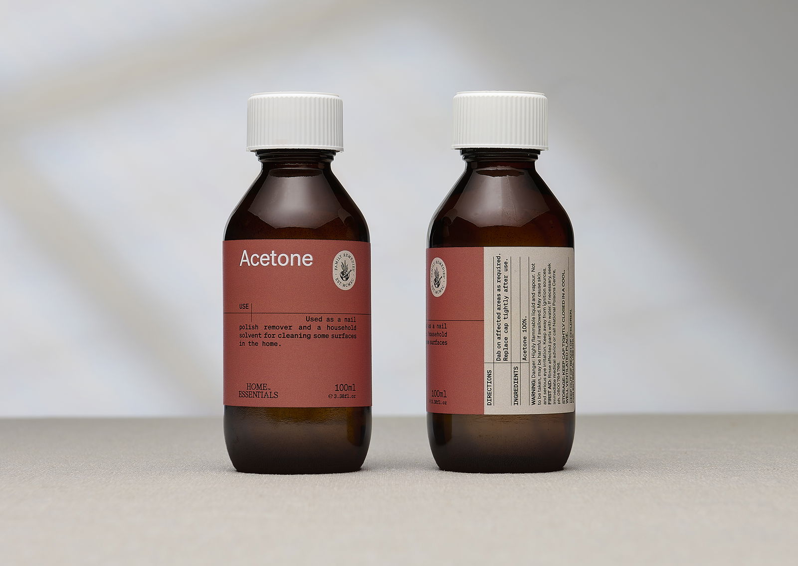
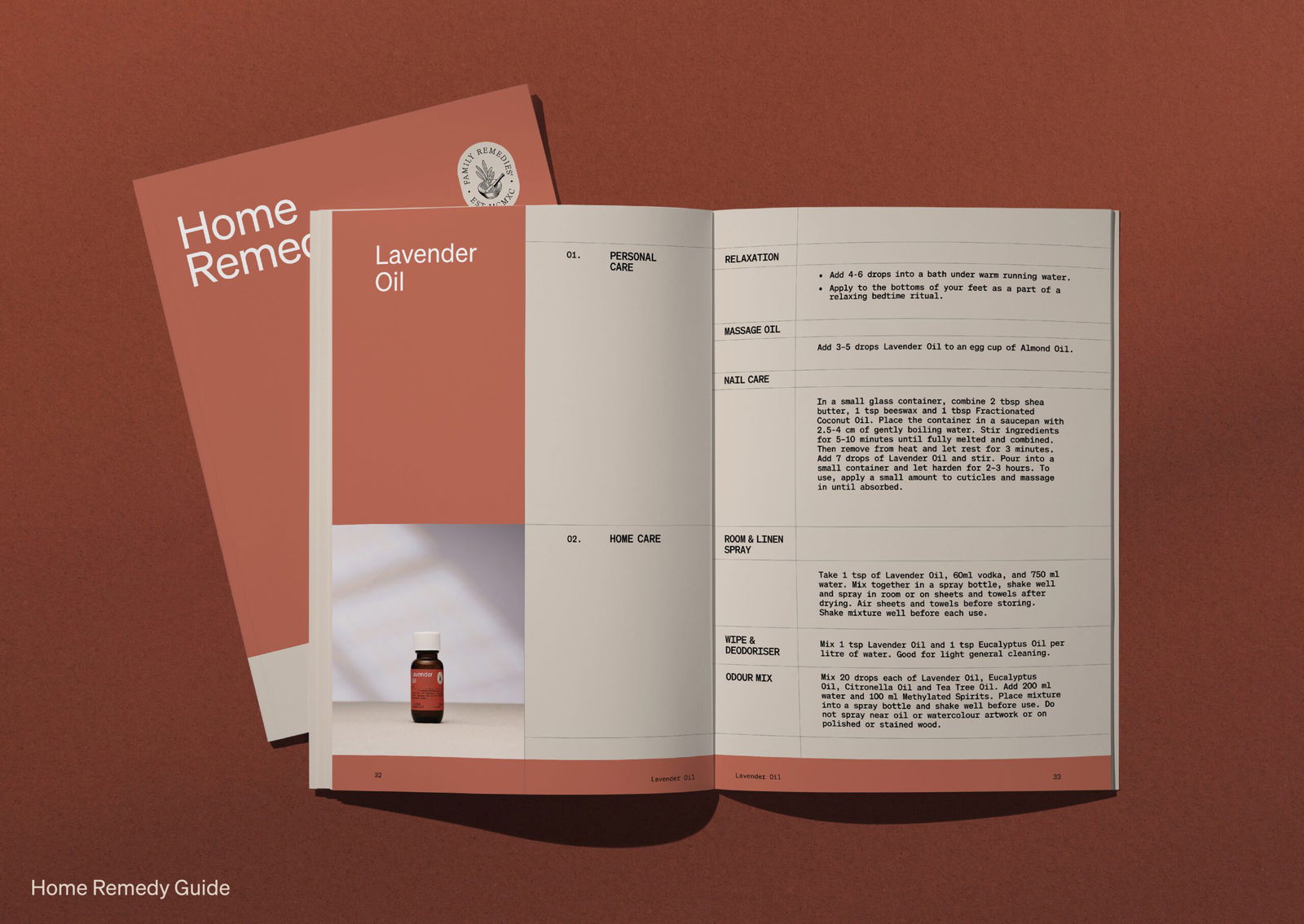
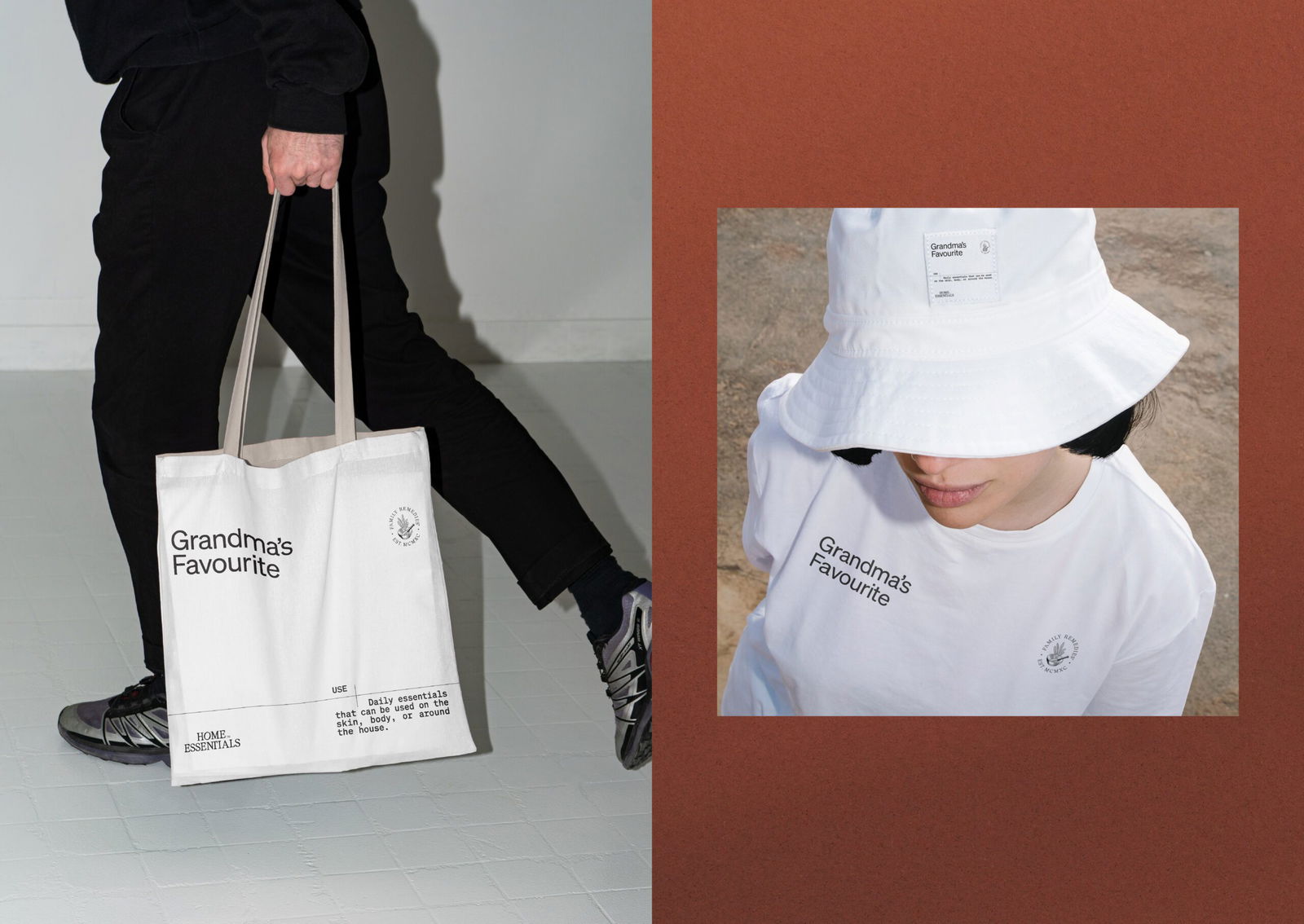
We tackled everything—brand strategy, packaging design, tone of voice, and visual guidelines—all to make Home Essentials feel fresh, cohesive, and impactful. The goal? Packaging that grabs attention on-shelf and a brand story that actually connects with people.
And speaking of roots, we made sure to keep the iconic mortar and pestle—just refined it a little so it’s crystal clear on every package, no matter the size. The whole rebrand is about simplicity, clarity, and impact. Home Essentials isn’t just another household brand anymore—it’s one you actually want in your home.
From strategy to full brand activation, we’ve turned Home Essentials into a brand that doesn’t just sit on the shelf—it stands out.
Want to see the magic for yourself?
The rebranding effort streamlined Home Essentials' visual identity, honing it to a simplified version that's easily recognisable even on smaller product formats. The mortar and pestle icon, a symbol of the brand's roots, was kept and refined to ensure maximum clarity and impact on all packaging applications.


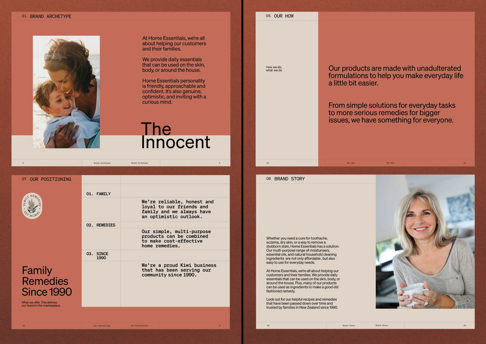
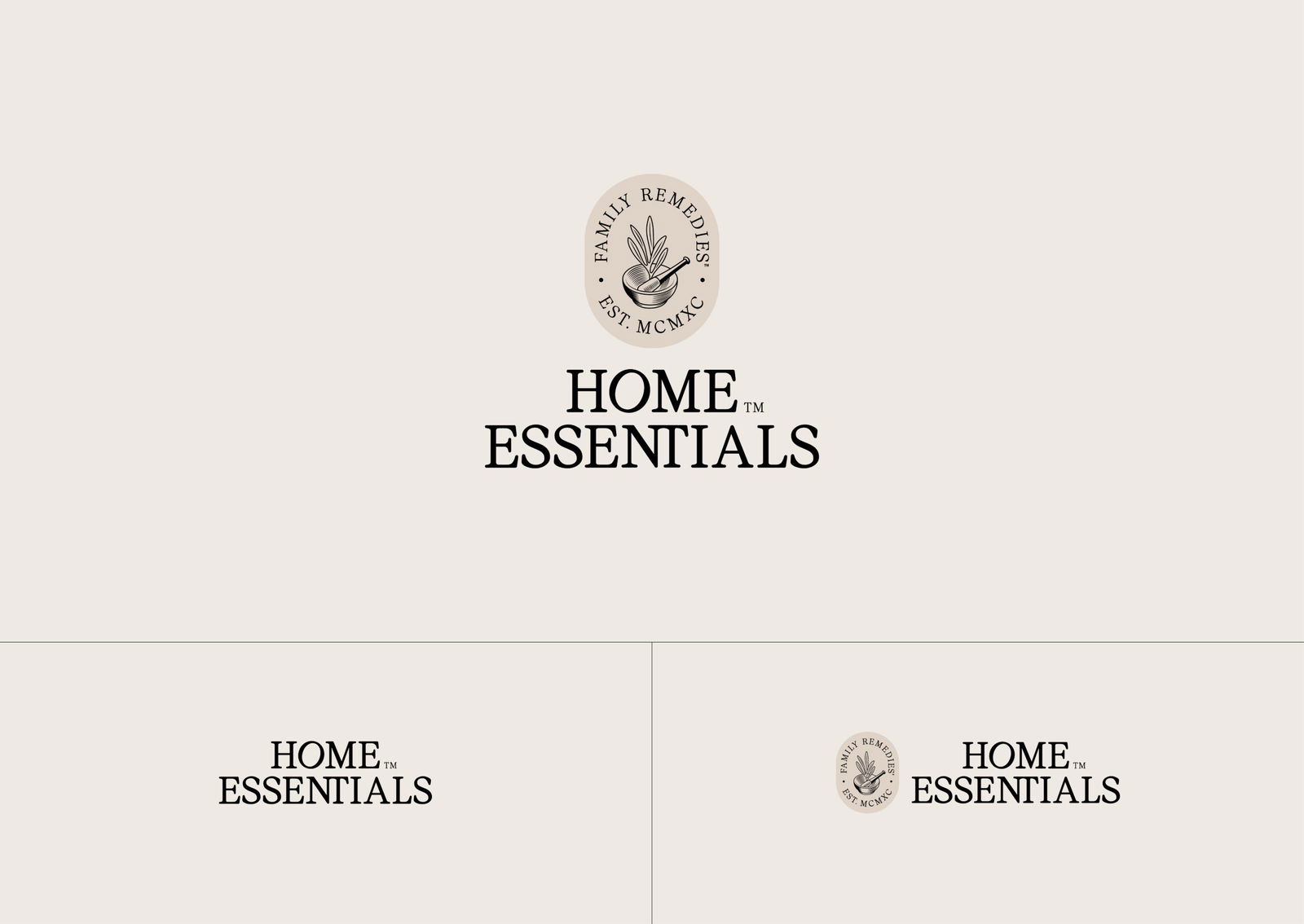

The rebranding effort streamlined Home Essentials' visual identity, honing it to a simplified version that's easily recognisable even on smaller product formats. The mortar and pestle icon, a symbol of the brand's roots, was kept and refined to ensure maximum clarity and impact on all packaging applications.





Related Projects
Contact Redfire
+64 9 3585692
hello@redfiredesign.co.nz
Design Services

Copyright © 2000- 2025 Redfire
All rights reserved.


