If you want a tasty drop, try this.
May 4, 2016 — Comments are off for this post.
Packaging Design: Ariki
April 12, 2016 — Comments are off for this post.
Re-establishing Brand Relevance
Brands are like us, they grow, change, and age. But they're different in that they can be reinvented, refreshed and reinvigorated or even re-positioned.
A key challenge is to ask yourself how relevant your brand is to your audience. If this audience or consumer segment is diminishing, sometimes prevalent in stagnant or dropping sales, then this may be the opportunity to re-establish brand relevance for a growing segment or larger consumer audience.
It's more than just a new brand logo, new website or packaging. Re-establishing brand relevance involves a holistic approach to brand building. It's about understanding the gaps or opportunities within your markets, understanding how purchasing decisions are made, knowing where to engage with customers, and then developing a story and communication strategy to to emotionally engage.
We recently worked with a company that owned two of NZ's largest travel and tourism training schools. One with 30 years heritage and the other 20. Both schools offered very similar programs, to the same students and at the same costs. We were challenged to merge this and choose one name to take them forward. Which name should they go with and/or if changed, we needed a damn good strategy to convince them that change was required.
There the New Zealand School Of Tourism was born. The name and brand strategy established their position as New Zealand's preeminent school for a career in travel or tourism. It reflected their size with 9 campuses throughout NZ and the position of being a brand leader.
Our research gave us deep insights into the target audience, predominantly female 16-19yrs old who were not going to go University, but wanted a qualification that would prepare and make them work ready...world ready.
Redfire re-established their positioning and gave more brand relevance to their student audience. They have enjoyed significant success since the re-brand and both student acquisition and retention has been outstanding.
April 7, 2016 — Comments are off for this post.
Inspirational quote to live by…
"If you can't explain it simply, you don't understand it well enough." - Albert Einstein
We love this quote and it forms a foundation in how Redfire works. We find the sense out of nonsense.
March 31, 2016 — Comments are off for this post.
There’s more to do in Vanuatu!
Loving this editorial on Vanuatu, just makes you want to travel and go visit. Coupled with our advertising campaign below - it speaks for itself; there is literally so much more to do in Vanuatu.
March 18, 2016 — Comments are off for this post.
Branding: Irvine
Irvine international carpet & flooring holds a huge share of New Zealand’s flooring market. We refreshed their brand with outstanding combinations of type, colour, imagery and smart language. Splashes of colour and bold brand language make a striking statement about their point of difference in the market
March 16, 2016 — Comments are off for this post.
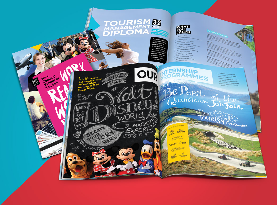
Brochure Design: New Zealand School of Tourism
New Zealand School of Tourism is the largest private tertiary establishment specialising in training programs for the airline, travel and tourism industries. We designed their new prospectus brochure to capture the attention and imagination of a very young market segment, using bright colours and energetic layouts.
March 7, 2016 — Comments are off for this post.
Jason oozing style and design
Just visited the Auckland Home & giftware show today and gotta say we love our friends at Jason. Stylish and inspirational.
Let's go shopping.
March 3, 2016 — Comments are off for this post.
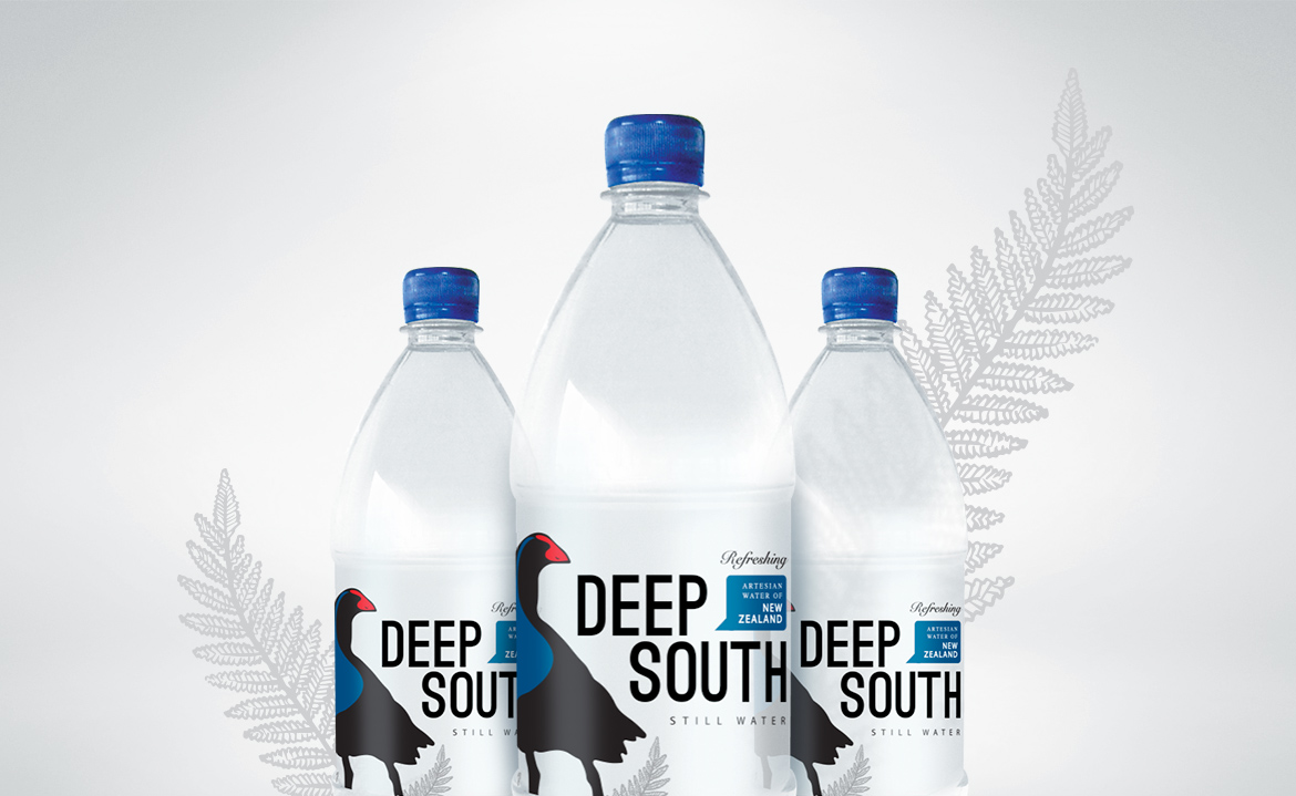
Packaging: Deep South Water
Sourced and bottled in the Cantebury Plains in the South Island of New Zealand Deep South Water wanted branding that would say “100% pure New Zealand” without actually saying it. We used bold condensed type, an illustration of the Pukeko bird (the colour palette was derived from its plumage) and emotive shots of New Zealand’s Southern Alps to make a confident, sophisticated brand system.
February 25, 2016 — Comments are off for this post.
Branding: Commit
Commit is a multi-faceted communication services company specialising in the design, installation and management of integrated communication networks. Redfire Design helped Commit to articulate their purpose and direction under their new ownership. The logo had to be adaptable to work across their many marketing platforms and graphic devices were created to give strength and visual clues. We designed and developed a responsive website to bring them into the mobile era.
February 21, 2016 — Comments are off for this post.
Brand Strategy: Ariki
Ariki is an ambitious and inspirational new player with a Polynesian heart, looking to reach a global audience. Redfire Design crafted this premium spirit brand with love; we didn’t want Ariki to be a stereotypical “sun, sea, sand and palm trees” brand, but one that acknowledges its heritage while exuding the sophistication, class, taste and flavors that please discerning spirit drinkers.
We are a creative agency for challenger brands, specialising in strategy and design across all platforms.


