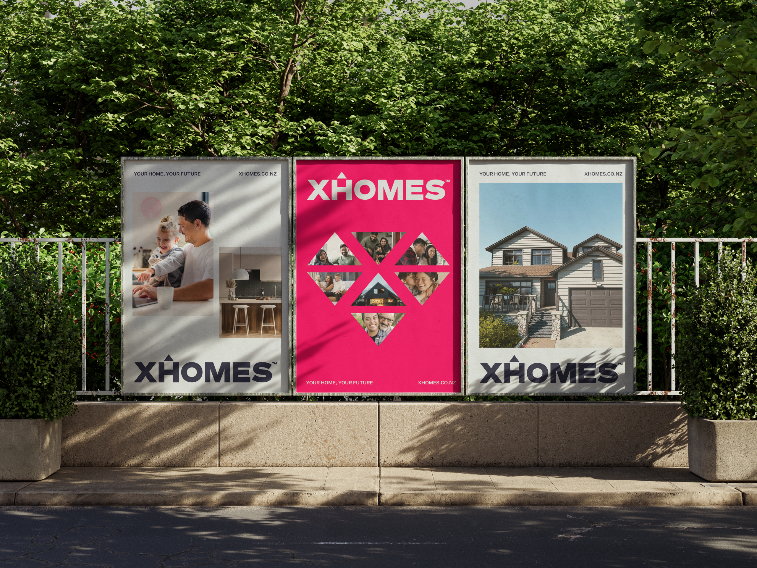
XHOMES property OOH brand marketing by Redfire

Creating a property brand built to win investor and renter confidence.
 

CLIENT: XHOMES

INDUSTRY: Property development and residential housing

CATEGORY: Residential development, rental homes, property management and modular building

PRIMARY AUDIENCE: Property investors and capital partners, residents, and community stakeholders

MARKETS: New Zealand.

THE RESULT:  Investor funds grew more than tenfold.

REDFIRE INVOLVEMENT: Brand strategy, brand manifesto, visual identity, brand guidelines, visual communications guide, photography art direction, and rollout across signage, construction hoardings, social, marketing collateral and stakeholder engagement material.


XHOMES set out to build a property brand that investors could back with confidence and families could trust with their home.

In property, the brand has to do its hardest work before the buildings exist. Capital is raised on a vision. Tenants commit to plans. Communities form a view from the hoardings going up on their street. Without a clear, credible brand, every one of those conversations starts from scratch.

Redfire built XHOMES from strategy through to street level. We developed the brand strategy and manifesto, designed the identity, wrote the brand guidelines and a detailed visual communications guide, then rolled the brand out across every touchpoint: signage, construction hoardings, social, marketing collateral and stakeholder engagement material.

Since launch, investor funds have grown more than ten times over.

PROJECT AT A GLANCE
The challenge
Build one brand credible enough for investors, warm enough for residents and clear enough for the wider community, while the development was still being built.
 
The insight
Investors, residents and communities all want the same three things from a development: security, reliability and confidence in the long term.
 
The strategy 
Position the brand around the relationship between everyone with a stake in the development. Then make it consistent at every touchpoint, from the investor deck to the site fence.
 
What Redfire did
  • Brand strategy and positioning
  • Brand manifesto
  • Visual identity, including the Unity Heart brand mark
  • Graphic devices and photography style
  • Brand guidelines
  • Visual communications guide
  • Signage and construction hoardings
  • Social and digital
  • Marketing collateral
  • Stakeholder engagement material
  • Website
 
The outcome
Investor funds up more than tenfold, and one brand system working across every audience and every phase.
THE CHALLENGE
Many stakeholders. One brand. 
 
XHOMES operates four business lines under one name: building homes, renting them, managing them for owners, and supplying modular second dwellings to investors.
 
Every line has its own audience asking its own question. Investors want to know whether their capital is in safe hands. Residents want to know whether this is a good place to live. Councils and neighbours want to know what the development means for the area.
 
The brand had to answer all three at once. And it had to hold together as the business grew, without needing a new identity every time a new line or stage came along.
THE INSIGHT
Everyone with a stake wants the same thing.
 
Investors want stable returns, good tenants and an asset that holds its value.
 
Residents want security and somewhere they can put down roots.
 
Communities want development that adds something and is built to last.
 
Underneath, the requirement is the same: security, reliability and the long term. That shared ground became the brand's foundation, and it let XHOMES speak to every audience from one position.
 
THE STRATEGY & MANIFESTO
Built around the relationship.
 
We positioned XHOMES around the relationship that makes a development succeed, with investors, residents and the developer working towards the same outcome.
 
The brand manifesto turned that position into a statement of belief and behaviour. It gave leadership, staff, partners and suppliers one reference point for how XHOMES speaks and acts, whether the conversation is a tenancy agreement or a capital raise.
 
The promise underneath it: Your home, your future.
THE IDENTITY
The Unity Heart.

We designed the Unity Heart to carry the strategy in a single mark. It's a heart built from triangles, representing the three stakeholders every XHOMES home depends on: the investor, the resident and XHOMES itself.
 
The triangles carry through the whole system. They form a diamond frame for photography, a set of graphic devices and patterns, and a visual language that scales from a social tile to a large-format hoarding. Photography was art directed to show real life in the homes, giving investors a picture of a well-built asset that people want to live in.
 
The result is an identity with an idea behind it, and one that can stretch to new business lines and future stages without losing coherence.
GOVERNANCE
Guidelines built for the people who apply them.
 
A property brand gets applied by many hands: builders, signwriters, property managers, marketing teams, printers and partners. If the system isn't clear, it breaks down on site.
 
We built comprehensive brand guidelines covering identity, colour, typography, graphic devices, photography and tone of voice. Alongside them sits a detailed visual communications guide showing how the brand comes to life in every format and channel. It gives every supplier and future consultant the same playbook.
THE ROLLOUT
From the site fence to the investor table.

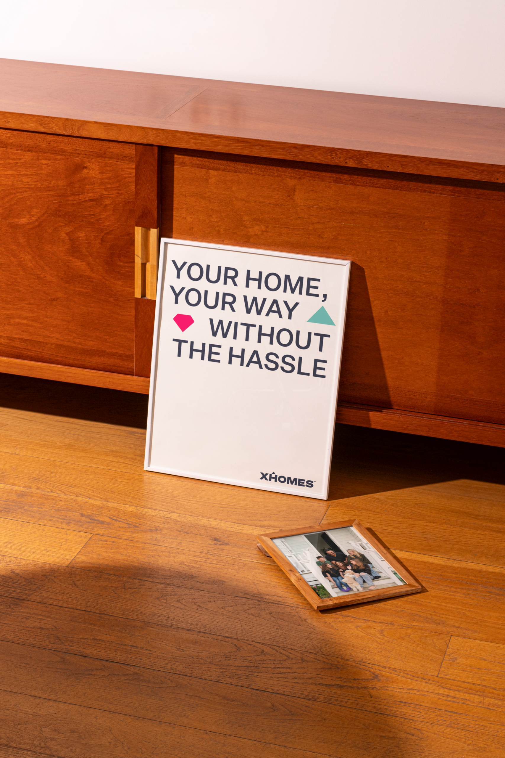
Construction hoardings and signage are often a community's first contact with a development, and they stay up for months. We designed them to tell people what's coming and why it matters.

 
The same system then carried through social, marketing collateral, the website and stakeholder engagement material. Investor-facing and resident-facing communications shared one voice and one visual language. That was deliberate. When every audience sees the same brand making the same promise, each has more reason to believe it.
THE RESULT
Confidence that turns into capital.
 
XHOMES now has a brand that investors back, residents trust and communities recognise.
Since launch, investor funds have grown more than ten times over.
 
In property development, confidence comes before construction. A brand that gives every stakeholder the same clear, credible reason to believe is a commercial asset, and XHOMES's growth shows it.
XHOMES-Branding_Strategy_Design by Redfire
XHOMES_branding_Design by Redfire
XHOMES-Property_Marketing_by Redfire
XHOMES_Tote BAG_Design by Redfire

Related Projects

Purity-3D-Thumbnail
Branding and Packaging Design New Zealand - Redfire
REDFIRE_caroll's_responsive_website_design_designagency_digitaladvertising
redfire-Subandtartic-Packaging-skincare-thumbnail
Contact Redfire
Design Services
Redfire_26 years of creativity

Copyright © 2000- 2026 Redfire

All rights reserved.

Back to top Arrow