REDFIRE_altmeatco_branding_packaging_digital_graphicdesign_advertising_designagency

The Alternative Dairy Co.

Building a performance-led brand for the barista market.

CLIENT: Sanitarium

INDUSTRY: Food & Beverage / FMCG

CATEGORY: Plant-based barista milk

PRODUCTS: Oat, Almond, Soy and Coconut Plant-based barista milks.

PRIMARY AUDIENCE: Foodservice, baristas, cafes, & coffee drinkers

MARKETS: Australia & New Zealand.

THE RESULT:  From new brand launch to more than $80 million in sales within four years.

REDFIRE INVOLVEMENT: Strategy, positioning, naming, narrative, identity, tone of voice & packaging design


The Alternative Dairy Co. wasn't created to be another plant-based milk sitting quietly on the shelf.
It was created to win over one of the category's toughest audiences: baristas.

Sanitarium saw an opportunity to take its decades of plant-based expertise into the growing café market. But entering the category wasn't enough. To earn a place behind the espresso machine, the new brand needed to perform brilliantly, understand café culture and feel completely at home within it.

Redfire was brought in to build the brand from the ground up.
Strategy. Positioning. Naming. Brand narrative. Identity. Tone of voice. Packaging.

The result was The Alternative Dairy Co., a distinctive challenger brand built around performance, personality and an uncompromising understanding of its audience.

Within four years, the business had grown to more than $80 million in sales.


PROJECT AT A GLANCE
The challenge
Launch a new plant-based milk brand into the competitive Australian and New Zealand café market and build credibility with baristas.

The insight

Baristas don't simply choose a milk alternative. They choose a product they can trust to perform in the cup, while also reflecting the culture and expectations of contemporary cafés.

The strategy

Build a specialist café brand, not a mainstream consumer brand. Give it the confidence, language and visual attitude to belong behind the espresso machine.

What Redfire did

Brand strategy and positioning
Brand naming
Brand narrative
Visual identity
Tone of voice
Packaging design
Colour system
Iconography
Brand patterns and assets

The outcome

More than $80 million in sales within four years, with The Alternative Dairy Co. establishing a leading position in the Australian and New Zealand café market.
THE CHALLENGE
Don't look like another alternative

Plant-based milk was becoming increasingly competitive.
New brands were appearing quickly. Established dairy and food businesses were entering the category. Independent brands had built strong followings with café owners and baristas.

For Sanitarium, simply producing another good plant-based milk wasn't going to be enough.
This was a different audience, a different environment and a very different purchasing decision.

The brand had to earn credibility with people who work with the product every day.
Baristas care about how a milk stretches, textures, pours and works with coffee. Café owners care about consistency and what their customers ask for. And both operate in a culture where authenticity matters.

So we couldn't build a Sanitarium brand and simply make it look younger.
We needed to create something with its own point of view.
A genuine alternative.
THE INSIGHT
Start with the people behind the coffee

Our strategy began with a simple idea:
Baristas don't just make coffee. They create experiences.
 
That meant The Alternative Dairy Co. needed to behave less like a traditional FMCG product and more like a brand born within café culture.

It needed expertise without corporate language.
Confidence without arrogance.
Personality without becoming gimmicky.
And above all, it had to make performance central to the brand promise.

The product had been developed specifically for café use. Our job was to make that specialisation visible, memorable and meaningful.
 
That gave us the foundation for the brand:
Crafted for baristas. Made for cafés.
THE STRATEGY
Specialist by design

Rather than chasing the entire plant-based category, we positioned The Alternative Dairy Co. around the professional café channel.
 
That focus changed everything.
Instead of talking broadly about dairy alternatives, the brand could talk specifically about coffee.
Instead of presenting itself as another health or lifestyle brand, it could build authority around performance.
Instead of trying to appeal to everyone, it could earn the respect of the people whose recommendations influence thousands of coffee drinkers every day.
The strategic positioning gave the brand somewhere meaningful to stand.
Not anti-dairy.
Not another wellness brand.
Not a corporate imitation of an independent label.
 
The alternative made for café.
 
 
THE NAME
Say exactly what you are. Then own it.

The Alternative Dairy Co. gave the new business a name that was deliberately direct.
 
It clearly described the category while creating enough personality and ownership to become a distinctive brand.
 
“Alternative” became more than a product descriptor.
It became an attitude.
 
A platform for the brand's challenger mentality and a way of celebrating people who were prepared to choose something different.
 
The name also allowed the business to expand across different plant-based ingredients without becoming tied to one product or flavour.
 
Oat. Almond. Soy. Coconut.
Different products. One unmistakable alternative.
THE BRAND IDENTITY
Built to stand out behind the machine

Café counters are busy environments.
Coffee machines, grinders, cups, menus, food, people and multiple competing brands are all fighting for attention.
 
The Alternative Dairy Co. needed to be instantly recognisable.
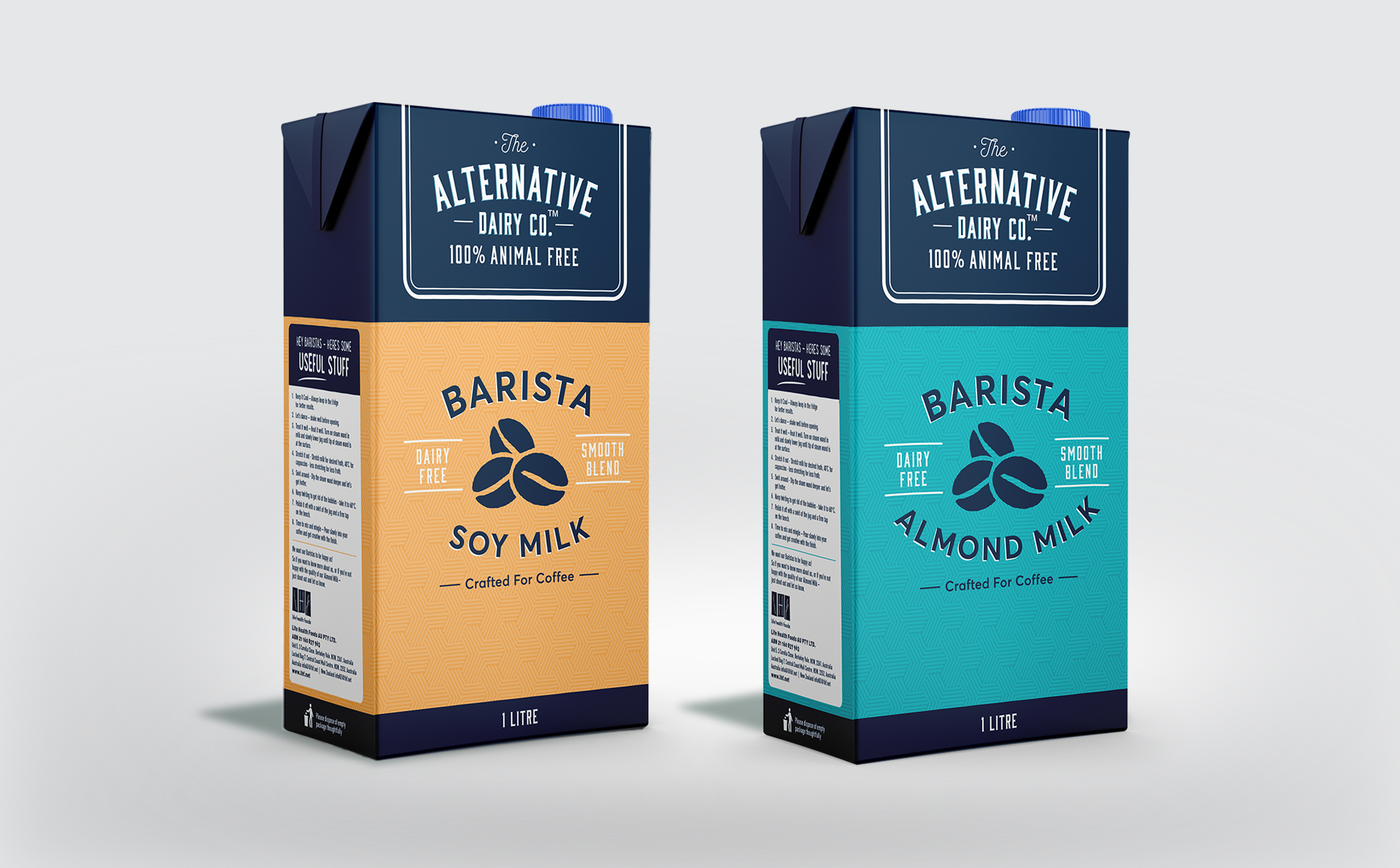
We developed a visual identity with bold typography, strong colour coding and an intentionally confident graphic language.
 
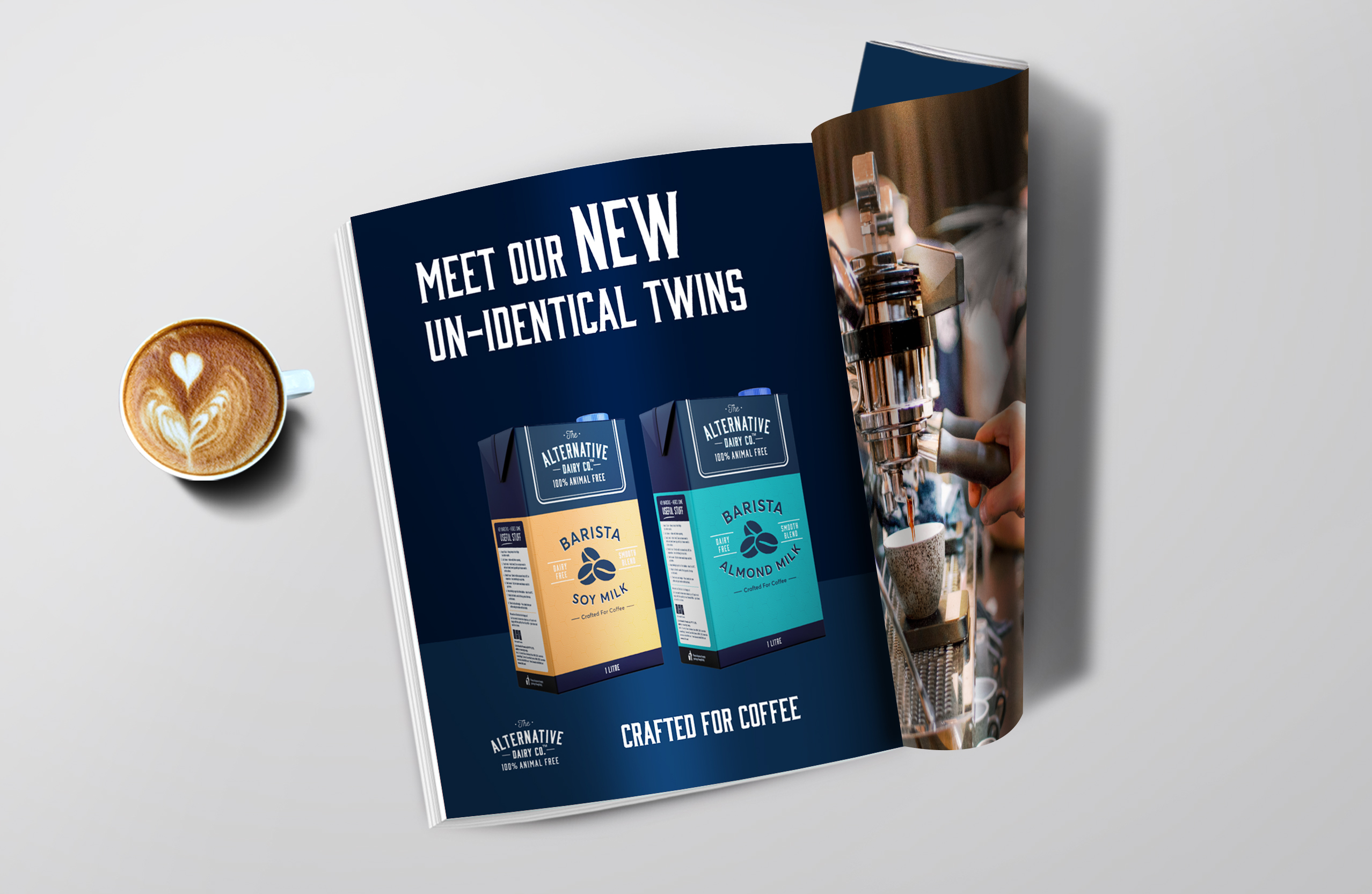
Each product could have its own personality while remaining unmistakably part of the same family. The colour palette became one of the brand's strongest assets, creating distinction across the range and giving the cartons significant visibility both behind the coffee machine and on shelf.
 
The identity was supported by a flexible family of icons, patterns and graphic elements that could extend naturally across packaging, digital, trade communications and marketing.
 
It was bold without becoming noisy.
Simple without becoming generic.
And distinctive enough to be recognised from across a café.
THE TONE OF VOICE
Speak café, not corporate

The visual identity couldn't do all the work. The Alternative Dairy Co. needed to sound like it belonged in the same world as its audience.
 
We developed a tone of voice that was direct, confident, spirited and conversational.
No unnecessary corporate language.
No preaching.
No trying too hard to sound cool.
Just a brand comfortable with what it was and why it existed.
 
That personality gave The Alternative Dairy Co. the ability to communicate naturally with baristas, café owners and coffee drinkers while maintaining enough credibility to support a serious performance-led product.
THE PACKAGING
Performance on the inside. Personality on the outside.
 
Packaging was one of the brand's most important communication tools.
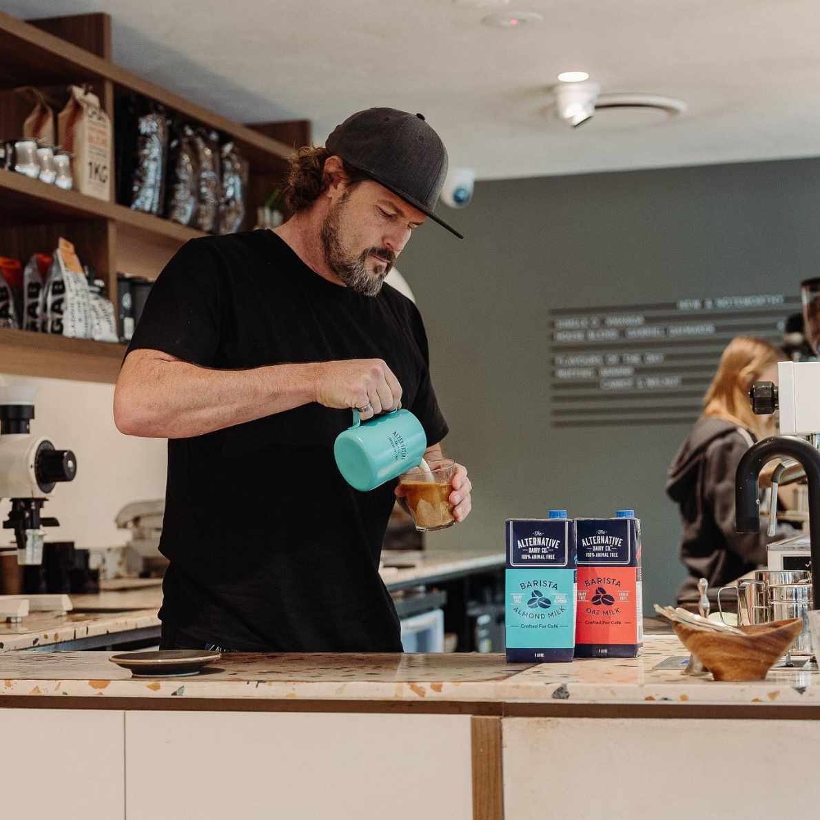
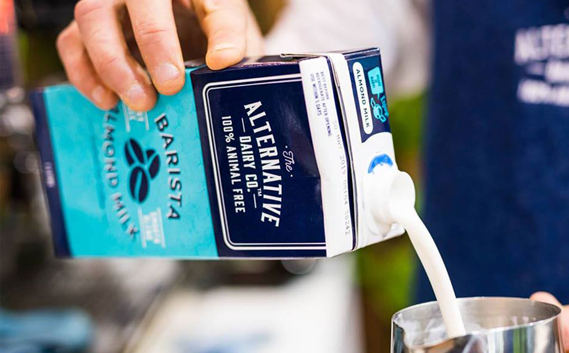
In cafés, the carton isn't hidden in a cupboard.
 
It's constantly being handled, poured and left sitting alongside some of the most recognised coffee brands in the market. So every pack had to work hard.
 
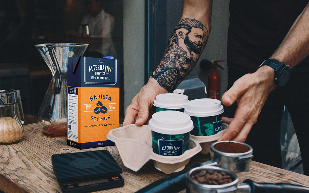
The packaging system used bold colour, clear product differentiation and a strong masterbrand presence to create immediate recognition across Oat, Almond, Soy and Coconut.
 
The design moved away from many of the predictable cues associated with dairy alternatives and created something more energetic, contemporary and ownable.
 
The result was packaging designed not simply to contain the product, but to build the brand every time it appeared on a café counter.
THE RESULT
From alternative to category leader

What began as a new brand launch in 2019 became a significant new business for Sanitarium.
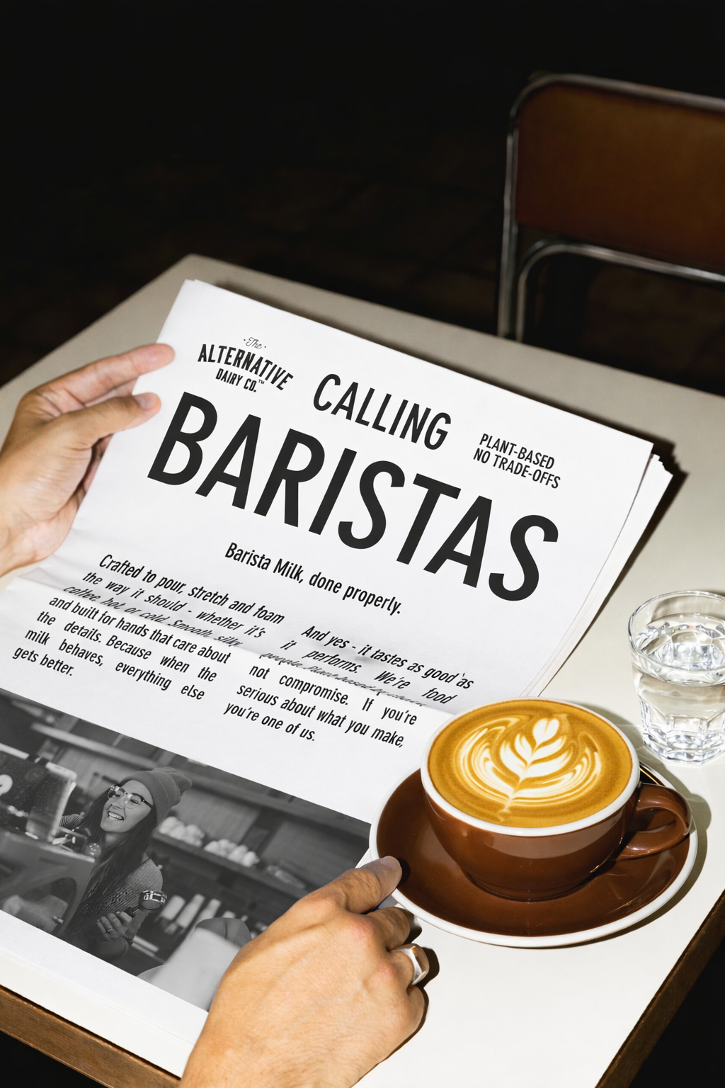
Within four years, The Alternative Dairy Co. had grown to more than $80 million in sales.
 
Independent reporting on the business has also recorded that it:
Reached #1 for Oat barista milk in Australian cafés.
Reached #1 for Oat, Almond and Soy within its category in New Zealand.
 
And the brand continues to grow its presence across café culture in Australia and New Zealand.
 
It is now poured by leading cafés and coffee businesses and has developed a community extending far beyond the original product launch.
 
For us, that is what good brand strategy should do.
Not simply make something look different.
Give a business a distinctive position it can own, build and grow from.
Calling baristas brand story 1 Small
redfire-vegan-nut-milk-marketing-nz
REDFIRE_altdairyco_photography_branding_packaging_digital_graphicdesign_advertising_web_designagency
REDFIRE_altmeatco_branding_packaging_digital_graphicdesign_advertising_designagency
redfire-vegan-almond-milk-packaging-design-nz
redfire-plant-based-milk-branding-nz
redfire-vegan-plant-based-milk-advertising-nz

Brand 
elements

REDFIRE_altdairyco_photography_branding_packaging_digital_graphicdesign_advertising_web_designagency

Logo

REDFIRE_altmeatco_branding_packaging_digital_graphicdesign_designagency

Tone of voice

REDFIRE_altmeatco_branding_packaging_digital_graphicdesign_designagency

Iconography

REDFIRE_altmeatco_branding_packaging_digital_graphicdesign_designagency

Colour

REDFIRE_altmeatco_branding_packaging_digital_graphicdesign_designagency

Pattern

Related Projects

redfire-design-chicken
REDFIRE_altmeatco_brandmarketing_photography_branding_packaging_digital_graphicdesign_advertising_brochure_designagency
Mataura-Milk-Thumbnail
THELAND-Pouches-Whole-Milk_square
Contact Redfire
Design Services
Footer Icon v2

Copyright © 2000- 2026 Redfire

All rights reserved.

Back to top Arrow