Wine branding & packaging design that tells a story in every bottle
CLIENT: Westbrook
Creating wine brands that pour personality, provenance, and premium appeal.
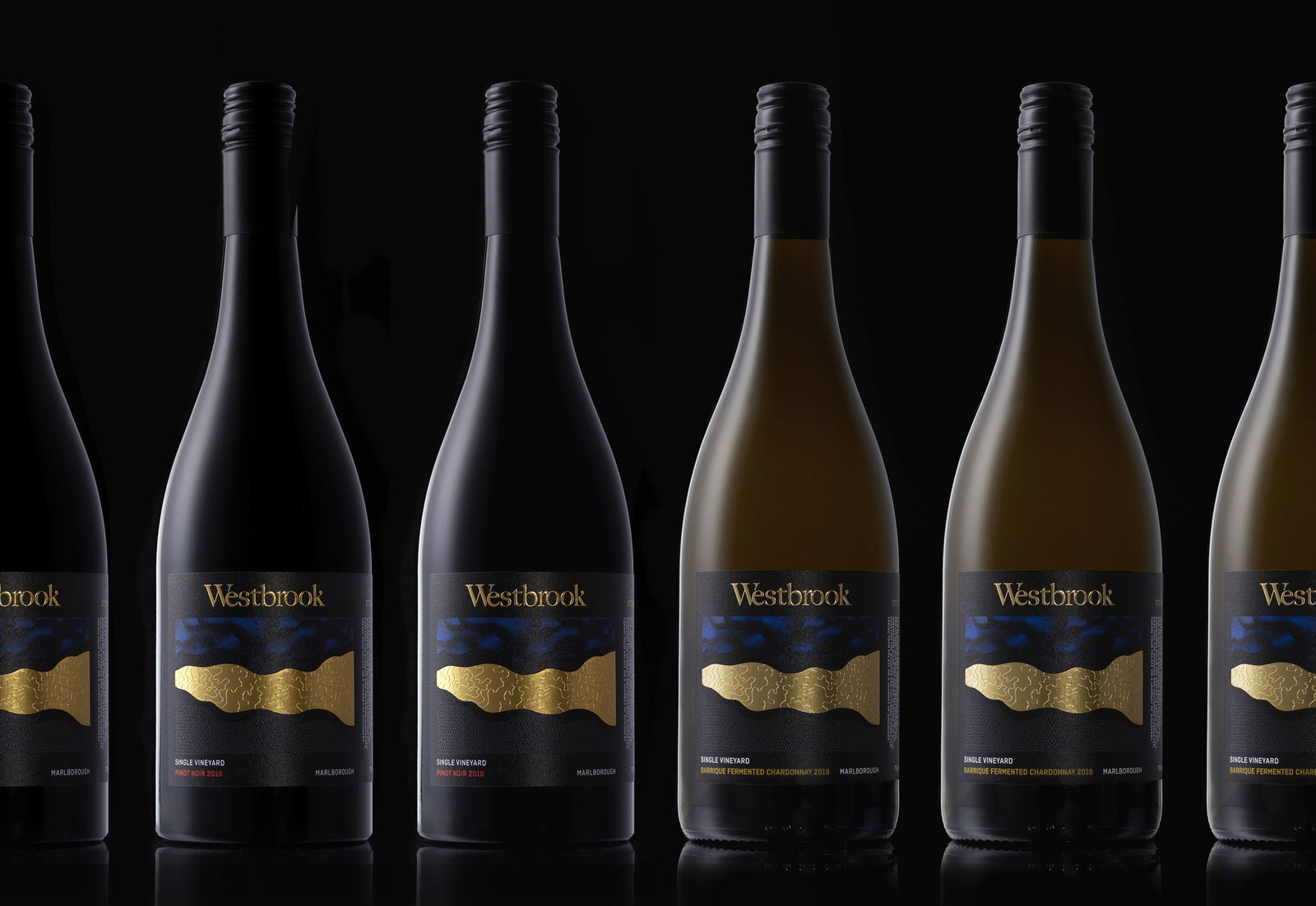
Westbrook is one of New Zealand’s most respected boutique wineries - a name with deep roots and rich heritage. When they approached us for a rebrand, they were ready to evolve. The brief? Refresh their brand and packaging with a stronger, more distinctive presence that reflects the quality of their wine and stands out in today’s competitive market.
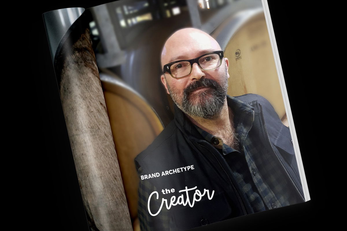
We started with strategy - defining a clear, compelling brand positioning that honours Westbrook’s legacy while setting the foundation for future growth. The brand mantra “Flows from the land” became the heart of our creative process. It inspired a story-rich tone of voice and a refined brand language built around craft, character, and place.
READ MORE
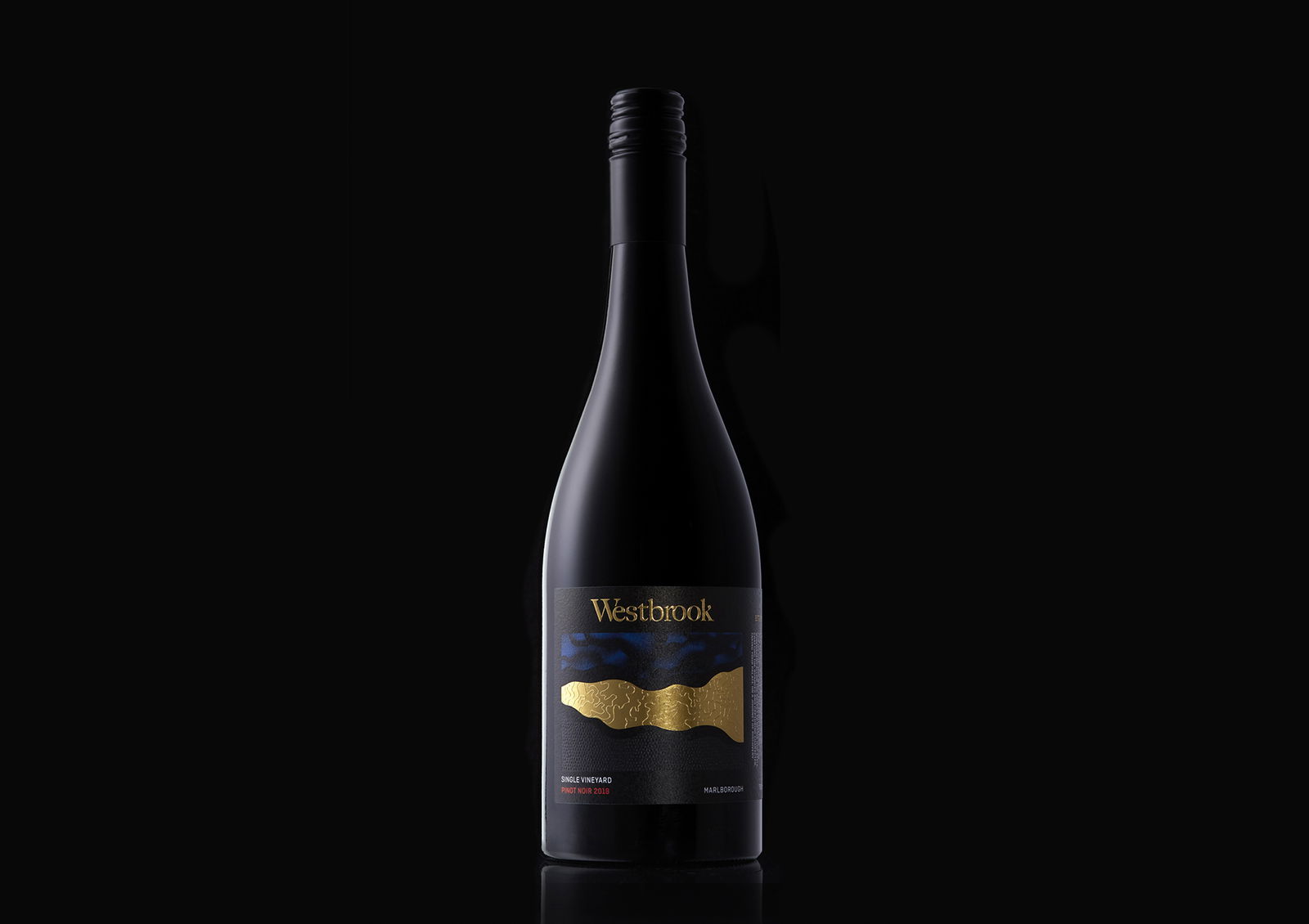
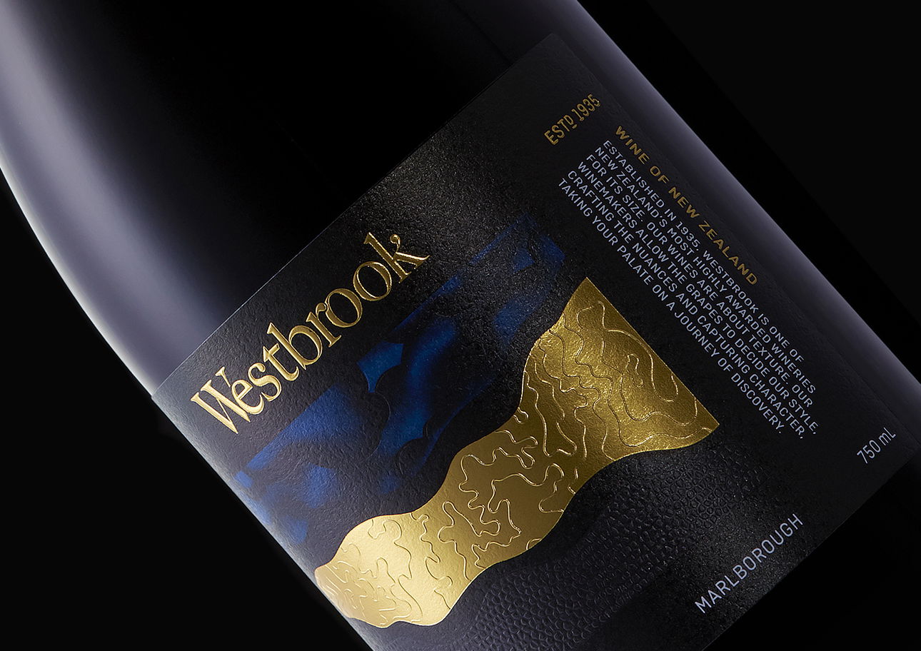
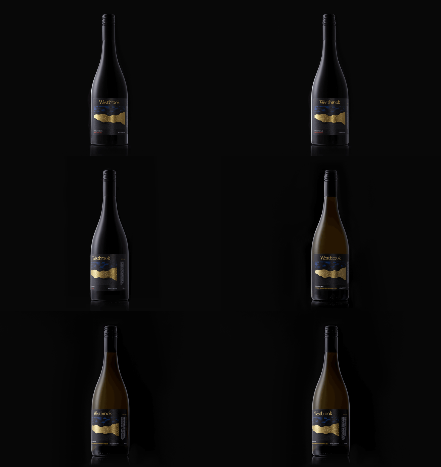
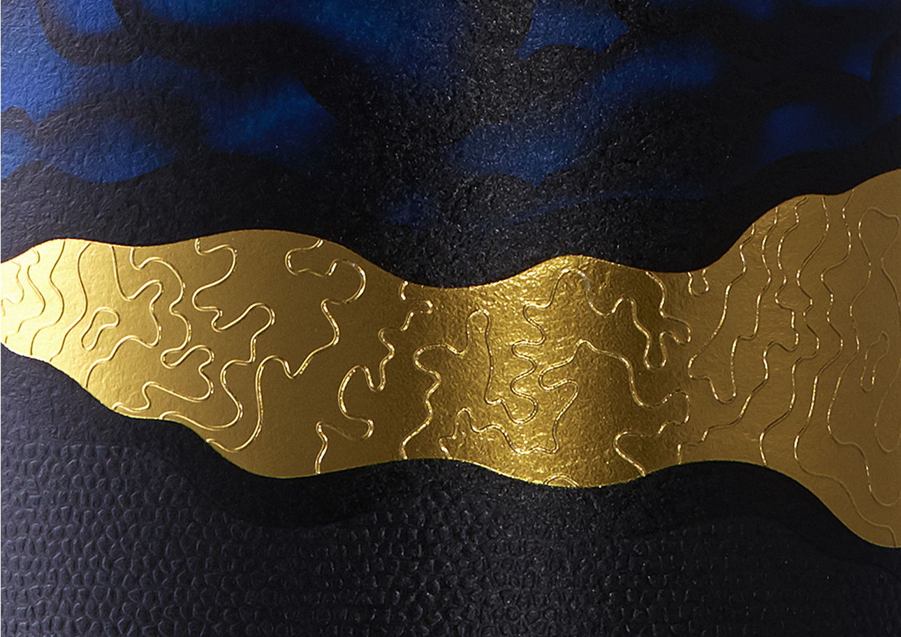
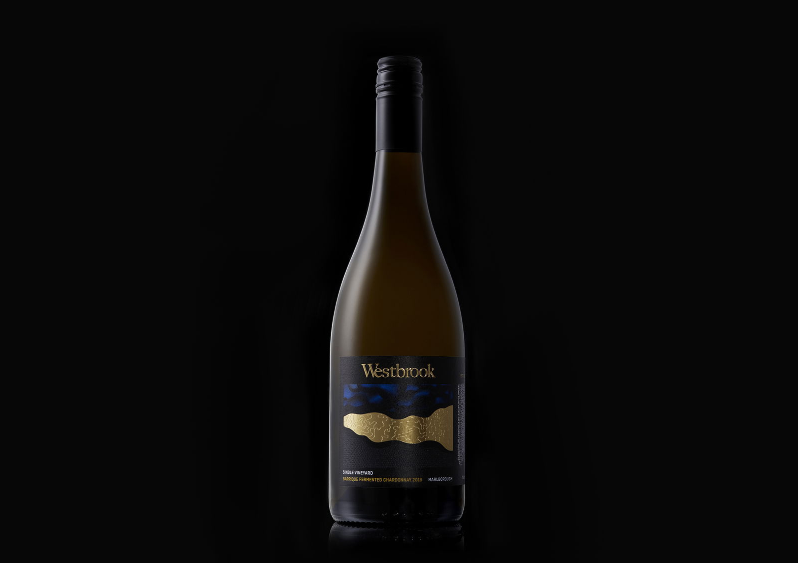
The rebrand flowed into packaging design, where we retained familiar cues from the original label but elevated everything - from logo and typography to layout and finish. The new identity is confident, premium, and unmistakably Westbrook, with a bold brand-led hierarchy that commands attention on shelf.
The result? A beautifully rebranded wine that looks as exceptional as it tastes - and one you’d be proud to take to a dinner party.
WHAT WE DID
Visual Identity
Brand Narrative
Branding
Brand Architecture
Packaging Design
Print Management
Brand Narrative
Branding
Brand Architecture
Packaging Design
Print Management



Related Projects
Contact Redfire
+64 9 3585692
hello@redfiredesign.co.nz
Design Services
Copyright © 2000- 2026 Redfire
All rights reserved.
