NZ School of Tourism. Two heritage brands. One national leader. 

CLIENT: The Aviation & Travel Training Group

INDUSTRY:  Education and training

CATEGORY:  Specialist travel and tourism training

CAMPUSES:  Nine campuses nationwide

PRIMARY AUDIENCE:  School leavers and young adults planning a career in travel, tourism and aviation

MARKET:  New Zealand

THE RESULT:  Student acquisition up 127%, full classrooms in under six weeks, and a brand built for, and achieving, sale to a venture capital fund.

REDFIRE INVOLVEMENT:  Market research, brand review, naming, positioning, strapline, visual identity, campus colour system, environmental branding, marketing communications and a through-the-line student acquisition campaign

The Aviation & Travel Training Group had just acquired its biggest competitor. That left it with two respected training brands, Sir George Seymour (SGS) and Travel Careers & Training (TCT), more than 50 years of combined heritage, and a market that knew them as rivals.

Running two brands side by side would split the group's marketing, confuse students and waste the advantage the acquisition had created. But folding one into the other risked throwing away decades of equity.

Redfire was brought in to find the way forward. Research. Brand review. Naming. Positioning. Identity. Then the campaign to fill the classrooms.

The result was the New Zealand School of Tourism: a new name, a new brand and one clear position as the country's only specialist travel and tourism training provider.

Student acquisition grew 127%. Classrooms were full in under six weeks. And the brand went on to do the job it was built for, attracting a sale to a venture capital fund.
PROJECT AT A GLANCE
The challenge
Merge two competing heritage brands into one, without losing the equity either had built, and give the combined business a position strong enough to lead the market and attract investment.
 
The insight
The opportunity wasn't in either old brand. It was in what the merger made possible: a single national provider that could own travel and tourism training outright.
 
The strategy
Build one power brand around specialist leadership, with a name that claimed the category and a system flexible enough for nine campuses nationwide.
 
What Redfire did
  • Market research and brand equity review
  • Brand strategy and positioning
  • Naming: New Zealand School of Tourism
  • Strapline: Work Ready… World Ready
  • Visual identity and icon device
  • Campus colour system
  • Environmental branding
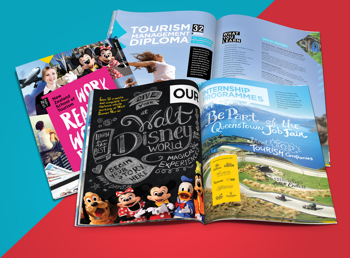
  • Marketing communications
  • Through-the-line student acquisition campaign across print, digital and social
 
The outcome
Student acquisition up 127%, full classrooms in under six weeks, and a brand that helped secure the business's sale to a VC fund.
 
THE CHALLENGE
Two rivals. One future.
 
SGS and TCT had spent years competing for the same students. Each had loyal graduates, industry relationships and a reputation worth protecting.
 
After the acquisition, they belonged to the same owner. Keeping both brands meant two marketing budgets, two sets of messages and students left wondering which one to choose. Picking one and retiring the other meant losing half the heritage the group had just paid for.
 
The new brand also had to stand up to scrutiny beyond students. The business was being built to grow and, ultimately, to sell. The brand had to look like a market leader to investors as well as to an 18-year-old choosing a career.
 
THE INSIGHT
Own the category

We began with market research to understand what each brand was really worth: where its equity sat, how students saw it, and where the gaps were.
 
The answer pointed beyond both of them. Neither SGS nor TCT could claim leadership on its own. Combined, the group was something no competitor could match: the only specialist travel and tourism training provider in New Zealand, with a nationwide footprint.
 
That was the position to own. The merger wasn't a compromise between two brands. It was the chance to build a national leader.
 
THE NAME
Say exactly what you are, at national scale

We recommended a fresh name rather than a blend of the old ones. New Zealand School of Tourism claims the category in four words. It's national, it's authoritative and it says exactly what students get.
 
It also gave both heritage communities a new home to come together under, rather than a sense that one side had won.
 
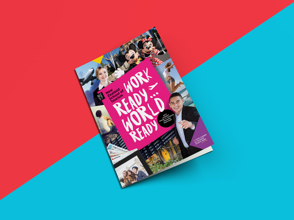
The strapline, Work Ready… World Ready, connected the brand to the thing students wanted most: a job in an industry that could take them anywhere.
 
THE BRAND IDENTITY
One brand, nine campuses
 
The new identity was built as a graphic framework designed to hold everything NZST offers.
 
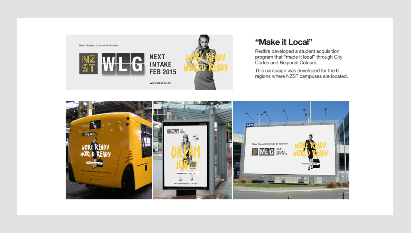
An icon device locks up with the wordmark, and colour is used to regionalise each campus. Every location has its own recognisable regional colour while staying unmistakably part of one national brand. It's a system that can absorb a new campus or programme without needing redesign.
 
We optimised the logo and brand elements to perform at every scale, from small-space digital and social, through print, to environmental branding on campus.
 
THE CAMPAIGN
Work Ready… World Ready
 
With the brand in place, the classrooms needed filling.
 
We developed a through-the-line student acquisition campaign across print, digital and social, aimed at millennials within each campus's local catchment. The design framework let us adapt quickly by region and audience, using emotive copywriting, photography, colour and typography.
 
The hook was simple. NZST is the step between where you are and the job you dream about.
 
THE RESULT
From merger to market leader

Student acquisition grew by 127%. Classrooms were full in under six weeks.
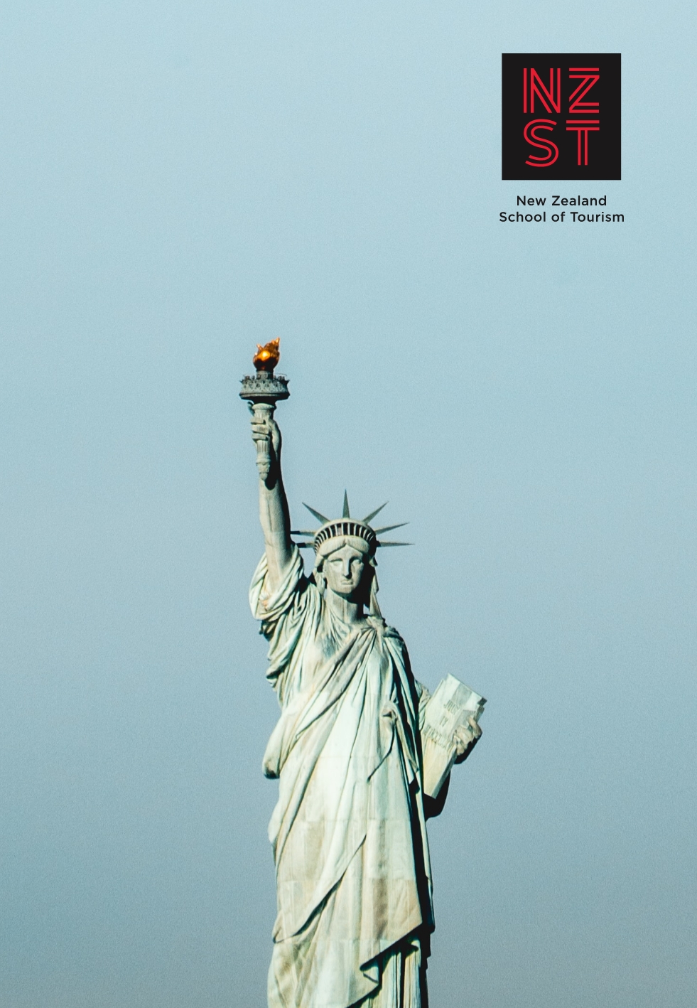
Two heritage brands became one dominant national provider, with a name and position competitors couldn't copy.
 
And the brand did the commercial job it was designed for. Built to support the sale of the business, it helped the group achieve exactly that, with a sale to a venture capital fund.
 
For us, that's what good brand strategy should do. Find the position a business can own, then give it a brand strong enough to win customers and attract investors.
 
redfire-new-zealand-school-of-tourism-tertiary-training-branding
redfire-new-zealand-school-of-tourism-tertiary-training-marketing
redfire-design-NZST-web-banners
Redfire-NZST-Propsectus-cover-editorial-2
Redfire-NZST-Propsectus-cover-editorial-4
Redfire-NZST-campaignVB

Related Projects

ignite-Thumbnail
REDFIRE_giantpoppy_brandmarketing_photography_branding_packaging_digital_graphicdesign_advertising_brochure_designagency
Tirimoana-School-Thumbnail
JEZZY-THUMB-FINAL-
Contact Redfire
Design Services
Redfire_26 years of creativity

Copyright © 2000- 2026 Redfire

All rights reserved.

Back to top Arrow