
Screenshot 2026-10-15 at 12.07.24

Inspired for Better: Banking that belongs to its members. 

CLIENT: NZCU- Credit Union Auckland 

INDUSTRY: Finance, banking and not-for-profit

CATEGORY: Member-owned credit union.

PRODUCTS: Personal loans, vehicle finance, debt consolidation, insurance, and banking and savings services

PRIMARY AUDIENCE: Existing members, and a new generation of borrowers and savers across Tāmaki Makaurau’s diverse communities.

MARKET: Auckland, New Zealand

THE RESULT: Record growth in loans and debt consolidation over 200%. More than 7,000 website visits and 365,000 ad impressions in the first six weeks of the campaign, at an average of $0.45 per interaction. 

REDFIRE INVOLVEMENT: Consumer insight, brand strategy, purpose and positioning, messaging, brand identity, brand guidelines, visual communications strategy, campaign development, multilingual digital advertising, social media, billboards, brochures, e-newsletters, corporate collateral, signage and wayfinding, and website

NZCU Auckland exists for its members. It’s a not-for-profit credit union, owned by the people it serves, offering fair rates, better terms and fewer fees.

But growth had stalled. Most members came through its union heritage, and outside that base few people knew NZCU existed, let alone that it was a real alternative to a bank. It was competing against ASB, ANZ, BNZ, Westpac and a crowd of finance companies, all with bigger budgets, bigger branch networks and louder advertising.

NZCU couldn’t win that fight on spend. It had to win on something the banks couldn’t copy.

Redfire was brought in to find it. Insight. Strategy. Purpose. Positioning. Identity. Then the campaign to take it to Auckland.

The answer was already in NZCU’s DNA. Member owned. Inspired for Better.

PROJECT AT A GLANCE
The challenge
Grow membership beyond NZCU’s union base in a market dominated by the big banks, with a fraction of their budget.
 
The insight
People choose their bank on convenience and rates. To compete, NZCU had to change how people think about their banking relationship, and create an emotional connection strong enough to beat the commodity drivers.
 
The strategy
Connect with people through shared values rather than demographics: fairness, inclusion, respect, transparency and belief in the common good. Lead with member ownership. Talk about what NZCU stands for, not who it stands against.
 
What Redfire did
  • Consumer insight and competitor research
  • Brand strategy, purpose and positioning
  • Brand platform: Inspired for Better
  • Messaging strategy and copywriting
  • Brand identity evolution and brand device
  • Brand guidelines
  • Visual communications strategy and activation toolkit
  • Multilingual digital advertising across Google Search, Display, Gmail and YouTube
  • Social media campaigns
  • Billboards, brochures and e-newsletters
  • Corporate collateral
  • Signage and wayfinding
  • Website
 
The outcome
A clear, values-led brand speaking to Auckland’s communities with one voice, and campaigns that grew deposits, and loan and debt consolidation by more than 200%. Grew 7,000 website visits in its first six weeks.
THE CHALLENGE
Outspent, out-branched and overlooked

Personal finance in New Zealand belongs to the big banks. They can outspend, out-innovate and out-branch any local financial institution.
 
NZCU had something they didn’t. As a not-for-profit owned by its members, every decision is made for the people it serves rather than for shareholders. But very few people outside its existing membership knew that, or knew that a credit union could be an alternative to a bank
at all.
 
Low awareness. A stalled depositors and loan book. A category where convenience and rates decide almost everything. NZCU needed more than visibility. It needed people to rethink who they bank with, and why.
 
THE INSIGHT
People join values, not banks

Our research showed that NZCU’s members weren’t defined by age, income or postcode. They were defined by what they believed.
 
They wanted to be part of something better. Something bigger than themselves that does real good for their community, their family and their friends. They wanted a financial partner that understood where they were coming from, culturally as well as financially, and where they
were going.
 
That changed the target. Rather than chasing demographics, NZCU could connect with anyone who shares its values: fairness, inclusion, respect, transparency and belief in the common good.
 
And that pointed to its biggest advantage. When you’re a member, you’re an owner. You get more when you own it.
THE STRATEGY
Inspired for Better

We built the brand platform from NZCU’s purpose outwards.
 
Its why: an authentic desire to do better for its members, its communities and its people. NZCU is inspired to do more. Inspired for Better.
 
The platform came with one firm principle. Big banks are the obvious villain in a credit union’s story, and it would have been easy to attack them. We chose not to. NZCU would talk about what it stands for, not who it stands against: shared values, doing right by members, and the power of people coming together to make the whole community stronger.
 
That gave NZCU a confident, positive voice, and a message the banks couldn’t claim: a better way to bank, owned by the people who use it.
 
THE BRAND IDENTITY
Of the people, by the people, for the people
 
NZCU was founded by ordinary people to help ordinary people. The identity needed to carry 
that story.
 
We evolved the existing logo, keeping a heritage version for continuity, and paired it with a bold orange and black palette and clean, confident typography. At the centre of the system sits a brand device built around the words “He tangata, he tangata, he tangata”: it is people, it is people, it is people. It roots the brand in Tāmaki Makaurau and in the communities NZCU serves.
 
The three circle device locks up with the logo, works over photography and colour, and gives every piece of communication an instantly recognisable frame. Comprehensive brand guidelines keep it consistent, whoever is applying it.
 
THE CAMPAIGNS
Speaking to Auckland in its own languages

Auckland is one of the most diverse cities in the world, and NZCU’s members reflect that. So the campaigns had to connect across cultures.
 
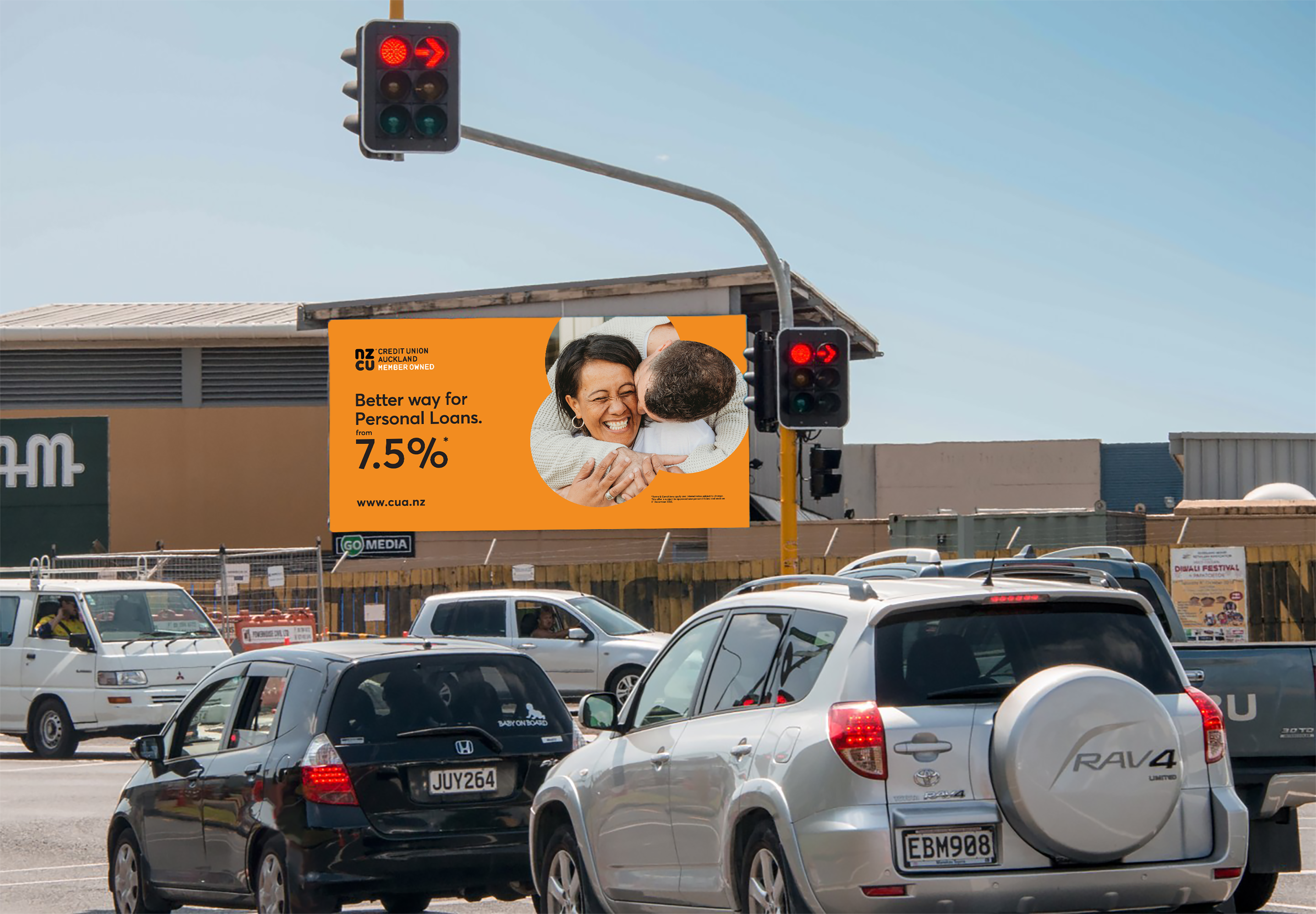
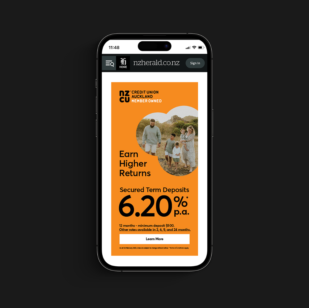
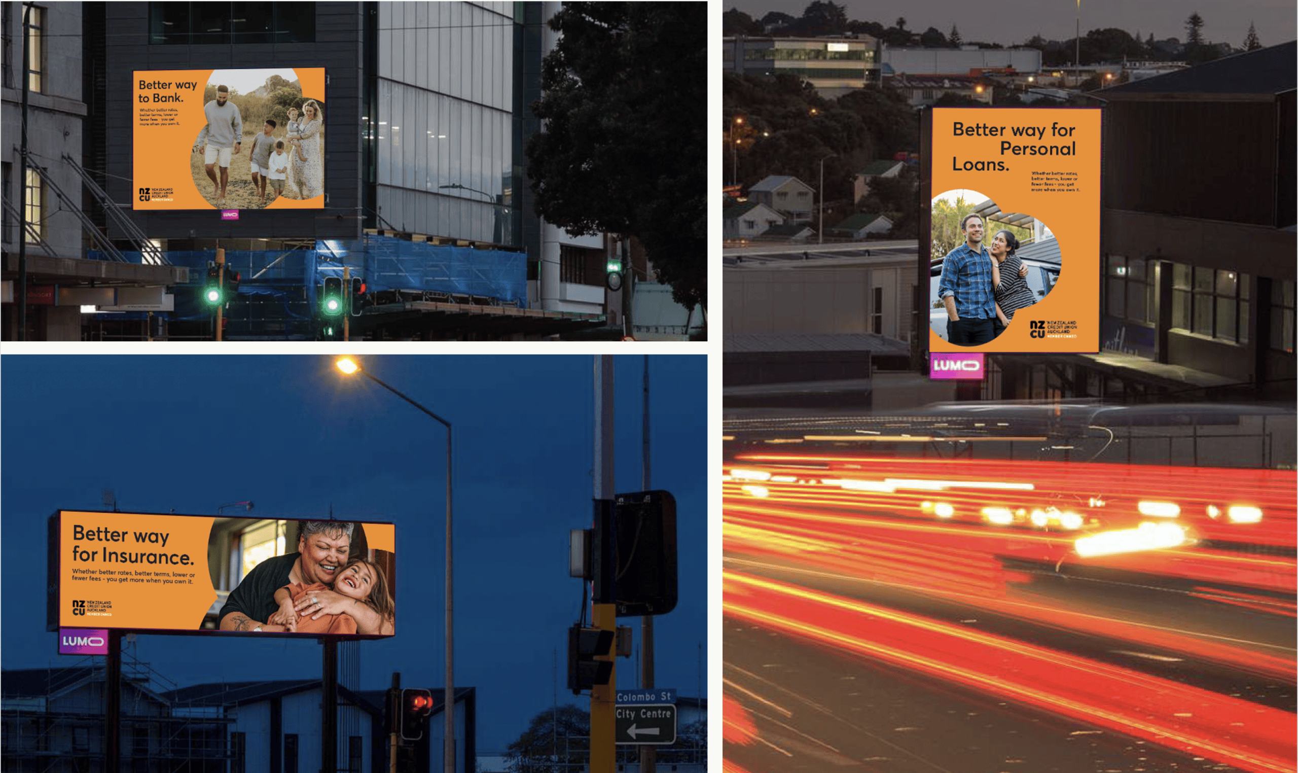
We ran print, OOH, and fully integrated digital campaigns across Google Search, Display, Gmail, YouTube and partner publications, with multilingual versions of the ads designed to build confidence and connect more deeply with each community. Every ad paired NZCU’s values with a clear offer, so emotional connection turned into action.
 
Social media campaigns ran alongside, supported by billboards, brochures and e-newsletters. Corporate collateral, signage, wayfinding and the website carried the same look and voice, so the brand felt like one organisation wherever people met it.
 
THE RESULTS
A brand people could find, and believe in

Deposits grew by 20% month on month. Loans and debt consolidation grew by over 200%. Financial literacy and the barriers to finance were broken though targeted campains, a more personalised and empatheic tone of voice, and a viusual communications strategy that was more relatable to the membership.

In the first six weeks, the campaigns drove more than 7,000 visits to the NZCU website.
Google advertising delivered more than 365,000 impressions and 10,496 clicks and views, at an average of $0.45 per interaction. Over two weeks, the Facebook campaign reached more than 85,000 people.
 
More importantly, NZCU now has a brand that tells its story clearly: a member-owned alternative to the banks, built on values its community shares.
 
For us, that’s what good brand strategy should do. Find what makes an organisation fundamentally different, and give people a reason to believe in it.
Screenshot 2026-10-15 at 12.08.25
redfire-nzcu-brand-strategy-design-advertising-billboard
redfire-nzcu-brand-strategy-design-advertising-01
Screenshot 2026-10-15 at 12.07.48

Related Projects

redfire-black-robin-branding-01
BA-Thumbnail-NEW
carrolls-thumbnail-faster
Air-Vanuatu-Thumbnail
Contact Redfire
Design Services
Redfire_26 years of creativity

Copyright © 2000- 2026 Redfire

All rights reserved.

Back to top Arrow