redfire-tanoa-hotel-group-visual-communications-nz

Pacific Island hotel branding & growth strategy

CLIENT: Tanoa Hotel Group

INDUSTRY: Tourism and hospitality

CATEGORY: Hotel group: corporate, property and country brands

PROPERTIES:  Eight hotels across Fiji, Samoa and Tonga, including Tanoa International in Nadi, Tanoa Plaza in Suva, Tanoa Tusitala in Apia and Tanoa International Dateline in Nuku'alofa

PRIMARY AUDIENCE:  International tourists, domestic travellers, business travellers, and local businesses booking conferences and events

MARKETS:  Fiji, Samoa and Tonga

THE RESULT:  One masterbrand system carrying Tanoa from a Fijian hotel group to a Pacific one.

REDFIRE INVOLVEMENT:  Brand strategy, purpose and positioning, brand architecture, brand manifesto, visual identity, tone of voice, visual communications strategy, brand and usage guidelines, environmental branding and wayfinding, restaurant and bar branding, uniforms, advertising, digital marketing.


Tanoa opened in 1965 as Fiji's first locally owned tourist hotel. Six decades on, it had grown into a family-owned group with hotels across Fiji.

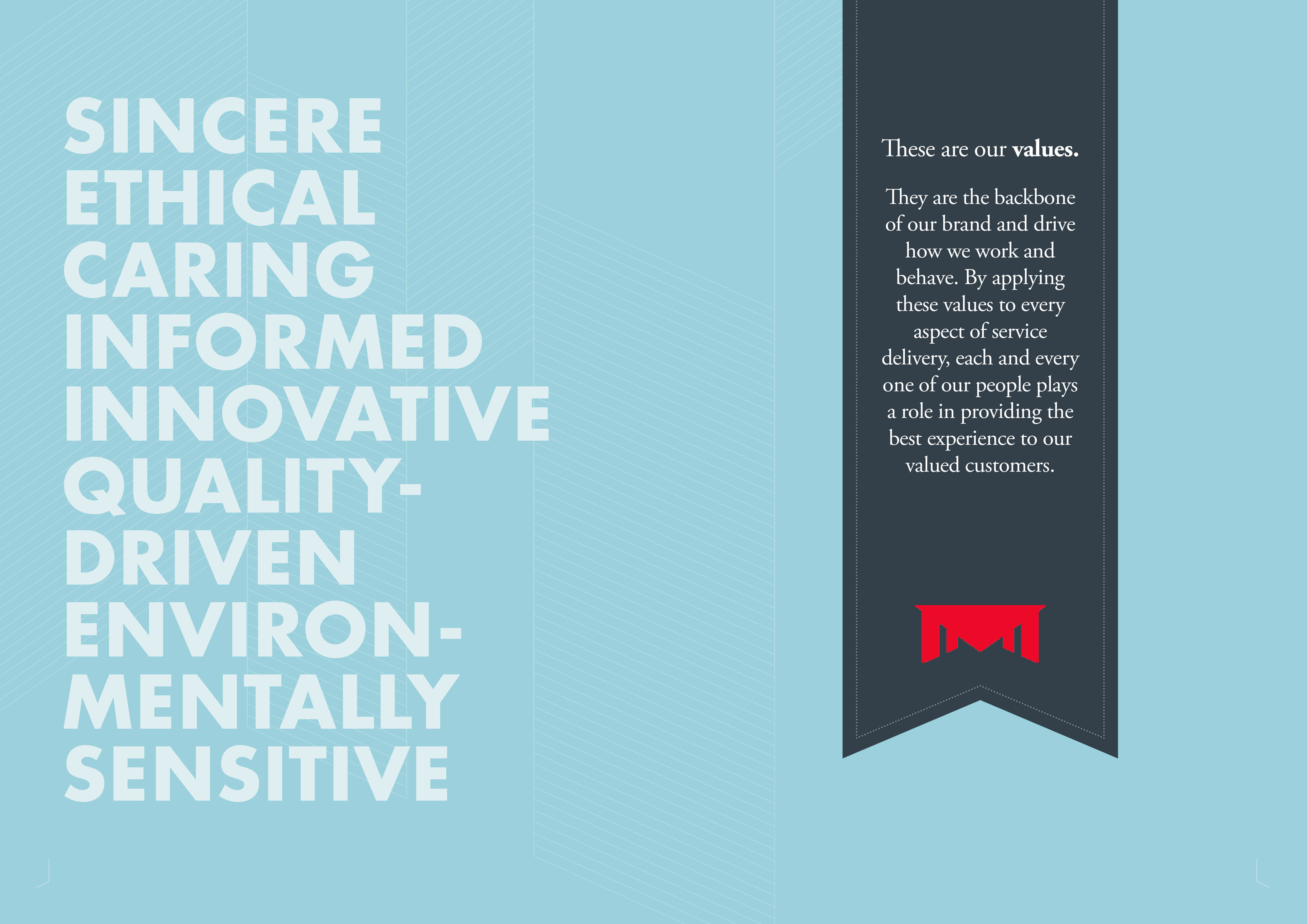
Tanoa had always traded on something stronger than branding. The hotels operated under the Tanoa name, but what really held them together were the Reddy family's values. Warmth, honesty and looking after people ran through every property, and guests felt it whether they stayed in Nadi, Rakiraki or Lautoka.

For decades, that was enough. Then Tanoa set its sights on Samoa and Tonga. Moving into new countries meant introducing Tanoa to guests, partners and staff who had never experienced it. Family values that lived in people and habits now had to be captured, shared and carried across borders. Expansion turned brand from a nice-to-have into the platform for the group's next stage of growth.

Redfire was brought in to build that platform. Strategy. Purpose. Positioning. Brand architecture. Manifesto. Identity. Tone of voice. Then the full rollout, from the sign at the gate to the uniform at reception.

The result was a masterbrand system flexible enough for every property and every country, and grounded enough in Pacific culture to feel like it belonged in each one. 

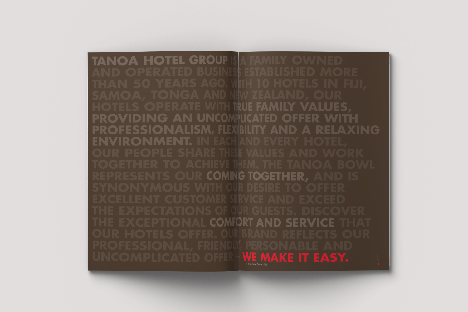
At the heart of it all sat one simple idea: We Make It Easy.


PROJECT AT A GLANCE
The challenge
Turn the family values behind a much-loved Fijian hotel group into a brand that could travel, and build a system ready for growth across Samoa, Tonga and beyond.

The insight
Tanoa's strength was never luxury. It was dependability and a genuine Pacific welcome, at a price that made sense for business travellers, families and local events alike.

The strategy
A masterbrand with property and country sub-brands, united by one proposition, We Make It Easy, and governed tightly enough to stay consistent in every market.

What Redfire did
  • Brand strategy, purpose and positioning
  • Brand architecture: corporate, property and country brands
  • Brand manifesto
  • Visual identity and brandmark
  • Tone of voice
  • Visual communications strategy
  • Brand guidelines and brand usage guidelines
  • Environmental branding, signage and wayfinding
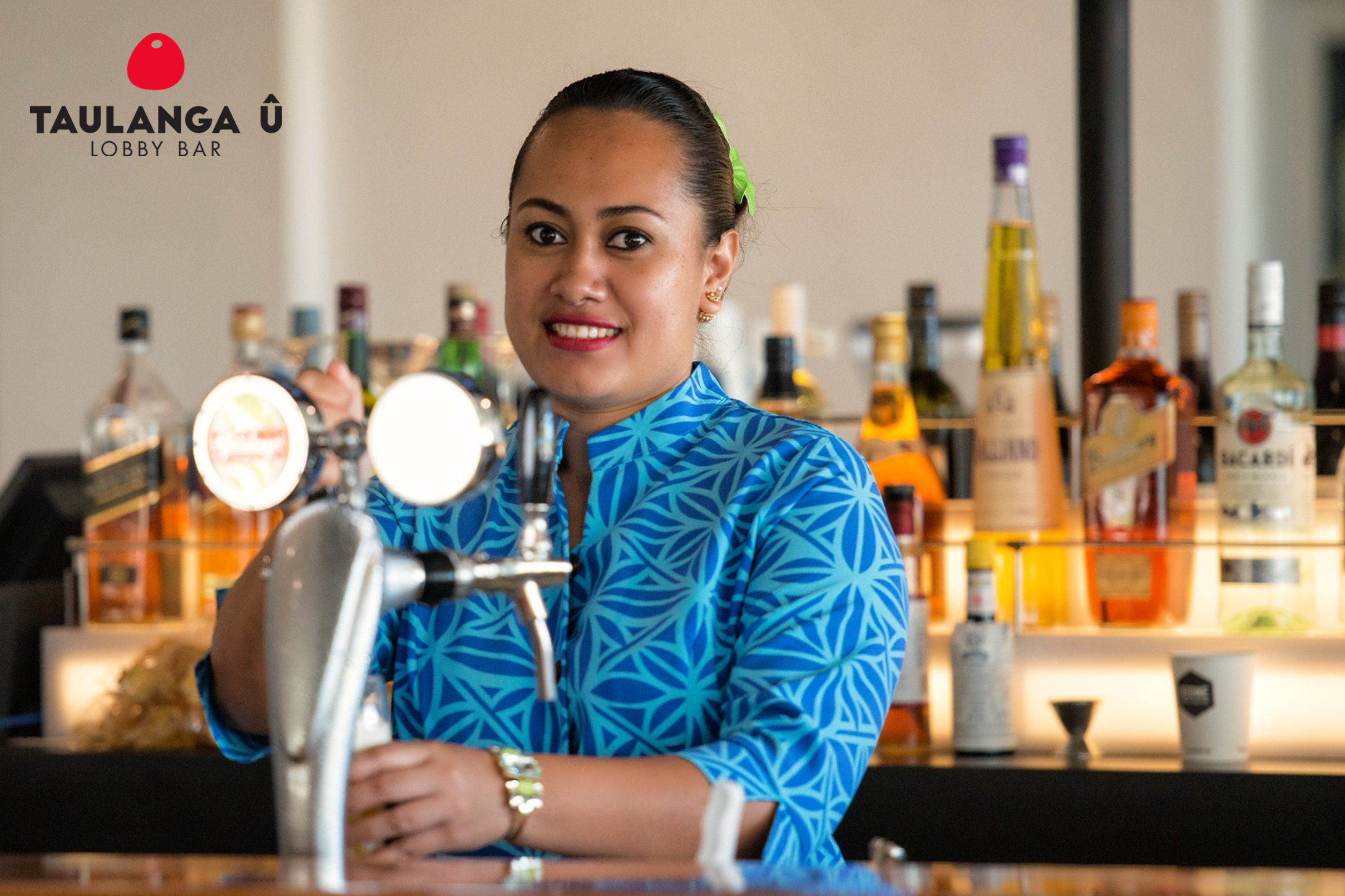
  • Restaurant and bar branding
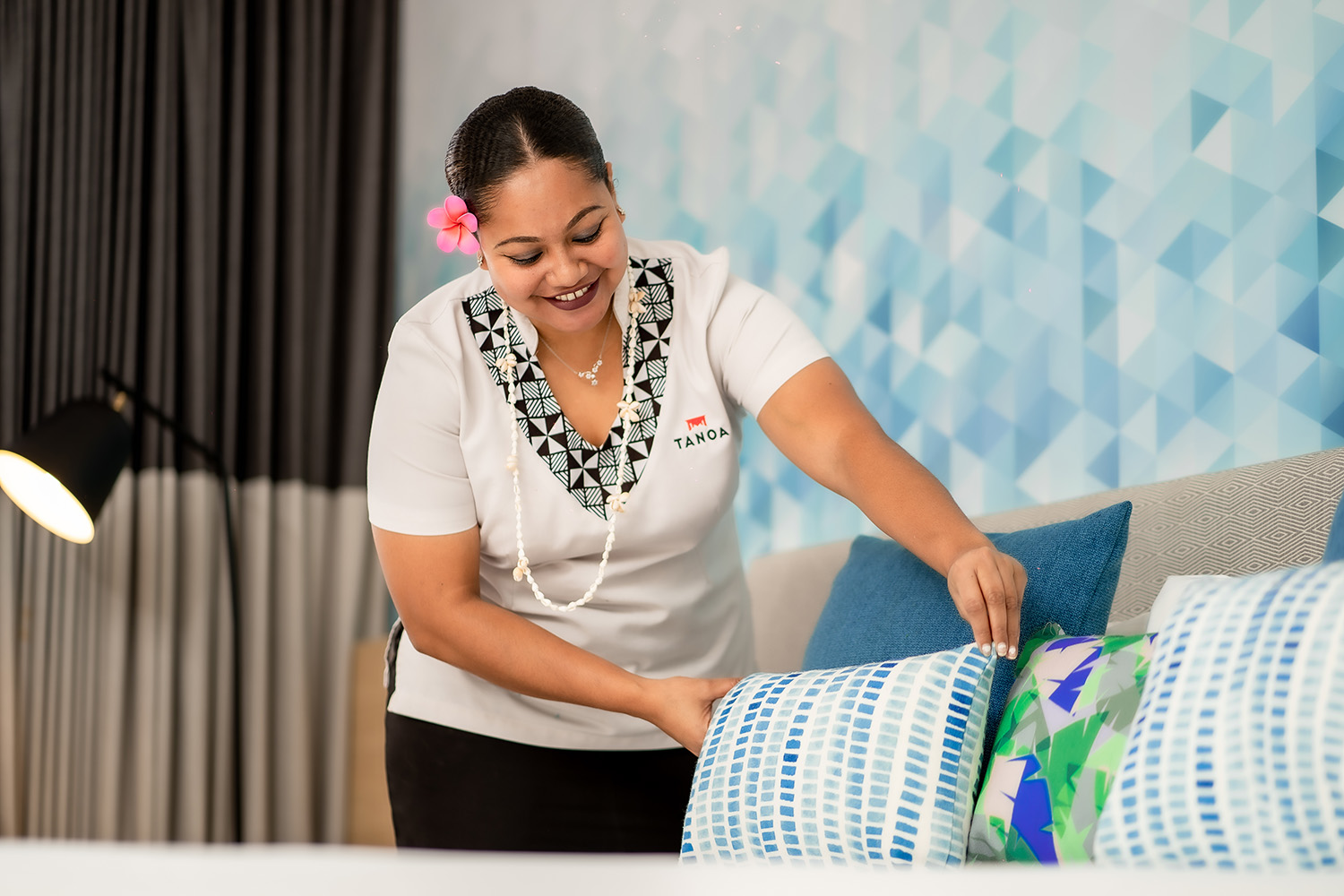
  • Uniforms
  • Corporate, conference and event collateral
  • Internal communications and staff engagement
  • Advertising and digital marketing
  •  
The outcome
A Pacific hotel group with one clear brand, ready to grow across Fiji, Samoa and Tonga.
 
THE CHALLENGE
Making family values travel
 
In Fiji, everyone knew Tanoa. Its reputation for affordable quality, business travel and a genuine welcome had been built over generations, mostly by word of mouth and the people who worked there.
 
That doesn't travel on its own. A new hotel in Apia or Nuku'alofa can't rely on a reputation guests have never encountered. Staff joining in a new country need to understand what Tanoa stands for from their first day. Partners and local stakeholders need a clear reason to back it.
 
The group's audiences made it harder still: international tourists arriving through Nadi, domestic travellers, business guests, and local companies running conferences and events. The brand had to speak to all of them, in three countries, and stay true to the family values that made Tanoa what it is.
 
THE INSIGHT
We make it easy 
 
When we looked at what guests valued most about Tanoa, one thing came through again and again. It was easy.
 
Easy to book. Easy to arrive. Easy to stay. A business traveller could land in Nadi and know the room would be ready, the Wi-Fi would work and breakfast would be waiting. A family could relax without second-guessing the bill. A conference organiser could hand over the details and trust the team to deliver.
 
That ease wasn't an accident. It came from the way the Reddy family had always run their hotels: anticipate what people need, remove the friction and look after them like family.
 
We Make It Easy put that into four words. It became the underthread of the whole brand. It isn't a tagline for an ad. It's a description of how Tanoa delivers hospitality, and a standard every team member can act on, every day.
 
THE STRATEGY
A masterbrand built to grow

We defined Tanoa's purpose and positioning, then built a brand architecture to carry it across markets.
 
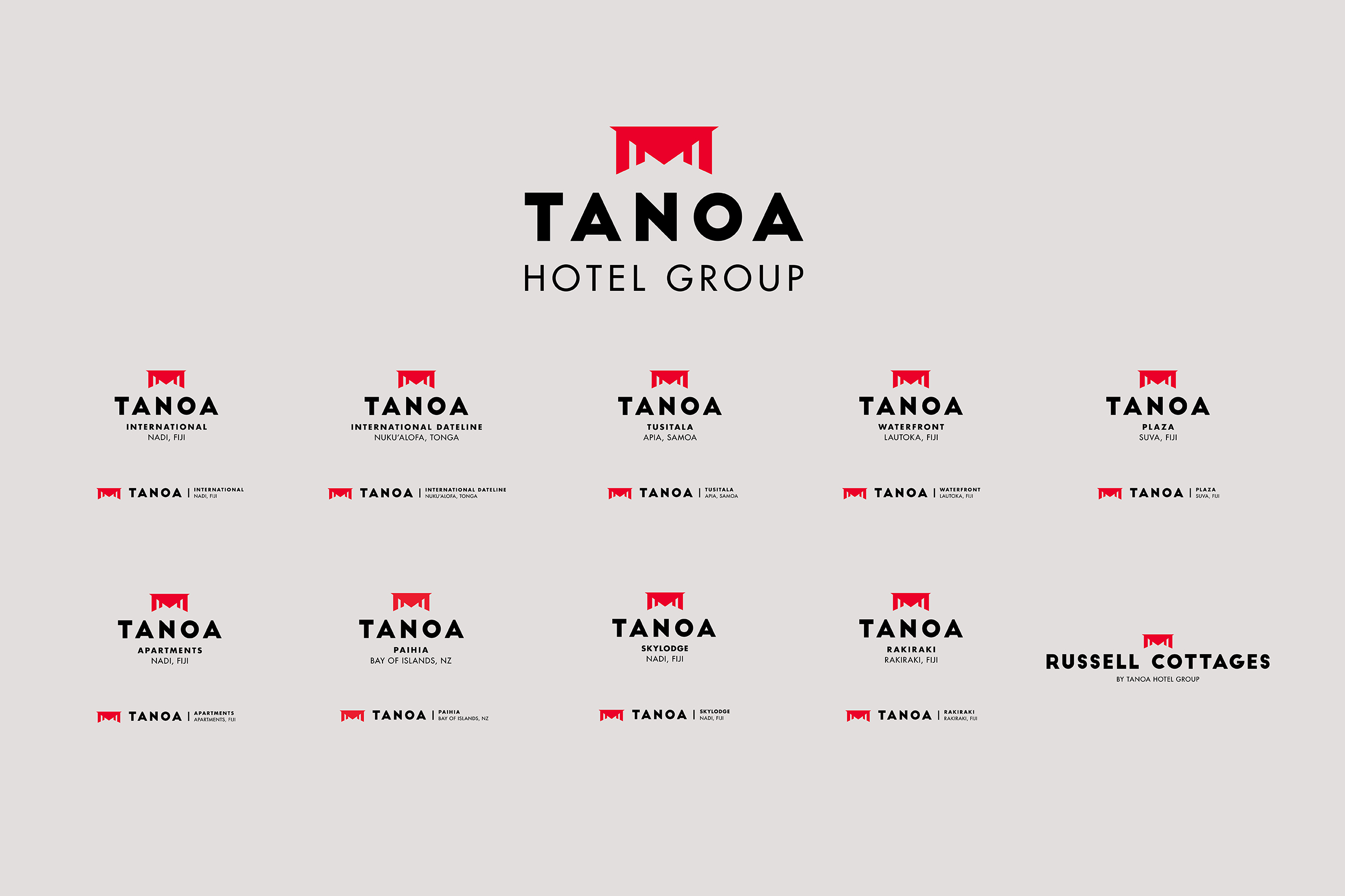
At the top sits the Tanoa masterbrand and its promise: We Make It Easy. Below it, property brands give each hotel room for its own character and location. Country branding lets Tanoa feel local in Fiji, Samoa and Tonga, while staying recognisably one group.
 
The proposition is what holds that structure together. Whether it's a resort-style stay in Lautoka, a conference in Suva or a business trip to Nuku'alofa, every guest gets the same experience of ease. That meant expansion didn't call for a new brand each time. A new property slots into a system that already knows how to make it feel like Tanoa.
 
THE MANIFESTO
Putting family values into words

A hotel brand lives or dies through its people. The manifesto was where the Reddy family's values were written down for the first time, setting out what Tanoa believes and how it behaves, with We Make It Easy at its centre.
 
It turned the proposition into behaviour: how staff greet a guest, solve a problem or set up a function room. It became part of onboarding for new staff, the opening conversation with new partners, and the reference point for stakeholder engagement in each new market. When Tanoa moved into a new country, the manifesto arrived first.
 
THE BRAND IDENTITY
Rooted in the tanoa bowl
 
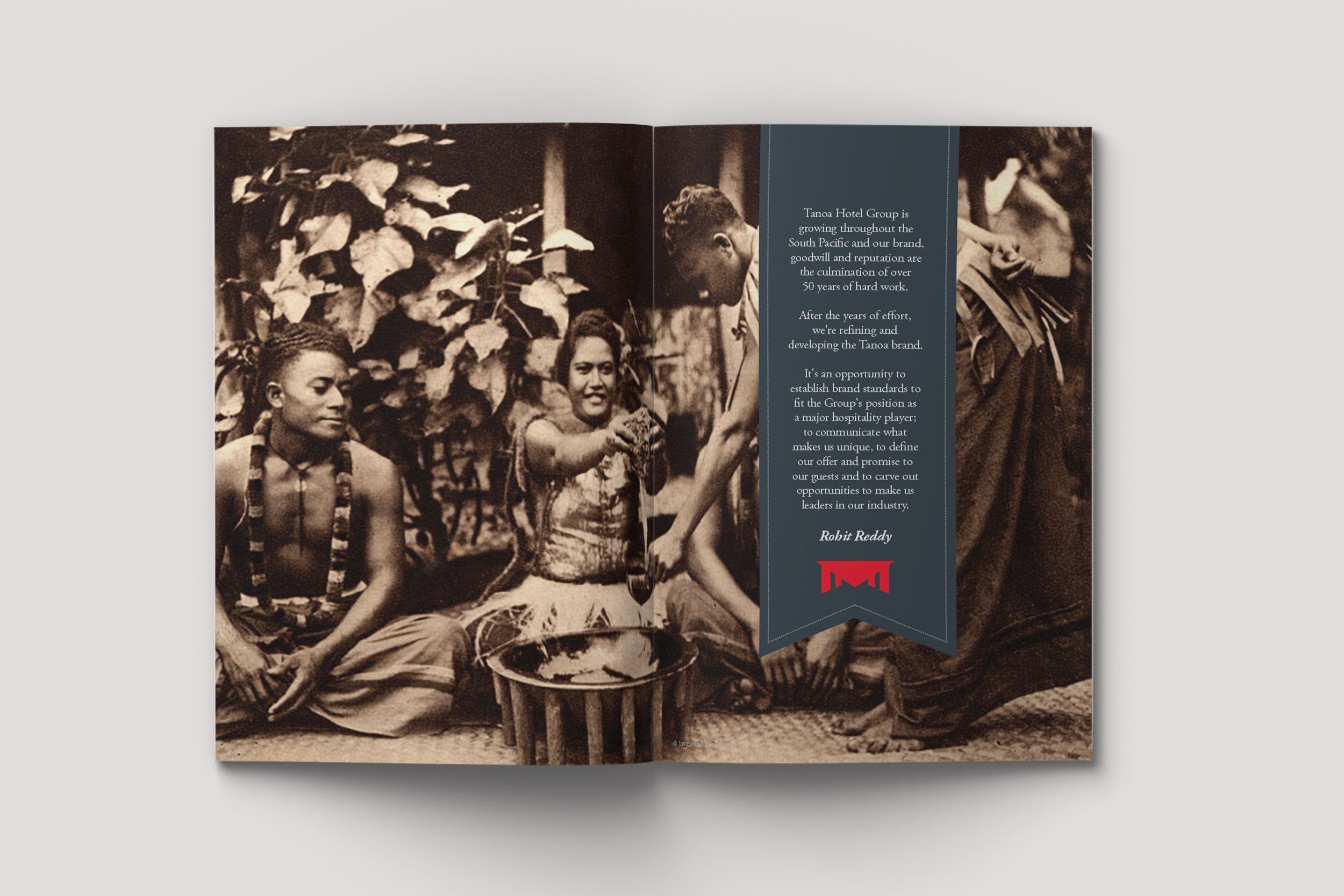
The tanoa is the bowl at the centre of the kava ceremony, a symbol of welcome, gathering and respect across the Pacific. It's also the group's name, and the strongest cultural asset it owns.
 
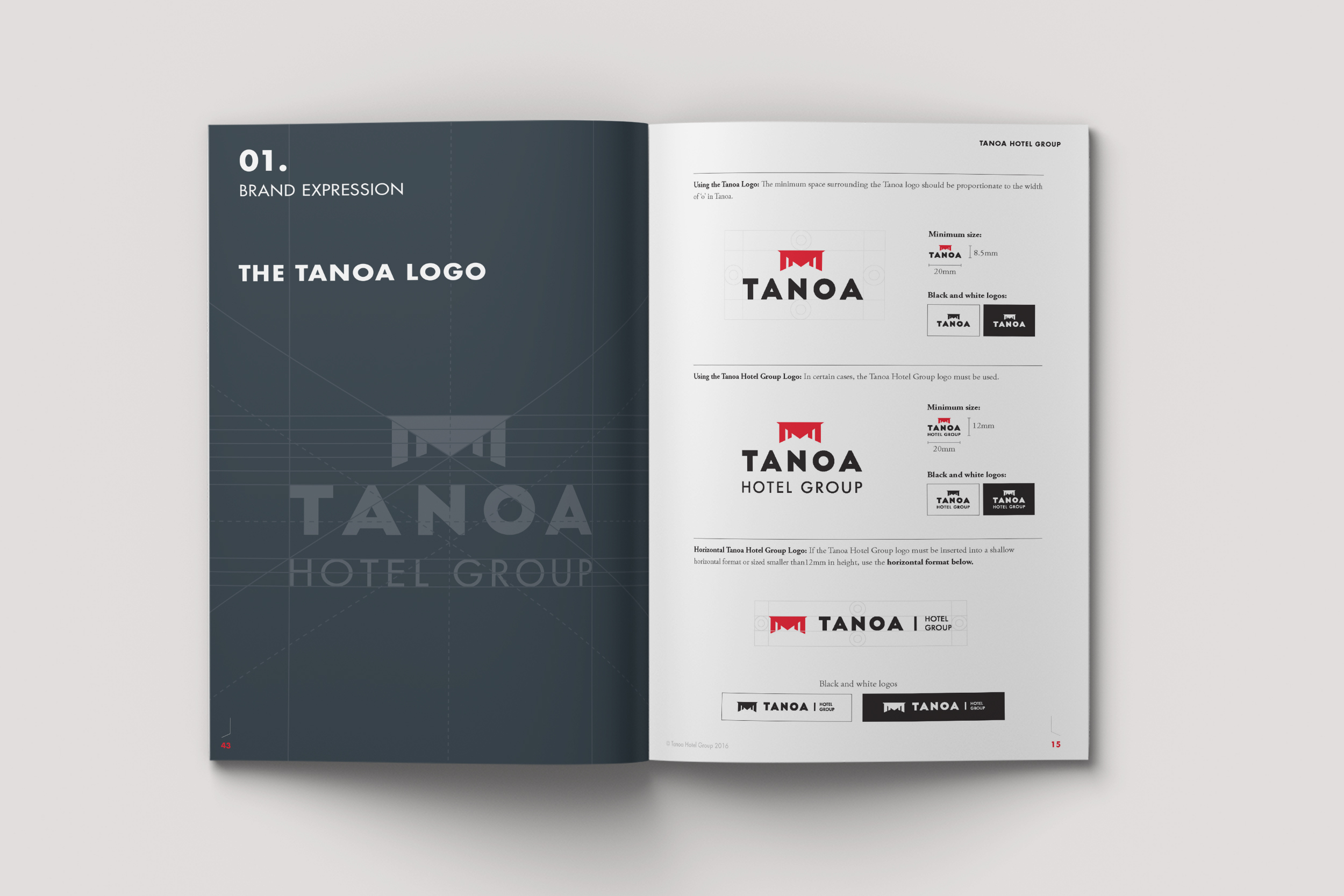
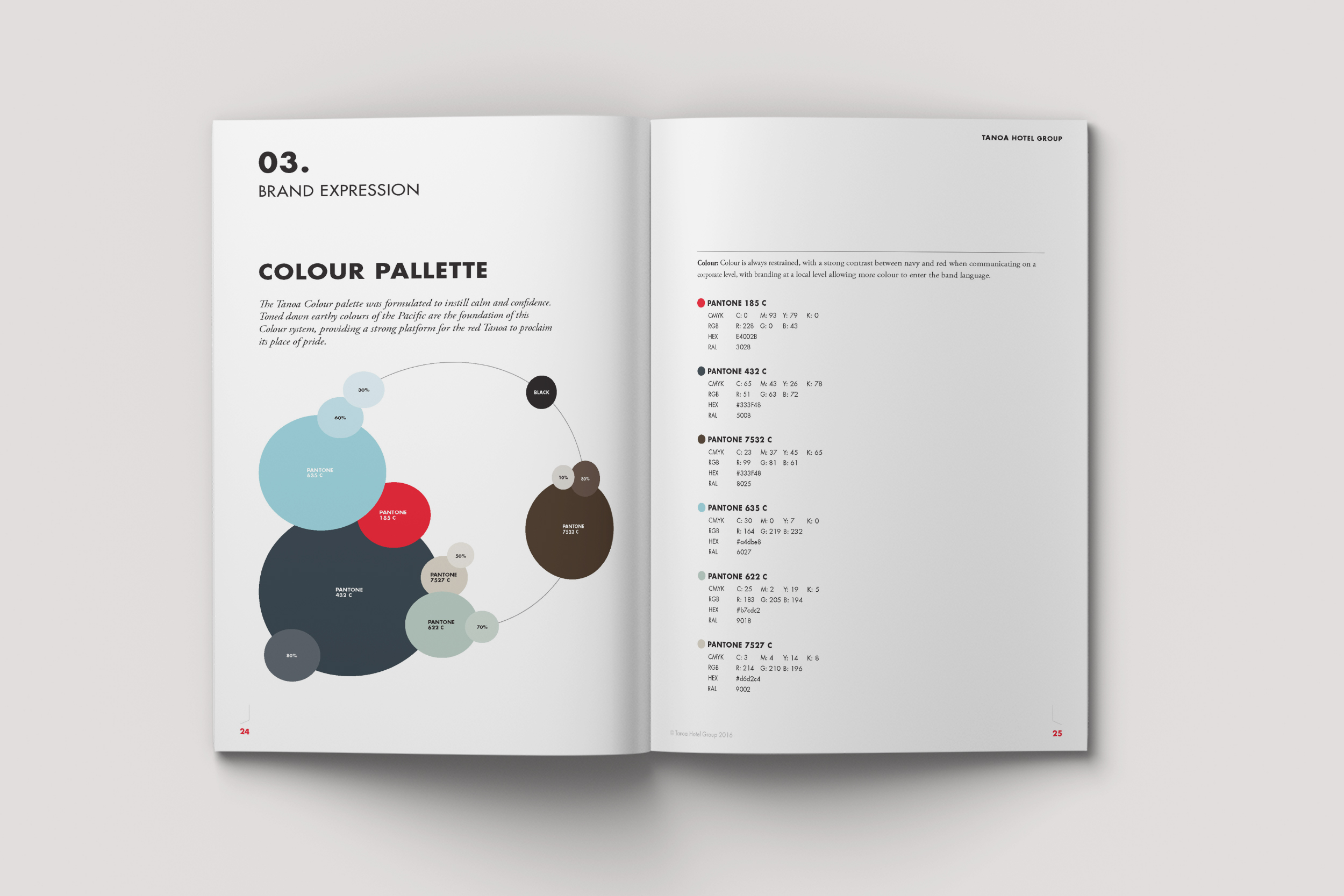
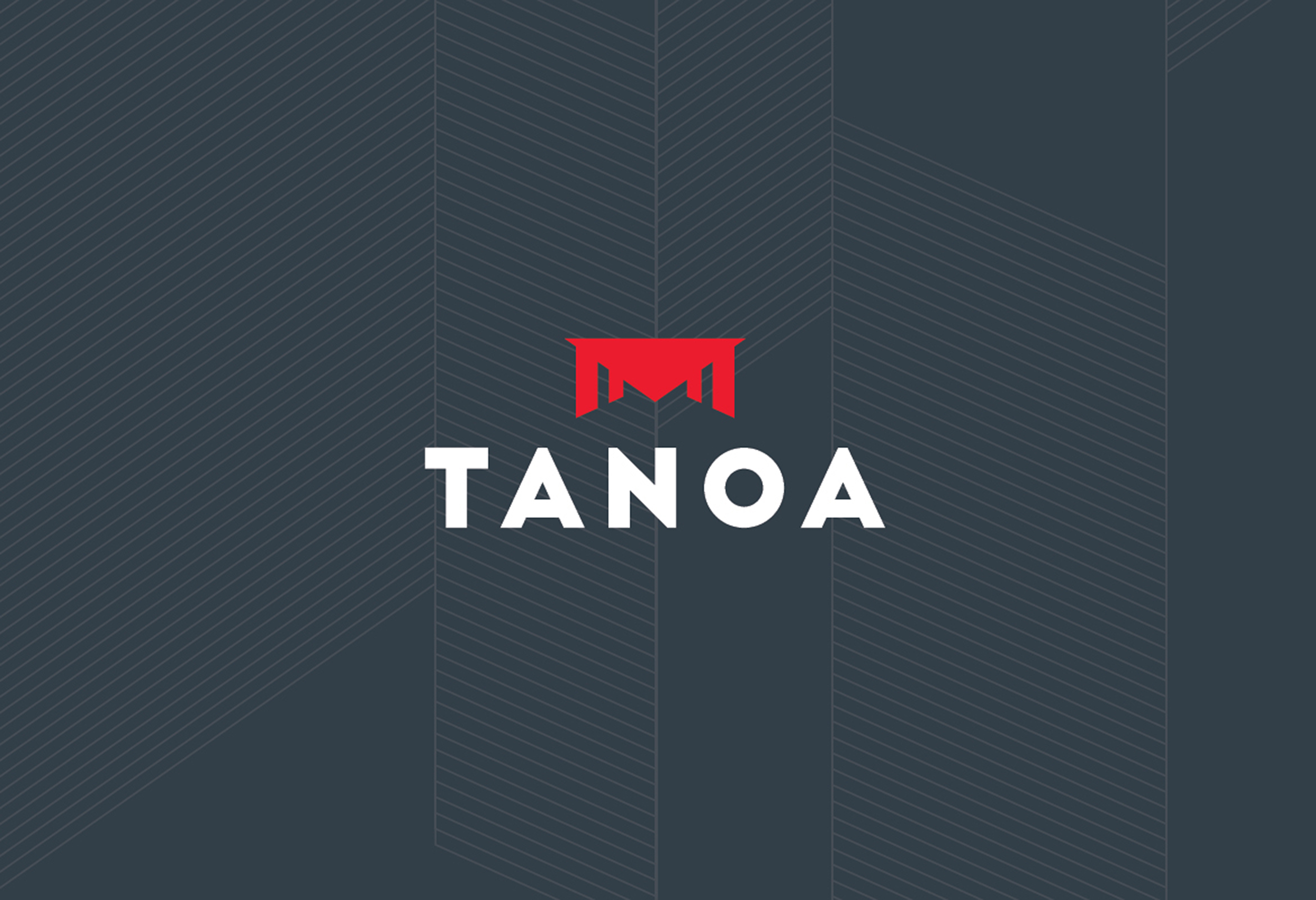
We modernised the brandmark by pairing a bold, clean wordmark with the tanoa bowl, bringing the brand up to date without cutting it off from its roots. Patterns, colour and imagery drew on Pacific culture and tradition, giving the system warmth and a clear sense of place.
 
THE TONE OF VOICE
Easy to talk to

If the brand promises ease, it has to sound easy too.
 
We developed a tone of voice that is warm, plain-speaking and unpretentious. No hotel jargon. No overselling. It speaks as naturally to a family on holiday as to a conference organiser, and always makes the next step clear.
 
THE ROLLOUT
From the front gate to the function room

Hotels are physical brands. Guests experience them through every sign, space and interaction, so every touchpoint had to deliver on the promise.
 
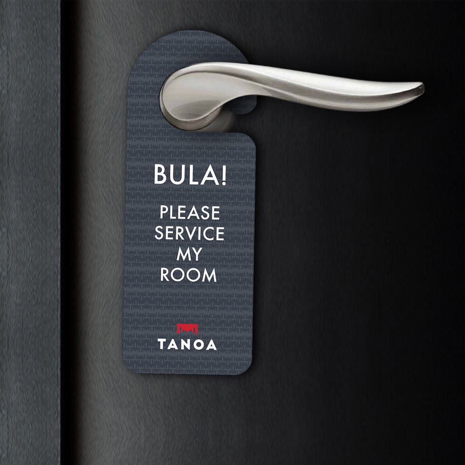
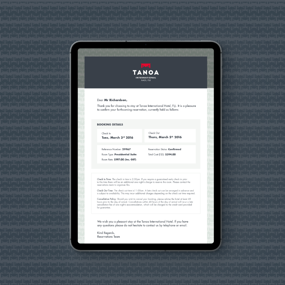
We applied the brand across the whole guest journey: entry signage and wayfinding that make arriving simple, public spaces, rooms, bars and restaurants, uniforms, and conference and event collateral that make planning straightforward. Behind the scenes, it carried through internal documents and staff engagement material, so the team lived the brand as well as wore it.
 
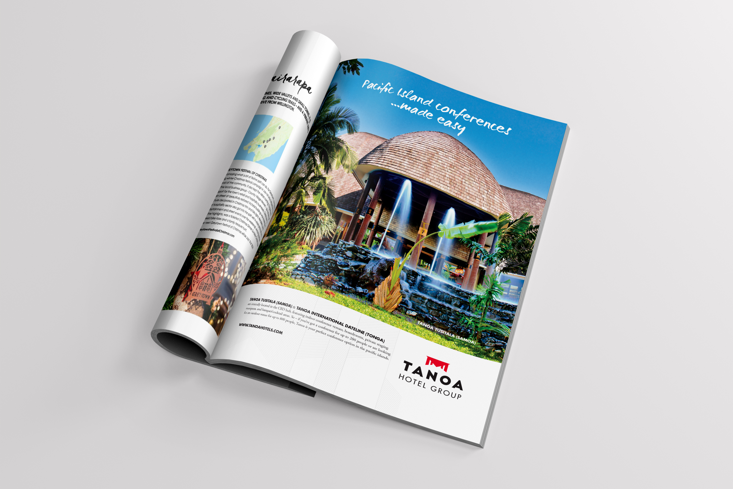
Outward, We Make It Easy powered advertising, marketing, digital campaigns and the website, giving Tanoa one consistent voice across every market it trades in.
 
THE GUIDELINES
Built for every property, country and partner

A brand spread across eight hotels in three countries is applied by hundreds of hands: property managers, local suppliers, signwriters, marketing agencies and travel partners.
 
We created detailed brand guidelines and separate brand usage guidelines covering application by property, region and country, plus clear rules for external partners and marketing agencies. True to the brand, they're designed to make getting it right easy. Each new property, supplier or partner starts from the same playbook, so the brand stays consistent however far it travels.
 
THE RESULT
Growth, with the brand leading the way

Tanoa now operates eight hotels across Fiji, Samoa and Tonga under one brand system.
What began as family values became a brand the whole group can stand behind and take into any new market. The masterbrand and its promise give guests something they can rely on wherever they stay. The architecture gives each property and country room to be itself. And the guidelines keep it working as one, whoever is applying it.
 
We Make It Easy is more than a line. It's how Tanoa does hospitality.
 
For us, that's what good brand strategy should do. Give a business a clear position it can own, and a system strong enough to grow with it.
 
redfire-tanoa-hotel-group-logo-banner-nz
redfire-tanoa-hotel-group-corporate-brand-guidelines-nz
redfire-tanoa-hotel-group-visual-communications-marketing-nz
redfire-tanoa-hotel-group-brand-narrative-nz
redfire-tanoa-hotel-group-corporate-brand-style-nz
redfire-tanoa-hotel-group-branding-brand-values-nz
redfire-tanoa-hotel-group-marketing-nz
redfire-tanoa-hotel-group-brand-narrative-nz
redfire-tanoa-hotel-group-corporate-visual-communications-photography-nz
redfire-tanoa-hotel-group-brand-refresh-logo-design-nz
redfire-tanoa-hotel-group-corporate-collateral-branding-nz
redfire-tanoa-hotel-group-digital-corporate-templates-nz
redfire-tanoa-hotel-group-magazine-advertising-graphic-design-nz

Related Projects

redfire-airtahitinui-airline-thumbnail-gif
Air-Vanuatu-Thumbnail
JEZZY-THUMB-FINAL-
expirience-Golf-thumbnail
Contact Redfire
Design Services
Redfire_26 years of creativity

Copyright © 2000- 2026 Redfire

All rights reserved.

Back to top Arrow