
Full Brand Strategy & Design for Education
CLIENT: Yoobee Colleges Ltd
Designing educational brands that lead with clarity and credibility.
NZST was born out of the amalgamation of two competing brands - Sir George Seymour (SGS) and Travel Careers & Training (TCT) for The Aviation & Travel Training Group. With over 50 years of combined heritage, our client acquired their competitor and was looking to consolidate the businesses.
READ MORE
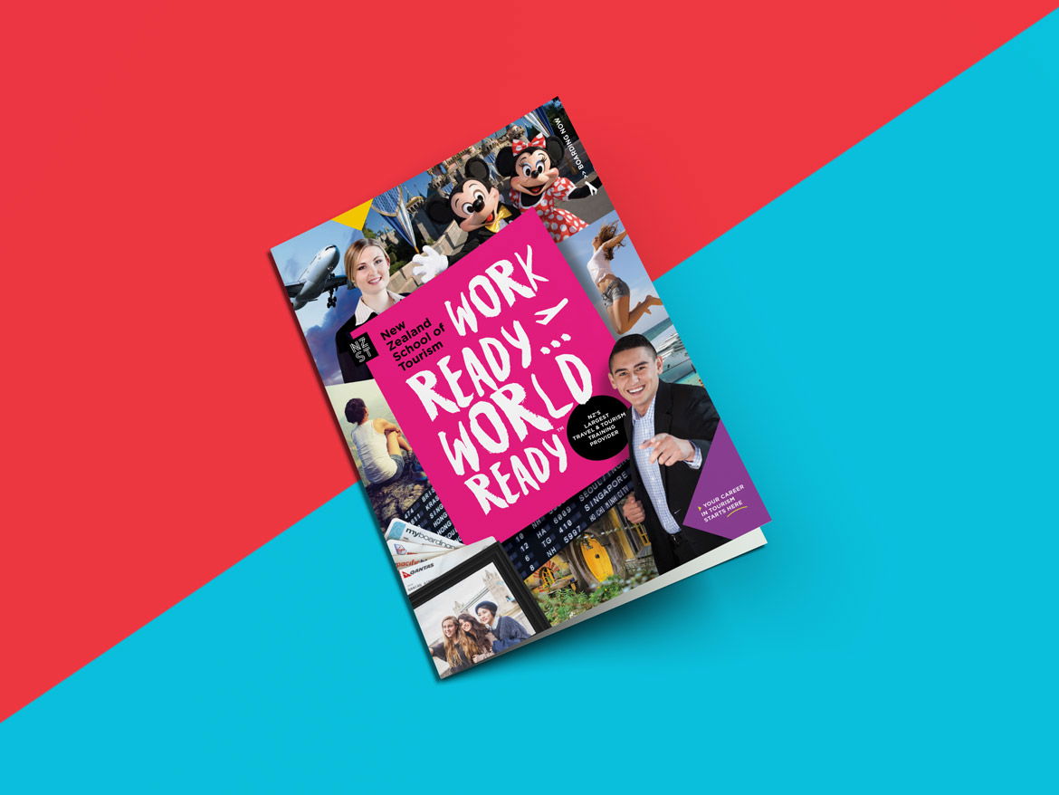
Redfire executed a full brand review to create a new name, brand and positioning. Our strategy was to leverage the new entity as the only specialist travel and tourism training provider in New Zealand. With a nationwide presence and nine campuses, we consolidated the two brands to create one power brand. The New Zealand School of Tourism was born along with a new positioning strapline "Work Ready...World Ready"
The new identity captures their authority as the leaders in Travel & Tourism training in a distinctive graphic framework that is designed to encompass all NZST has to offer. The icon device locks up the wordmark and uses colour to regionalise the campus locations.
The new identity captures their authority as the leaders in Travel & Tourism training in a distinctive graphic framework that is designed to encompass all NZST has to offer. The icon device locks up the wordmark and uses colour to regionalise the campus locations.
The logo and other brand elements have been optimised to perform across various platforms and scales, from print media through to the small-space digital world, and environmental branding and marketing communications.
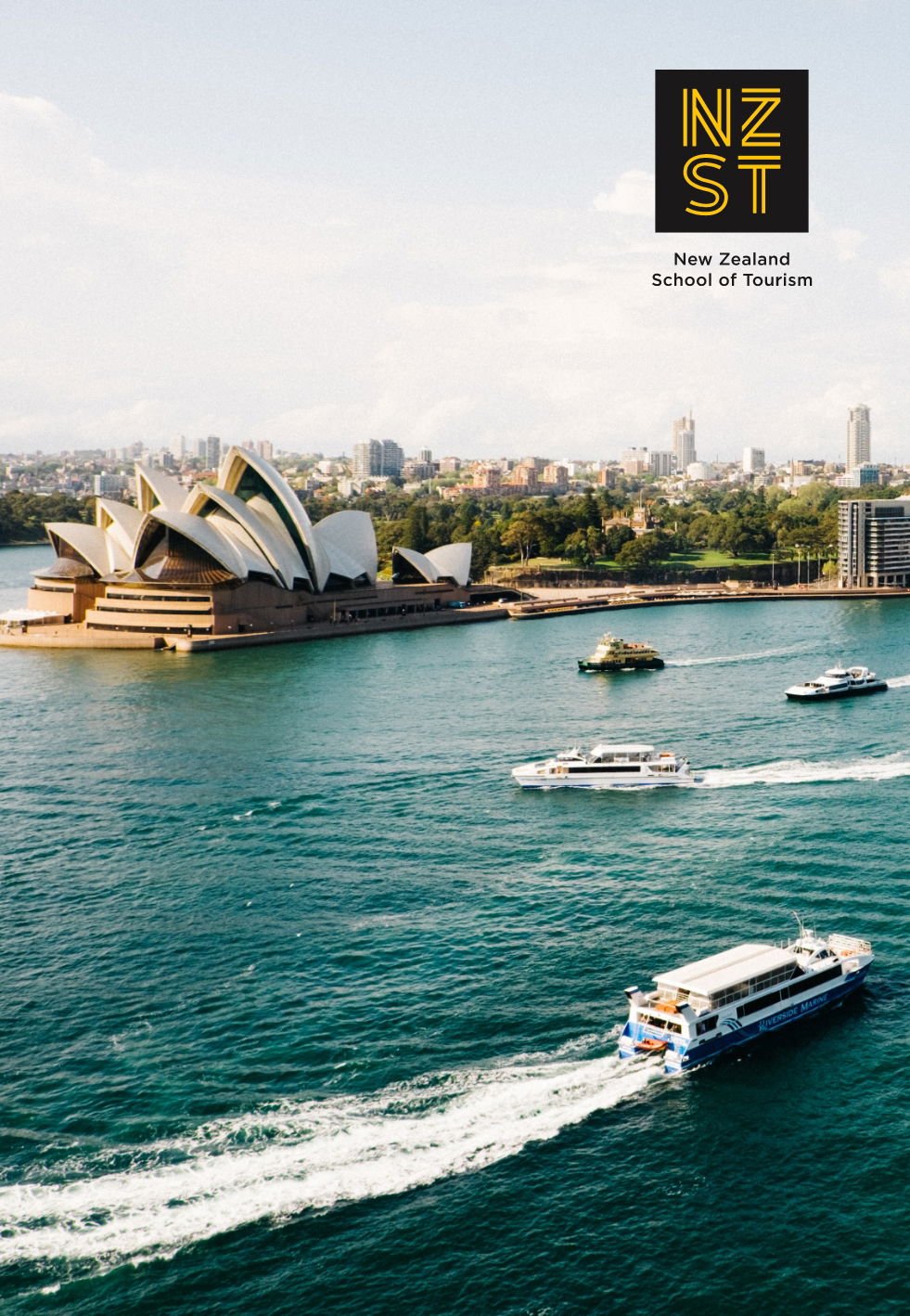
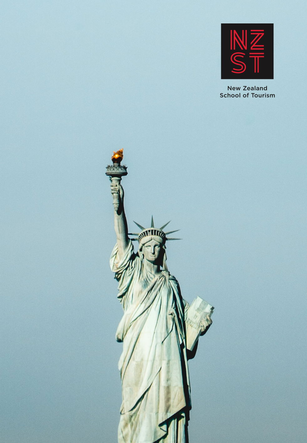
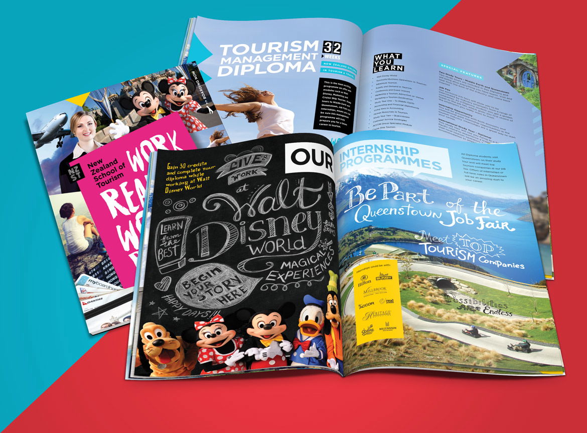
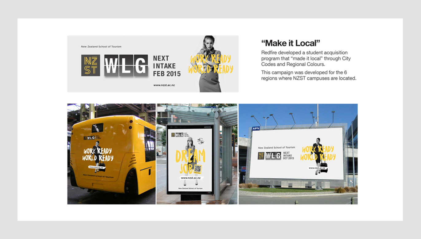
We then developed a strategic student acquisition campaign to target students within the local catchment areas strategically. This used our design framework to quickly adapt using emotive copywriting, photography, colour and typography.
We then developed a strategic student acquisition campaign to target students within the local catchment areas strategically. This used our design framework to quickly adapt using emotive copywriting, photography, colour and typography.
We deployed a through-the-line strategy focusing on print, digital and social channels to connect with our millennial target audience. Our hook was to connect NZST with landing a dream job, where students would be: “WORK READY… WORLD READY”.
WHAT WE DID
Brand Strategy
Naming
Visual Identity Systems
Brand Narrative
Branding
Brand Architecture
Advertising
Digital Strategy
Website Design
Social
Campaigns
Print Management
Photography
Naming
Visual Identity Systems
Brand Narrative
Branding
Brand Architecture
Advertising
Digital Strategy
Website Design
Social
Campaigns
Print Management
Photography

Related Projects
Contact Redfire
+64 9 3585692
hello@redfiredesign.co.nz
Design Services
Copyright © 2000- 2025 Redfire
All rights reserved.


